Hi Team,
I was trying to plot bar graph using bokeh and facing following issues.
- Interactivity is not there, I am using bokeh.charts and Bar library to create bar charts.
Below is the detail of the plot/function I am using:
def make_plot_promotype(source, title):
df=source.to_df()
bar = Bar(df,‘promotion_type’,values=‘value’,title=title)
return bar
Below is how I am calling this make_plot_promotype function
plot_sales_by_promo = make_plot_promotype(source_sales_by_promo, “Sales by Promotion Type”)
Now plotting this bar chart using
curdoc().add_root(HBox(plot_sales_by_promo))
The problem with the above code is that I am seeing two curves while running this application through bokeh server. One where I have called
plot_sales_by_promo = make_plot_promotype(source_sales_by_promo, “Sales by Promotion Type”)
and another is inside curdoc() function.
for implementing interactivity I am using call backs like this:
year_select.on_change(‘value’,update_plot)
where inside update_plot I am changing and update the source dataframe.
- Another problem with bokeh bar charts is that I want labels as strings on the X-axis but could not do this.
Appreciate your help on the same team.
Thanks,
Saurabh Heda
Somehow managed to plot Bar using rect but now the problem is related to the x axis labels. following is the code to plot the rectangle.
def make_plot_promotype(source, title):
-
label=[‘promo1’,‘promo2’,‘promo3’,‘promo4’]*
-
yr = DataRange1d(start=0, bounds=None)*
-
df=source.to_df()*
-
plot = Figure(plot_width=500, plot_height=400, toolbar_location=“above”,y_range=yr)*
-
plot.title = title*
-
plot.rect(x=‘promotion_type’,y=‘valuebytwo’,source=source, width =0.5, height = ‘value’, legend=title)*
-
plot.xaxis.major_label_orientation = np.pi/4 # radians, “horizontal”, “vertical”, “normal”*
-
return plot*
source is the columndatasource which is pandas dataframe. promotion_type, valuebytwo and value are the columns of the dataframe.
Above is the plot we get while x_range = label is not supplied but while figure is supplied with x_range = label getting the below curve.
plot = Figure(x_range=label,plot_width=500, plot_height=400, toolbar_location="above",y_range=yr)
···
On Tue, Sep 20, 2016 at 9:54 AM, Saurabh Heda [email protected] wrote:
Hi Team,
I was trying to plot bar graph using bokeh and facing following issues.
- Interactivity is not there, I am using bokeh.charts and Bar library to create bar charts.
Below is the detail of the plot/function I am using:
def make_plot_promotype(source, title):
df=source.to_df()
bar = Bar(df,‘promotion_type’,values=‘value’,title=title)
return bar
Below is how I am calling this make_plot_promotype function
plot_sales_by_promo = make_plot_promotype(source_sales_by_promo, “Sales by Promotion Type”)
Now plotting this bar chart using
curdoc().add_root(HBox(plot_sales_by_promo))
The problem with the above code is that I am seeing two curves while running this application through bokeh server. One where I have called
plot_sales_by_promo = make_plot_promotype(source_sales_by_promo, “Sales by Promotion Type”)
and another is inside curdoc() function.
for implementing interactivity I am using call backs like this:
year_select.on_change(‘value’,update_plot)
where inside update_plot I am changing and update the source dataframe.
- Another problem with bokeh bar charts is that I want labels as strings on the X-axis but could not do this.
Appreciate your help on the same team.
Thanks,
Saurabh Heda
–
You received this message because you are subscribed to the Google Groups “Bokeh Discussion - Public” group.
To unsubscribe from this group and stop receiving emails from it, send an email to [email protected].
To post to this group, send email to [email protected].
To view this discussion on the web visit https://groups.google.com/a/continuum.io/d/msgid/bokeh/8e47f152-c056-4259-a026-220af56ed122%40continuum.io.
For more options, visit https://groups.google.com/a/continuum.io/d/optout.
–
Regards
Saurabh Heda
www.pg4research.blogspot.com
home.iitj.ac.in/~saurabh.heda
Can anybody help me out on this? Seems like bug to me.
···
On Thu, Sep 22, 2016 at 4:52 PM, Saurabh Heda [email protected] wrote:
Somehow managed to plot Bar using rect but now the problem is related to the x axis labels. following is the code to plot the rectangle.
def make_plot_promotype(source, title):
- label=[‘promo1’,‘promo2’,‘promo3’,‘promo4’]*
- yr = DataRange1d(start=0, bounds=None)*
- plot = Figure(plot_width=500, plot_height=400, toolbar_location=“above”,y_range=yr)*
- plot.rect(x=‘promotion_type’,y=‘valuebytwo’,source=source, width =0.5, height = ‘value’, legend=title)*
- plot.xaxis.major_label_orientation = np.pi/4 # radians, “horizontal”, “vertical”, “normal”*
source is the columndatasource which is pandas dataframe. promotion_type, valuebytwo and value are the columns of the dataframe.
Above is the plot we get while x_range = label is not supplied but while figure is supplied with x_range = label getting the below curve.
plot = Figure(x_range=label,plot_width=500, plot_height=400, toolbar_location=“above”,y_range=yr)
–
On Tue, Sep 20, 2016 at 9:54 AM, Saurabh Heda [email protected] wrote:
Hi Team,
I was trying to plot bar graph using bokeh and facing following issues.
- Interactivity is not there, I am using bokeh.charts and Bar library to create bar charts.
Below is the detail of the plot/function I am using:
def make_plot_promotype(source, title):
df=source.to_df()
bar = Bar(df,‘promotion_type’,values=‘value’,title=title)
return bar
Below is how I am calling this make_plot_promotype function
plot_sales_by_promo = make_plot_promotype(source_sales_by_promo, “Sales by Promotion Type”)
Now plotting this bar chart using
curdoc().add_root(HBox(plot_sales_by_promo))
The problem with the above code is that I am seeing two curves while running this application through bokeh server. One where I have called
plot_sales_by_promo = make_plot_promotype(source_sales_by_promo, “Sales by Promotion Type”)
and another is inside curdoc() function.
for implementing interactivity I am using call backs like this:
year_select.on_change(‘value’,update_plot)
where inside update_plot I am changing and update the source dataframe.
- Another problem with bokeh bar charts is that I want labels as strings on the X-axis but could not do this.
Appreciate your help on the same team.
Thanks,
Saurabh Heda
–
You received this message because you are subscribed to the Google Groups “Bokeh Discussion - Public” group.
To unsubscribe from this group and stop receiving emails from it, send an email to [email protected].
To post to this group, send email to [email protected].
To view this discussion on the web visit https://groups.google.com/a/continuum.io/d/msgid/bokeh/8e47f152-c056-4259-a026-220af56ed122%40continuum.io.
For more options, visit https://groups.google.com/a/continuum.io/d/optout.
Regards
Saurabh Heda
www.pg4research.blogspot.com
home.iitj.ac.in/~saurabh.heda
–
Regards
Saurabh Heda
www.pg4research.blogspot.com
home.iitj.ac.in/~saurabh.heda
Bryan
4
Can you print and share the value of source.data[‘promitiin_type’] for us?
Thanks,
Bryan
···
On Thu, Sep 22, 2016 at 4:52 PM, Saurabh Heda [email protected] wrote:
Somehow managed to plot Bar using rect but now the problem is related to the x axis labels. following is the code to plot the rectangle.
def make_plot_promotype(source, title):
- label=[‘promo1’,‘promo2’,‘promo3’,‘promo4’]*
- yr = DataRange1d(start=0, bounds=None)*
- plot = Figure(plot_width=500, plot_height=400, toolbar_location=“above”,y_range=yr)*
- plot.rect(x=‘promotion_type’,y=‘valuebytwo’,source=source, width =0.5, height = ‘value’, legend=title)*
- plot.xaxis.major_label_orientation = np.pi/4 # radians, “horizontal”, “vertical”, “normal”*
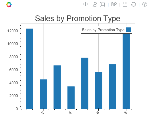
source is the columndatasource which is pandas dataframe. promotion_type, valuebytwo and value are the columns of the dataframe.
<image.png>
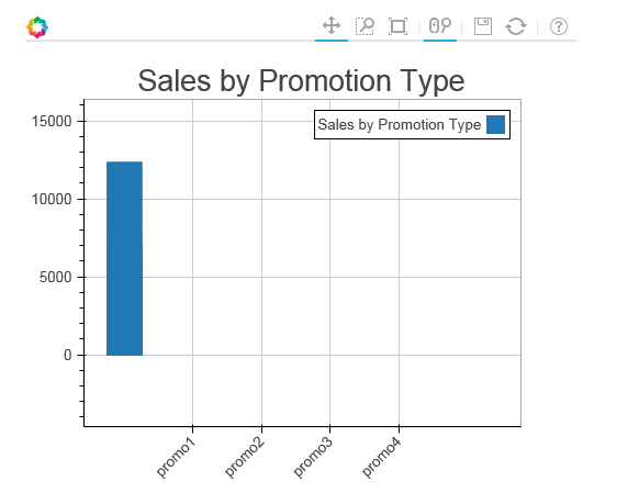
Above is the plot we get while x_range = label is not supplied but while figure is supplied with x_range = label getting the below curve.
plot = Figure(x_range=label,plot_width=500, plot_height=400, toolbar_location=“above”,y_range=yr)
<image.png>
–
On Tue, Sep 20, 2016 at 9:54 AM, Saurabh Heda [email protected] wrote:
Hi Team,
I was trying to plot bar graph using bokeh and facing following issues.
- Interactivity is not there, I am using bokeh.charts and Bar library to create bar charts.
Below is the detail of the plot/function I am using:
def make_plot_promotype(source, title):
df=source.to_df()
bar = Bar(df,‘promotion_type’,values=‘value’,title=title)
return bar
Below is how I am calling this make_plot_promotype function
plot_sales_by_promo = make_plot_promotype(source_sales_by_promo, “Sales by Promotion Type”)
Now plotting this bar chart using
curdoc().add_root(HBox(plot_sales_by_promo))
The problem with the above code is that I am seeing two curves while running this application through bokeh server. One where I have called
plot_sales_by_promo = make_plot_promotype(source_sales_by_promo, “Sales by Promotion Type”)
and another is inside curdoc() function.
for implementing interactivity I am using call backs like this:
year_select.on_change(‘value’,update_plot)
where inside update_plot I am changing and update the source dataframe.
- Another problem with bokeh bar charts is that I want labels as strings on the X-axis but could not do this.
Appreciate your help on the same team.
Thanks,
Saurabh Heda
–
You received this message because you are subscribed to the Google Groups “Bokeh Discussion - Public” group.
To unsubscribe from this group and stop receiving emails from it, send an email to [email protected].
To post to this group, send email to [email protected].
To view this discussion on the web visit https://groups.google.com/a/continuum.io/d/msgid/bokeh/8e47f152-c056-4259-a026-220af56ed122%40continuum.io.
For more options, visit https://groups.google.com/a/continuum.io/d/optout.
Regards
Saurabh Heda
www.pg4research.blogspot.com
home.iitj.ac.in/~saurabh.heda
–
Regards
Saurabh Heda
www.pg4research.blogspot.com
home.iitj.ac.in/~saurabh.heda