Hi All,
I’m facing a problem with the range of y-axis.
I want to show different plots with their data in one figure.
However, it seems that there’re some problems with range of y-axis.
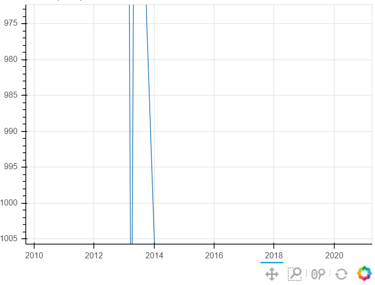
When i use the data of one set of data, it looks like:
This figure looks very weird. I know that can use figure tools to resize the axis. Is there any way to make it automatically to show the correct scale?
The maximum value of this data is about 3000, and the minimum value is about 500
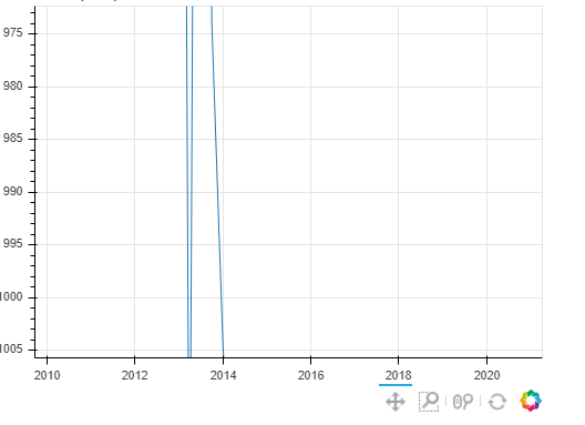
But for another set of data (sorry, I cannot upload the second picture, only one picture is allowed)
Anyway, the figure looks good and the scale is very normal.
Thank you!
BTW, do I need to put my code here?
Here is my code ---------------------------------------------
# create input controls
code_input = TextInput(title = ‘code’(e.g:000001.XSHE)’)
ticker_swl1 = Select(value=‘all’, options=options1,title = ‘level 1’)
ticker_swl3 = Select(value=‘all’, options=options3,title = ‘level 3’)
ticker_picture = Select(value=‘total market cap’, options=picture_option,title = ‘select a factor’)
def plot_data_transfer(data,var_name):
    df = data
    df = df[['date',var_name]]
    df = df.rename(columns={'date':'x',var_name:'y'})
    df.x = pd.to_datetime(df.x)
    return df
# input stock
def select_stock():
    code_val = code_input.value#.strip()
    selected = df
    if code_val != '':
        selected = df[df.code.str.contains(code_val)]

    return selected

# select industry
def select_industry_sw1():
    industry_val = ticker_swl1.value
    selected = df

    if industry_val == 'all':
        selected_df = selected
    else:
        selected_df = df[df['level 1'] == industry_val]
    return selected_df

def select_industry_sw3():
    industry_val = ticker_swl3.value
    selected = df

    if industry_val == 'all':
        selected_df = selected
    else:
        selected_df = df[df['level 3'] == industry_val]
    return selected_df

# update single_stock
def update_single_stock():
    code_val = code_input.value
    stock_df = pd.read_csv('data/%s.csv'%code_val,index_col = 0)
    stock_df = stock_df.drop('code',axis = 1)
    formater = lambda x:'%.3f' %x
    stock_df.iloc[:,1:] = stock_df.iloc[:,1:].applymap(formater)
    return stock_df

# plot
def make_plot():
    plot_val = ticker_picture.value
    plot = figure(x_axis_type="datetime",plot_width=500,plot_height = 400,
                  tools="pan,box_zoom,wheel_zoom,reset",toolbar_location="below",
                  y_range = DataRange1d())
    plot.line('x', 'y', source = source_3)
    plot.title.text = plot_val

    return plot

# source
source_1 = ColumnDataSource(df)
source_2 = ColumnDataSource(single_stock_df)
source_3 = ColumnDataSource(plot_data_transfer(single_stock_df,'total market cap'))

# callback
def stock_select(attr,old,new):
    df1 = select_stock()
    df2 = update_single_stock()
    source_1.data = df1
    source_2.data = df2
    source_3.data = plot_data_transfer(df2,ticker_picture.value)

def industry_change_sw1(attr,old,new):
    df0 = select_industry_sw1()
    source_1.data = df0
    if new != 'all':
        ticker_swl3.options = list(stock[['level 1','level 3']].loc[stock['level 1']==new]['level 3'].unique())
    else:
        ticker_swl3.options = ['all']

def industry_change_sw3(attr,old,new):
    df0 = select_industry_sw3()
    source_1.data = df0

def plot_change(attrname, old, new):
    plot_val = ticker_picture.value
    plot.title.text = plot_val

    df0 = update_single_stock()
    df0 = plot_data_transfer(df0,plot_val)
    source_3.data = df0

    start = source_3.data['y'].min()
    end = source_3.data['y'].max()
    plot.y_range = DataRange1d(start= start,end = end)


#change of interactive function
code_input.on_change('value',stock_select)
ticker_swl1.on_change('value',industry_change_sw1)
ticker_swl3.on_change('value',industry_change_sw3)
ticker_picture.on_change('value', plot_change)

#set attributte of interactive function
inputs = column(code_input, width  = 300, height = 100)
ticker1 = column(ticker_swl1, width = 300, height = 100)
ticker2 = column(ticker_swl3, width = 300, height = 100)
ticker3 = column(ticker_picture, width = 300, height = 100)


columns_1 = [TableColumn(field = i, title = i, width = 500) for i in df.columns[:]]
columns_2 = [TableColumn(field = i, title = i, width = 450) for i in single_stock_df.columns[:]]

data_table_1 = DataTable(source=source_1, columns=columns_1, height = 300, width = 1600)
data_table_2 = DataTable(source=source_2, columns=columns_2, height = 300, width = 1200)
plot = make_plot()

#set the layout
l = layout([
    [data_table_1],
    [inputs,ticker1,ticker2,ticker_picture],
    [data_table_2,plot],
])

curdoc().add_root(l)
curdoc().title = 'Stocks'