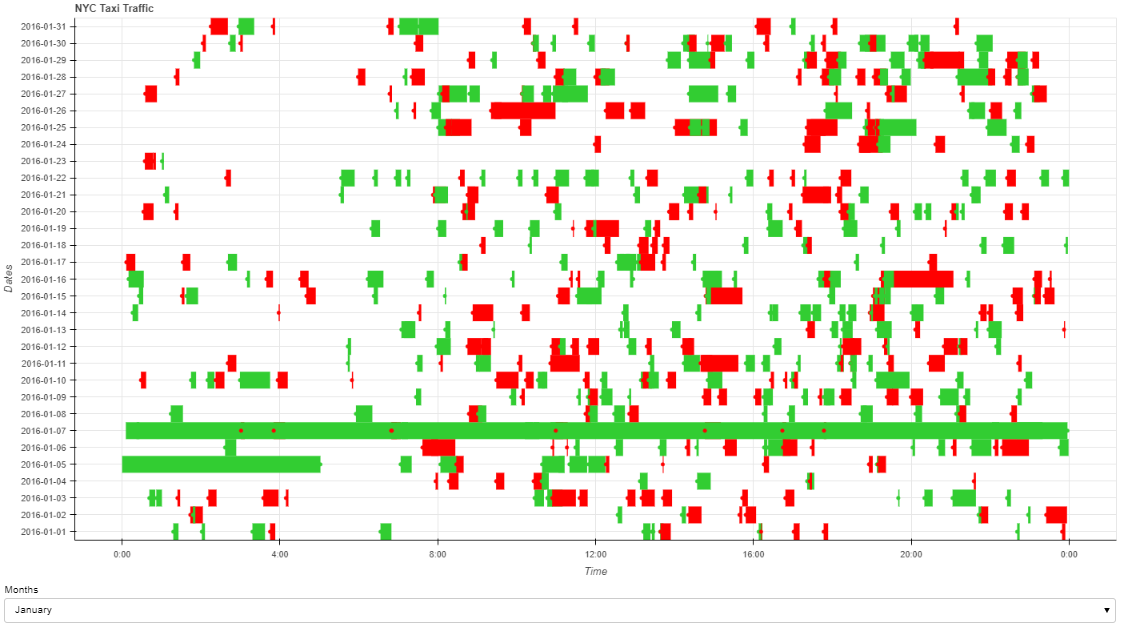
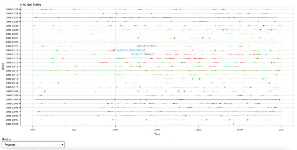
I’m creating a plot to process and visualize the taxi trip details in NYC in every day for each month. The plot will showcase the length of the trip and will be encoded using horizontal bar charts, and each bar starts from the pickup time and ends at the drop off time. The size of the circles represent the number of passengers. The vendor id is encoded in two different colours.
print(df.head(20)
           id vendor_id     pickup_datetime    dropoff_datetime  \
0   id1920009  vendor_1 2016-03-07 18:56:40 2016-03-07 19:14:48
1   id2534249  vendor_1 2016-02-11 18:57:02 2016-02-11 19:05:15
2   id0669446  vendor_2 2016-04-08 22:38:29 2016-04-08 22:48:00
3   id0572918  vendor_2 2016-01-09 21:21:41 2016-01-09 21:29:38
4   id2182053  vendor_2 2016-03-02 07:48:15 2016-03-02 08:10:58
5   id3243826  vendor_2 2016-05-08 14:22:43 2016-05-08 14:36:19
6   id1838795  vendor_1 2016-06-02 19:18:58 2016-06-02 19:38:30
7   id2049478  vendor_2 2016-04-19 11:05:05 2016-04-19 11:11:41
8   id1097651  vendor_2 2016-06-13 00:35:33 2016-06-13 00:59:54
9   id2403524  vendor_1 2016-02-10 20:59:00 2016-02-10 21:08:41
10  id1963201  vendor_1 2016-04-09 12:53:50 2016-04-09 13:08:27
11  id2529196  vendor_1 2016-05-24 15:58:58 2016-05-24 16:16:07
12  id0383397  vendor_2 2016-06-17 13:44:12 2016-06-17 13:54:51
13  id3535223  vendor_1 2016-04-18 07:56:54 2016-04-18 08:11:01
14  id2400930  vendor_1 2016-04-08 09:15:12 2016-04-08 09:26:11
15  id2444453  vendor_2 2016-06-23 17:14:45 2016-06-23 17:19:46
16  id0027673  vendor_2 2016-02-03 22:45:21 2016-02-03 22:50:50
17  id1078997  vendor_2 2016-05-19 22:54:27 2016-05-19 23:23:31
18  id2095160  vendor_1 2016-02-07 16:14:15 2016-02-07 16:23:29
19  id0832604  vendor_2 2016-05-11 11:49:39 2016-05-11 12:20:43

    passenger_count  pickup_longitude  pickup_latitude  dropoff_longitude  \
0                 1        -73.990364        40.752483         -73.958588
1                 1        -73.982300        40.775333         -73.972305
2                 1        -73.990700        40.750900         -73.981804
3                 6        -73.975296        40.749565         -73.974625
4                 3        -73.995422        40.687881         -73.973022
5                 2        -73.997337        40.736687         -73.982620
6                 1        -73.993034        40.727982         -73.988899
7                 1        -74.001869        40.734478         -73.990150
8                 2        -73.782349        40.644615         -73.917175
9                 1        -73.983047        40.766499         -73.968369
10                2        -73.961647        40.755680         -73.973221
11                1        -73.970802        40.764381         -73.967499
12                1        -73.986710        40.756222         -73.979401
13                4        -73.961357        40.764290         -73.982491
14                2        -73.985680        40.757587         -74.004982
15                2        -73.983337        40.744030         -73.978348
16                1        -73.972931        40.743671         -73.987473
17                5        -74.004990        40.706718         -73.946426
18                1        -74.002228        40.740013         -73.988716
19                1        -73.873398        40.774029         -74.011360

    dropoff_latitude store_and_fwd_flag  trip_duration    datetime  \
0          40.768791                  N           1088  2016-03-07
1          40.784046                  N            493  2016-02-11
2          40.762875                  N            571  2016-04-08
3          40.762020                  N            477  2016-01-09
4          40.754223                  N           1363  2016-03-02
5          40.763386                  N            816  2016-05-08
6          40.750923                  N           1172  2016-06-02
7          40.737232                  N            396  2016-04-19
8          40.706589                  N           1461  2016-06-13
9          40.796867                  N            581  2016-02-10
10         40.785324                  N            877  2016-04-09
11         40.787804                  N           1029  2016-05-24
12         40.765919                  N            639  2016-06-17
13         40.744938                  N            847  2016-04-18
14         40.740749                  N            659  2016-04-08
15         40.751259                  N            301  2016-06-23
16         40.749840                  N            329  2016-02-03
17         40.707802                  N           1744  2016-05-19
18         40.745377                  N            554  2016-02-07
19         40.702991                  N           1864  2016-05-11

   pickup_datetime_month pickup_datetime_time dropoff_datetime_time    color
0                  March             18:56:40              19:14:48  #FF0000
1               February             18:57:02              19:05:15  #FF0000
2                  April             22:38:29              22:48:00  #32CD32
3                January             21:21:41              21:29:38  #32CD32
4                  March             07:48:15              08:10:58  #32CD32
5                    May             14:22:43              14:36:19  #32CD32
6                   June             19:18:58              19:38:30  #FF0000
7                  April             11:05:05              11:11:41  #32CD32
8                   June             00:35:33              00:59:54  #32CD32
9               February             20:59:00              21:08:41  #FF0000
10                 April             12:53:50              13:08:27  #FF0000
11                   May             15:58:58              16:16:07  #FF0000
12                  June             13:44:12              13:54:51  #32CD32
13                 April             07:56:54              08:11:01  #FF0000
14                 April             09:15:12              09:26:11  #FF0000
15                  June             17:14:45              17:19:46  #32CD32
16              February             22:45:21              22:50:50  #32CD32
17                   May             22:54:27              23:23:31  #32CD32
18              February             16:14:15              16:23:29  #FF0000
19                   May             11:49:39              12:20:43  #32CD32
Here I create my select widget and define a function that creates a ColumnDataSource and another function that updates the ColumnDataSource when a new month is selected from the select widget.
category = df['pickup_datetime_month'].unique().tolist()
select_category = Select(title='Months',value='January',options=category)

grouped_months = df.groupby('pickup_datetime_month')

def create_datasource(month):
    month_df = grouped_months.get_group(month).drop(['pickup_longitude', "pickup_latitude","dropoff_longitude","dropoff_latitude","store_and_fwd_flag"],1)

    month_df.sort_values(by=['datetime','pickup_datetime_time'],inplace=True)

    data = {'Vendor': list(month_df['vendor_id']),
            'NumOfPass': list(month_df['passenger_count']),
            'StartTime': list(month_df['pickup_datetime_time']),
            'EndTime': list(month_df['dropoff_datetime_time']),
            'Dates' : month_df.loc[:,'datetime'],
            'Color' : list(month_df['color'])
    }

    source = ColumnDataSource(data=data)

    return source

def update_source(attr, old, new):

    month = select_category.value

    source1 = create_datasource(month)

    p.y_range.factors = list(source1.data['Dates'].unique())

    source.data.update(source1.data)

select_category.on_change('value',update_source)
Now this might be where I’m messing up my code somewhere in here.
current_month = 'January'
source = create_datasource(current_month)
y_Range = list(dict.fromkeys(source.data['Dates']))

p = figure(x_axis_type="datetime", y_range = y_Range, plot_width=1400, plot_height=700, toolbar_location=None,title="NYC Taxi Traffic")
p.xaxis.formatter = DatetimeTickFormatter(hours=["%H:%M"], days=["%H:%M"], months=["%H:%M"], years=["%H:%M"])

p.hbar(y='datetime',color='Color',source=source)
circle = p.circle(x='StartTime',y='datetime',color='Color',source=source)

p.add_tools(HoverTool(renderers=[circle], tooltips=[
    ('Date','@datetime'),
    ('Number of Passengers','@NumOfPass'),
    ('Vendor ID','@Vendor')],
                      formatters={'@Dates' : 'datetime'}))

p.yaxis.axis_label = "Dates"
p.xaxis.axis_label = "Time"
p.sizing_mode = "stretch_both"

layout = gridplot([[p], [select_category]])
curdoc().add_root(layout)
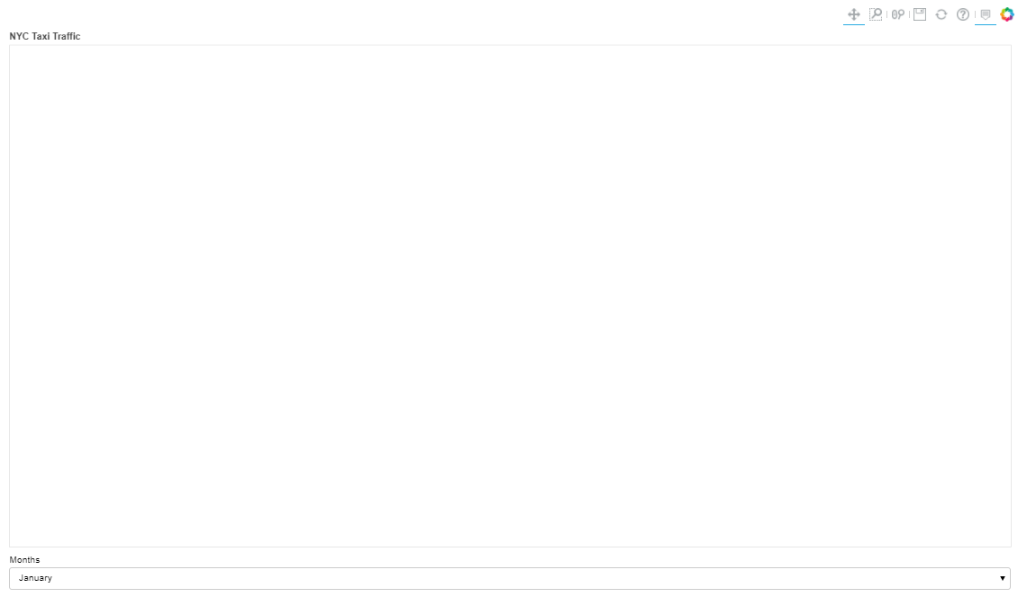
And when I run my code from the command line, I get an almost completely blank plot. The axis don’t show up and no data is displayed.
bokeh serve --show code.ipynb
However, the plot should look similar to the following:
Where did I go wrong and how can I fix it?