I am trying to make a standalone html where the user can choose what categories will be used by the x and y axis. I found it fairly easy to change the values for the y-axis. However, changing the order / values for the x-axis is proving tricky.
As an experiment I used a pair of 3 nested factors, but actually only varied one of them, and they show properly as two separate bars. However, when I use the below code to reverse the order of the factors, I get the below blank graph with odd garbage in the upper right.
How should I be doing this?
forward = test_source.data.x;
                x_length = forward.length;

                var i;
                for (i = 0; i < x_length; i++) {
                    var temp = [3];
                    var k;
                    for(k=0;k<forward[i].length;k++) {
                        temp[k] = forward[i][k];
                    }

                    for (j = 0; j < 3; j++) {
                        forward[i][j] = temp[2-j];
                    }
                }
                p.x_range=FactorRange(factors=forward);
                test_source.change.emit();
@Kyle_Marcroft Well maybe, or maybe it’s not actually the same issue. Either way, to proceed we first really have to have a complete minimal script to reproduce. Can you provide that here for me to run first?
I guess I should mention one thing I missed earlier. You should first try replacing p.x_range.factors on the existing FactorRange instead of creating an entirely new FactorRange.
because you also need to update the coordinates to exactly match the factors in the range (i.e including the order). But adding that does not fix. I don’t think there is a working way to make this happen presently.
I’d say it’s worth filing a bug issue about. In the mean time I am not sure I have a better solution than to suggest duplicating the two plots and using the toggle to toggle visibility of one or the other.
@Bryan My goal is to have the ability for the user to narrow down the factors in a dataset such that a 3 ( 2 or 1 ) level bar plot can be created. Changing the y-axis ‘live’ is trivial, but, as you have seen, changing the x-axis does not properly work using figure.vbar.
Do you believe that the avenue of using a bokeh.models.glyphs.VBar is also not viable for this functionality? VBar — Bokeh 2.4.2 Documentation
I admit to being lost in how to even get a glyph.VBar to display a categorical axis, let alone anything more fancy. Do you know of an example that does barcharts using VBar ( or HBar )? The gallery does not seem to have one. I suspect that figure.vbar is a stripped down version of glyph.VBar that ( among other things ) is missing the “visible” flag ( or is difficult to access ).
My fallback plan is to engineer a Python GUI for users to choose limiters + x-axis factors and y-axis metric, then have the code generate a static bar chart each time as standalone html for the user to look at. For that I will need a GUI library that can call python code; is this a use case for Bokeh, or would you suggest that I look elsewhere? I have never worked with Bokeh Server, but did not want to invest a lot of time if it cannot do what I need.
Thank you again for all of your assistance and precious time!
vbar is just a higher level convenience function around the low level VBar model. There’s really nothing you can do with VBar directly that you can’t do with vbar.
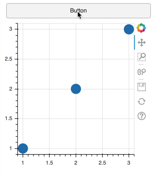
As for options, I guess we should first make sure we are on the same page. My understanding from your original post is that you want users to be able to toggle between two views of a plot. My suggestion in the last reply was to do this by creating two separate plots and toggling their visibility (instead of creating a single plot, and making severe modifications to it). Here is an example:
from bokeh.io import show
from bokeh.layouts import column
from bokeh.models import CustomJS, Button
from bokeh.plotting import figure

p1 = figure(plot_width=300, plot_height=300)
p1.circle([1,2,3], [1,2,3], size=20)

p2 = figure(plot_width=300, plot_height=300)
p2.line([1,2,3], [3,2,1], line_width=3)
p2.visible = False

b = Button()
b.js_on_click(CustomJS(args=dict(p1=p1, p2=p2), code="""
   p1.visible = !p1.visible
   p2.visible = !p2.visible
"""))

show(column(b, p1, p2))
@Bryan I have a dataset containing aggregated electric-power consumption measurements of a limited assortment of intentionally-anonymous processors on a total-system and per-power-rail basis. These power measurements are taken under a variety of loads using benchmarks of various ilk. Various categorical data are recorded along with actual measurements in each entry in the dataset.
My UI plan was to allow the user to select 3 variables to use as the Factor Ranges for a tri-level nested vertical bar plot, and where necessary, single values for all other pertinent variables that could cause duplicate factors; in addition to a single metric choice for the y-axis. Once a legal set was selected, code would generate the necessary lists of lists and splat them into a FactorRange along with the one chosen metric to generate an appropriate Bar Chart. If the user did not like what they saw they could amend and regenerate. Since it looks like I won’t be able to do the amending in CustomJS, my next thought was to give a choose-generate_html-observe-repeat cycle to the user through Python/UI code that could generate a new bokeh html on each set of the cycle. Once the user has a display they like, that particular html can be shared.
Due to certain business needs, a live Bokeh Server is not viable for general consumption, but could work for the creation loop I outlined.
I think right now making deep changes to factor ranges is a problematic, unfortunately. Bokeh’s basic operation is around responding to events, e.g “some property changed => redraw everything”. This works well for many (most) situations, is straightforward to implement, and easy to explain to devs and to users. But it can get in to trouble when there are things that are mutually dependent on one another, as is the case here:
If the factors are changed first, that will trigger a re-render with data that is bad/out-of-date
If the data is changed first, that will trigger a re-render with factors that are bad/out-of-date
I know there are situations where changing factors does work, but I’m not sure if those are by accident, or because the factors weren’t nested, or something about the working cases being in a Bokeh server context. It will require some investigation to understand the difference between your example and those, and to decide what a good, minimally invasive path to improve things might be. A GitHub issue with lots of details and context would be appropriate.
Another core dev @mateusz is plannign to work on adding some synchronization features for grouping multiple updates at once. That alone might be a solution, but I am not sure what the timeline for that work to land is.
I’m not sure what to suggest in the immediate term. An offhand thought is to use the BokehJS API directly, to make entire new plots in the callback (to replace, rather than update, the existing one). But I haven’t ever actually done this so I don’t have any concrete examples to point to.