Hello,
My tries for radar and polar bar plots. I think they look good. Feel free to share or extend.
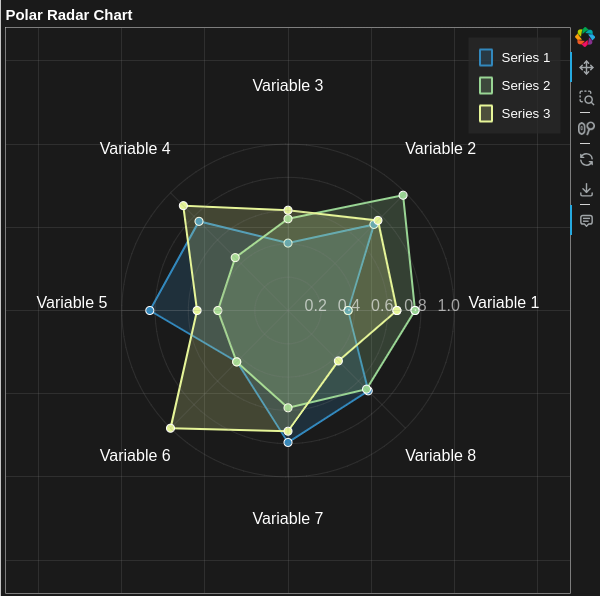
- Radar plot
import numpy as np
from bokeh.plotting import figure, show
from bokeh.models import ColumnDataSource, HoverTool, Label
from bokeh.palettes import Spectral6
from bokeh.io import curdoc

# Generate sample data for multiple series
n_variables = 8
n_series = 3

angles = np.linspace(0, 2*np.pi, n_variables, endpoint=False)
categories = [f'Variable {i+1}' for i in range(n_variables)]

# Generate random data for each series
series_data = []
for i in range(n_series):
    values = np.random.normal(0.6, 0.2, n_variables)
    values = np.clip(values, 0.1, 1.0)  # Ensure values are between 0.1 and 1
    series_data.append(values)

# Close the polygons by appending the first value
angles = np.append(angles, angles[0])
categories = np.append(categories, categories[0])
for i in range(n_series):
    series_data[i] = np.append(series_data[i], series_data[i][0])

# Convert to cartesian coordinates
def get_cartesian_coordinates(values, angles):
    x = values * np.cos(angles)
    y = values * np.sin(angles)
    return x, y

# Create the figure
p = figure(width=600, height=600, title="Polar Radar Chart",
           x_range=(-1.7, 1.7), y_range=(-1.7, 1.7),
           tools="pan,box_zoom,wheel_zoom,reset,save",
           background_fill_color="#1A1A1A",
           border_fill_color="#1A1A1A")

# Add the polygons for each series
colors = Spectral6[:n_series]
sources = []
for i in range(n_series):
    x, y = get_cartesian_coordinates(series_data[i], angles)
    source = ColumnDataSource(data=dict(
        x=x, y=y,
        value=series_data[i],
        category=categories,
        series=[f'Series {i+1}'] * len(x)
    ))
    sources.append(source)

    # Add filled polygon
    p.patch('x', 'y',
            fill_color=colors[i],
            fill_alpha=0.2,
            line_color=colors[i],
            line_width=2,
            legend_label=f'Series {i+1}',
            source=source)

    # Add points
    p.scatter('x', 'y',
              size=8,
              fill_color=colors[i],
              line_color="white",
              source=source)

# Add hover tool
hover = HoverTool(tooltips=[
    ('Series', '@series'),
    ('Category', '@category'),
    ('Value', '@value{0.00}')
])
p.add_tools(hover)

# Style the plot
p.grid.grid_line_color = "gray"
p.grid.grid_line_alpha = 0.2
p.outline_line_color = "white"
p.title.text_color = "white"
p.legend.background_fill_color = "#2A2A2A"
p.legend.background_fill_alpha = 0.7
p.legend.border_line_color = "white"
p.legend.border_line_alpha = 0.5
p.legend.label_text_color = "white"
p.xaxis.visible = False
p.yaxis.visible = False

# Add circular grid lines
radii = np.linspace(0.2, 1, 5)
theta = np.linspace(0, 2*np.pi, 100)
for radius in radii:
    x_circle = radius * np.cos(theta)
    y_circle = radius * np.sin(theta)
    p.line(x_circle, y_circle, line_color="gray", line_alpha=0.2)
    # Add radius label
    label = Label(x=radius-0.1, y=0, text=f'{radius:.1f}',
                 text_color="white", text_alpha=0.6)
    p.add_layout(label)

# Add radial lines and category labels
for angle, category in zip(angles[:-1], categories[:-1]):
    x_line = [0, np.cos(angle)]
    y_line = [0, np.sin(angle)]
    p.line(x_line, y_line, line_color="gray", line_alpha=0.2)

    # Add category label
    label_x = 1.3 * np.cos(angle)
    label_y = 1.3 * np.sin(angle)
    label = Label(x=label_x, y=label_y, text=category,
                 text_color="white", text_align="center")
    p.add_layout(label)

# Show the plot
show(p)
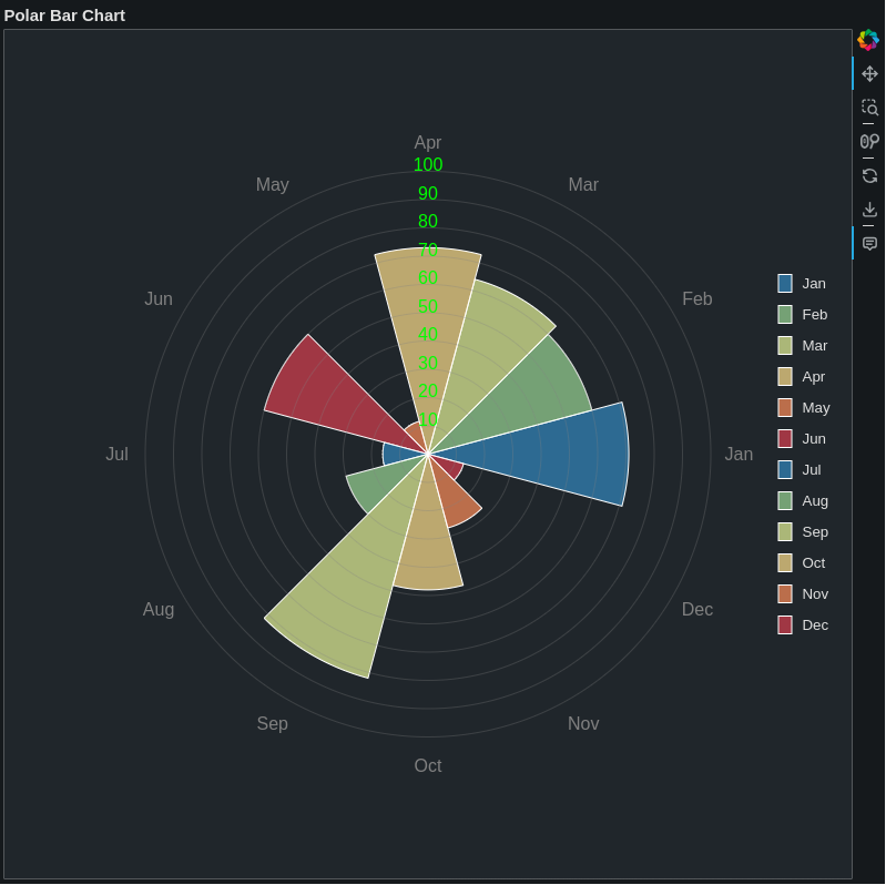
- Polar Bar plot
from bokeh.plotting import figure, show
from bokeh.io import output_file
from bokeh.models import ColumnDataSource, HoverTool
from bokeh.palettes import Spectral6
import numpy as np
from math import pi

# Generate sample data
months = ['Jan', 'Feb', 'Mar', 'Apr', 'May', 'Jun', 'Jul', 'Aug', 'Sep', 'Oct', 'Nov', 'Dec']
values = np.random.randint(10, 100, 12)

# Calculate angles for each month
angles = [i*2*pi/12 for i in range(12)]
start_angles = [angle - pi/12 for angle in angles]
end_angles = [angle + pi/12 for angle in angles]

# Create ColumnDataSource
source = ColumnDataSource(data=dict(
    months=months,
    values=values,
    start_angles=start_angles,
    end_angles=end_angles,
    colors=Spectral6 * 2,  # Repeat colors to match number of months
    x=values * np.cos(angles),
    y=values * np.sin(angles)
))

# Create figure
p = figure(width=800, height=800, title="Polar Bar Chart",
          tools="pan,wheel_zoom,box_zoom,reset,save",
          x_range=(-150, 150), y_range=(-150, 150))

# Add wedges
wedges = p.wedge(x=0, y=0, radius='values',
                 start_angle='start_angles',
                 end_angle='end_angles',
                 fill_color='colors',
                 fill_alpha=0.7,
                 line_color="white",
                 source=source,
                 legend_field='months')

# Add hover tool
hover = HoverTool(renderers=[wedges],tooltips=[

    ('Month', '@months'),
    ('Value', '@values')
])
p.add_tools(hover)

# Add circular grid lines
for radius in np.linspace(0, 100, 11):
    circle = p.circle(x=0, y=0, radius=radius, fill_color=None,
                     line_color='gray', line_alpha=0.3)
    if radius > 0:
        label = p.text(x=[0], y=[radius], text=[f'{int(radius)}'],color="lime",
                      text_baseline="bottom", text_align="center")

# Add month labels at a fixed radius
label_radius = 110
x_labels = label_radius * np.cos(angles)
y_labels = label_radius * np.sin(angles)

label_source = ColumnDataSource(data=dict(
    x=x_labels,
    y=y_labels,
    months=months
))

labels = p.text(x='x', y='y', text='months',
               text_align='center', text_baseline='middle', color="grey",
               source=label_source)

# Customize the plot
p.grid.grid_line_color = None
p.axis.visible = False
p.outline_line_color = None

# Move legend to the right
p.legend.location = "right"
p.legend.click_policy = "hide"  # Allow toggling bars by clicking legend

# Output to file
output_file("polar_bar.html")
show(p)