I have a rect based heatmap
create on top of the following figure:
fig = figure(title="Detailed view",
                 x_axis_type="datetime",
                 y_range=FactorRange(),
                 y_axis_location='right',
                 tools="xpan,reset,undo",
                 min_border=0,
                 active_drag='xpan',
                 plot_height=height,
                 output_backend="webgl",
                 **theme['plot'])
the tect is defined as follows:
rect = fig.rect(x=x,
                    y='Tags',
                    width=glyph_size,
                    height=1,
                    source=source,
                    line_color={
                        'field': 'value',
                        'transform': mapper
                    },
                    fill_color={
                        'field': 'value',
                        'transform': mapper
                    },
                    selection_color={
                        'field': 'value',
                        'transform': selected_mapper
                    },
                    hover_line_color=theme['heatmap_colors']['hover'],
                    nonselection_fill_alpha=1,
                    nonselection_line_alpha=1)
Where glyph_size is a float representing the size in milliseconds.
The chart has a green background and paints white rect glyphs where the data frame is not NaN.
For some reason I see the following:
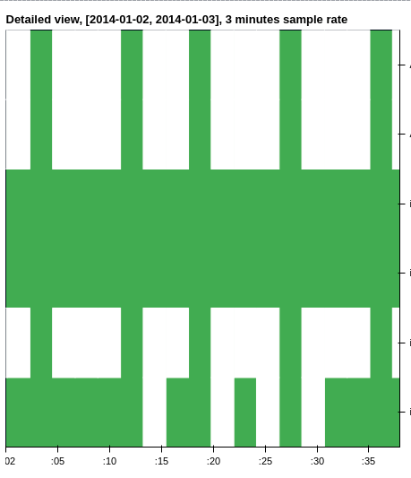
Notice the random green columns in the chart.
These are not real, there is data there!
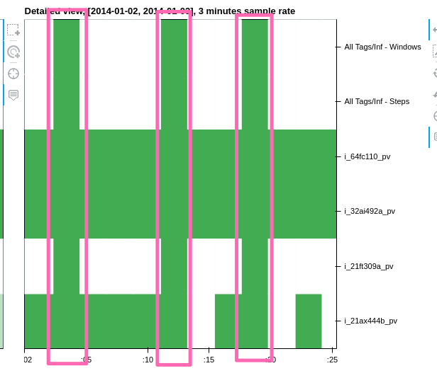
Here we can see that we have a data point at 00:00 that should be 3 minutes size (180000ms glyph size).
For some reason, 2 errors occur in this chart:
- the glyphs are not center around the correct time (or the x_range is not aligned, who knows)
- the size of the glyphs seems to be incorrect.
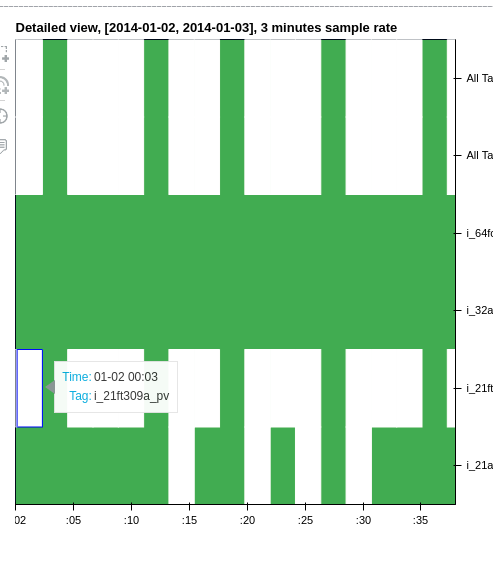
We can see here, that the point should be at 00:03 but it’s positioned somewhere around 00:01!

What I was originally trying to achieve:
draw a time-series based heatmap with the glyphs starting from their respective timestamps and in the size of the sample rate (in this case 3 minutes)
Thank you!