Render multiline plots

hi
I AM Working on dashboard which is dynamic based upon select,it render plot

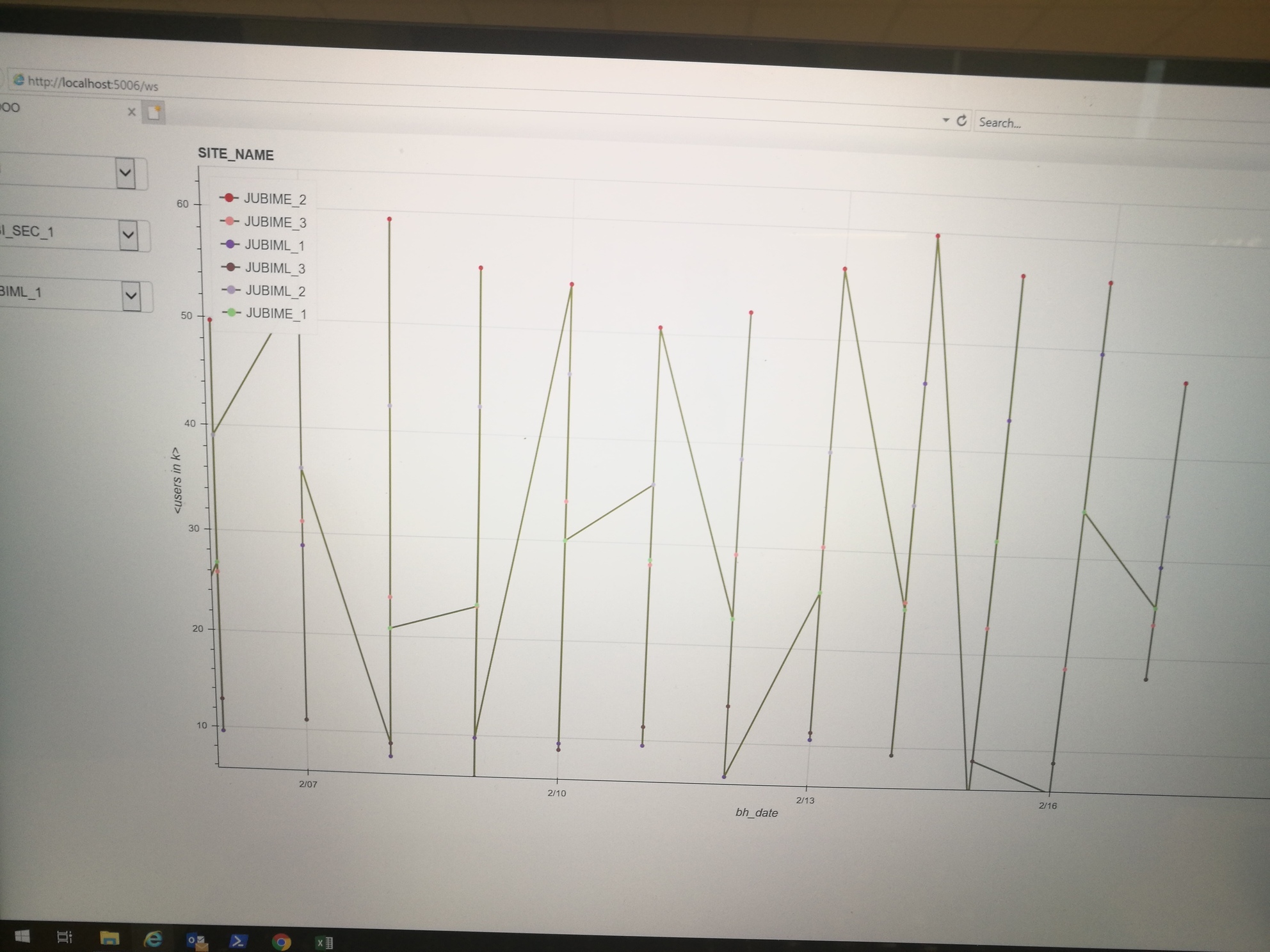
my problem if i render circle plot it display multiple circle lines correspondinmg to legends

but when i display lines .only one line is shown coonecting all the circles ( which i dont want)

any bug in y code?

Thanks for your help in advance

from bokeh.io import curdoc

import itertools from bokeh.transform import factor_cmap, factor_mark
import pandas as pd
import bokeh
from bokeh.layouts import row,gridplot,widgetbox,column
from bokeh.io import output_notebook
from bokeh.palettes import Category20
from bokeh.plotting import figure, output_file, show
from bokeh.models import Select,ColumnDataSource,HoverTool,BoxZoomTool, ResetTool, CrosshairTool, BoxSelectTool, WheelZoomTool,Legend,MultiSelect
df=pd.read_excel('D:/LRD_4_General.xlsx')
df=df.sort_values('bh_date')
df = df.reset_index(drop=True)
df_lrd=sorted(df.lrd_4.unique().astype(str).tolist())
df_sec=sorted(df.sec.unique().astype(str).tolist())
df_cell=sorted(df.cell_name_new.unique().astype(str).tolist())

select1 = Select(title="SIte",options=df_lrd,value=df_lrd[0])
select2 = Select(title="sec",options=df_sec,value=df_sec[0])
select3 = Select(title="cell",options=df_cell,value=df_cell[0])
# select3 = MultiSelect(title="cell:", options=df_cell,value=list(df_cell))

    
source=ColumnDataSource(df)
cell_cmp = factor_cmap('cell_name_new',palette=Category20[20]*len(df_cell),factors=df_cell)

hover=HoverTool(
        tooltips=[
            ( 'date',   '@bh_date{%F}'            ),
            ( 'cell',  '@cell_name_new' ), # use @{ } for field names with spaces
            ( 'user', '@avg_user_number{0.0 a}'      ),
        ],

        formatters={
            'bh_date'      : 'datetime', # use 'datetime' formatter for 'date' field
    #         'adj close' : 'printf',   # use 'printf' formatter for 'adj close' field
                                      # use default 'numeral' formatter for other fields
        },

        # display a tooltip whenever the cursor is vertically in line with a glyph
        mode='vline'
    )

tools = [hover, BoxZoomTool(), ResetTool(), CrosshairTool(), BoxSelectTool(), WheelZoomTool()] 
p = figure(x_axis_type="datetime", title='SITE_NAME', width = 800, height = 450,tools=tools,sizing_mode="scale_width")

p.line(x='bh_date',y='avg_user_number',legend_field='cell_name_new',line_width=2,line_dash='solid',source=source,color='olive')
p.scatter(x='bh_date',y='avg_user_number',source=source,legend_field='cell_name_new',line_color=cell_cmp,fill_color=cell_cmp)
p.xaxis.axis_label = 'bh_date'
p.yaxis.axis_label = '<users in k>'
p.legend.location = "top_left"
p.legend.click_policy="hide"
def update_site(attr,old,new):
     select1.value==select1.options
    df_new=df[df.lrd_4==select1.value]
    select2.options=sorted(df_new.sec.unique().tolist())
    select3.options=sorted(df_new.cell_name_new.unique().tolist())
    source.data=df_new

def update_sec(attr,old,new):
    select3.value==select2.options
    df_sec_new=df[df.sec==select2.value]
    select3.options=df_sec_new.cell_name_new.unique().tolist()
    source.data=df_sec_new

def update_cell(attr,old,new):
    select3.value==select3.options
    df_cell_new=df[df.cell_name_new==select3.value]
    source.data=df_cell_new
    
# Attach the update_plot callback to the 'value' p  roperty of select
select1.on_change('value', update_site)
 select2.on_change('value', update_sec)
select3.on_change('value', update_cell)


controls = column(select1, select2, select3, width=200)
layout = row(controls,p)

curdoc().add_root(layout)
curdoc().title = "SK_JADOO"

HI @shakeel there is a whole lot in that code that seems unrelated to the primary question (e.g. tools, widgets, stying, layout, callbacks…). It very much helps other people help you, if you can present a minimal example that is focused just on the issue that you are trying to solve. Can you edit your posts down to a smaller code sample without all the extraneous bits?

Apology .

here is my call back and plots

p.line(x='bh_date',y='avg_user_number',legend_field='cell_name_new',line_width=2,line_dash='solid',source=source,color='olive')
p.scatter(x='bh_date',y='avg_user_number',source=source,legend_field='cell_name_new',line_color=cell_cmp,fill_color=cell_cmp)

p.legend.location = "top_left"
p.legend.click_policy="hide"
def update_site(attr,old,new):
    df_new=df[df.lrd_4==select1.value]
    select2.options=sorted(df_new.sec.unique().tolist())
    select3.options=sorted(df_new.cell_name_new.unique().tolist())
    source.data=df_new
def update_sec(attr,old,new):
    select3.value==select2.options
    df_sec_new=df[df.sec==select2.value]
    select3.options=df_sec_new.cell_name_new.unique().tolist()
    source.data=df_sec_new
def update_cell(attr,old,new):
    select3.value==select3.options
    df_cell_new=df[df.cell_name_new==select3.value]
    source.data=df_cell_new
    
select1.on_change('value', update_site)
select2.on_change('value', update_sec)
select3.on_change('value', update_cell)

@shakeel no apologies necessary, but I should clarify when I asked for a minimal example, I also meant a complete minimal example. I would like to take your code and try to run it. I’m also confused, you said you were having trouble about plotting lines, but almost all the code above is about callbacks. It’s not clear to me what problem you are actually trying to solve. It might also help if you can provide e.g. a screen shot of the ‘wrong’ output to provide some clarity.

If use line +scatter plot

I am going to guess you don’t want the lines “connected”? If so, you don’t want a single call to line. The line glyph accepts a list of points, and draws one single line (only) through them. You can either:

  • make separate individual calls to line for ever different disconnected line you want, or
  • use the multi_line glyph to provide a list of lists of points (i.e. and array of lines)

Thanks Bryan ,for your reply .

Actually I am confused ,how to use multi line glyph.

As my x axis is always date and y axis depends upon the column I want to plot .

May be I am not sure how to deploy multi line glyph in this scenario

@shakeel looking at the link to multi_line can you describe what exactly is confusing? I am not sure how to advise you based only on the very general description you have given. The data for multi_line needs to be a list of lists (or list of arrays). Each sublist corresponds to one of the lines you want to b drawn. Otherwise all I can do is try to make the linked example more verbose:

# x coords for two lines
xs = [
    [ 1, 2, 3 ], # sublist with x coords for first line
    [ 4, 5, 6 ], # sublist with x coords for second line
] 

# y coords for two lines
ys = [
    [ 1, 2, 1 ], # sublist with y coords for first line
    [ 4, 5, 7 ], # sublist with y coords for second line
] 

# this plots two lines
p.multi_line(xs, ys)

If I use scatter plot only