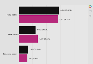
Hey Bokeh users, my first post here. To get started, I have to say it’s been quite nice using Bokeh and I really enjoy the simplicity of being able to rip out some controllable visualizations.
One thing I’m having a tough time doing, however, is trying to deal with some survey data and make it more consumable. The challenge is that the yaxis labels are long and are aligned to the axis (right or left). From a design perspective, I would like to figure out how to either:
- Add a categorical label to a set of hbars that appears above the hbars with a left alignment on the yaxis and hide the yaxis.
- OR, create a custom axis that renders the labels without tick marks and I hack up the label position to appear inside the chart itself and hide the entire set of axis lines. Seems more challenging to do that…
What I have currently:
What I want to have (photoshop hack):
I’m roughly exporting about 40 HTML files (jupyterlabs) with a custom template and stylesheet. In each of these exports, some of the category labels are really long, as long as the bars themselves in some cases, and take up most of the space. I’d rather condense the graph vertically and put the category labels on top of the subset bars.
Any help or pointers where to look would be greatly appreciated.

