Scatter plot with color of points depending on the magnitude of the values in the array

Hello everyone!
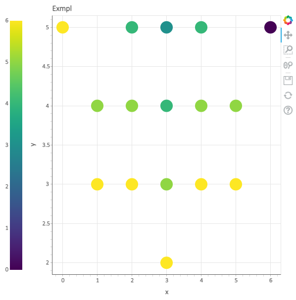
I need to plot points (x, y) from some dataset using different color of points depending on the magnitude of the value in another dataset Z. The dimensions of x, y, z are the same.

In short, how to write the same code using pylab but in Bokeh?

import numpy as np
import pylab as plt
x=[0,1,1,2,2,2,3,3,3,3,4,4,4,5,5,6]
y=[5,3,4,3,4,5,2,3,4,5,3,4,5,3,4,5]
col=[6,6,5,6,5,4,6,5,4,3,6,5,4,6,5,0]
plt.figure(figsize=(10,5))
plt.scatter(x, y, c=col, s=100)
plt.colorbar()
plt.axis('equal')

image

I tried to find examples of the solution and came across to factor_cmap and linear_cmap
However could not find a solution that worked for me.

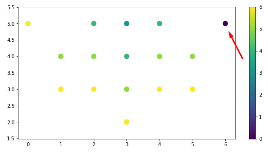
This is necessary in order to find outgoing points on similar datasets (like the one in the screenshot marked with an arrow).

@KonradCurze

See the accepted answer for the following StackOverflow topic, which uses a LinearColorMapper based on the petal length (numeric value) for a common iris data set used in classification problems.

The example is similar to your problem in key respects of (i) plotting circle glyphs and (ii) having the color tied to some numeric attribute.

3 Likes

Thank you so much.
I probably did not see this solution.
Below is the corrected code.

from bokeh.plotting import figure, show, output_file
from bokeh.sampledata.iris import flowers  
from bokeh.models import LinearColorMapper
from bokeh.models import ColumnDataSource

p = figure(title = "Exmpl")
p.xaxis.axis_label = "x"
p.yaxis.axis_label = "y"

source = ColumnDataSource({'x':x,'y':y,'col':col})

exp_cmap = LinearColorMapper(palette="Viridis256", 
                             low = min(col), 
                             high = max(col))

p.circle("x", "y",size=25, source=source, line_color=None,
        fill_color={"field":"col", "transform":exp_cmap})

from bokeh.models import ColorBar
bar = ColorBar(color_mapper=exp_cmap, location=(0,0))
p.add_layout(bar, "left")

show(p)

3 Likes