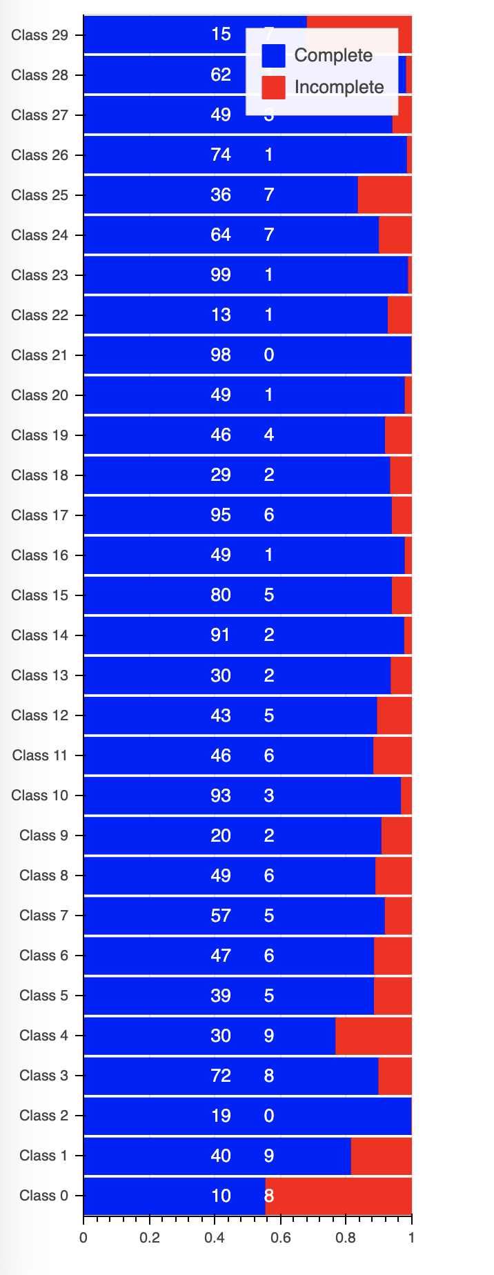
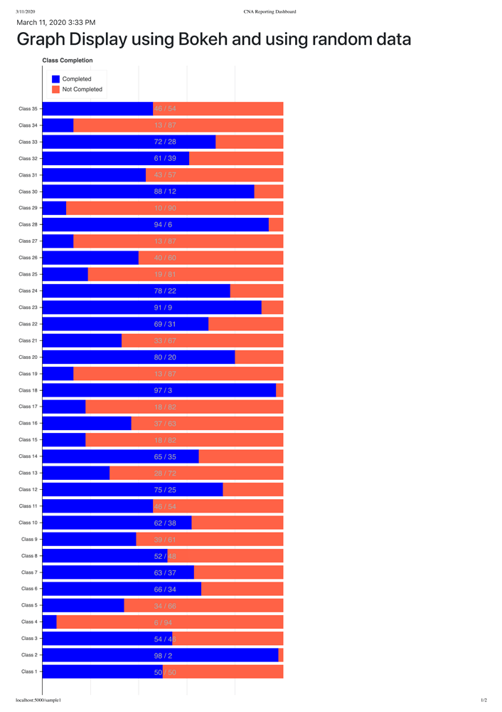
Hello, I’m new to web development and I’m currently working on a reporting dashboard. Please see attached pdf of what it looks like (I’ve made numerous changes but it still looks more or less the same)
-
What would be the best way to display the percentages of the graphs? Currently I have a loop that populates it with citations. See code below:
for i in range (2,24):
string2 = str(Compl[i])
string1 = str(Total[i]-Compl[i])
XLow = 245 * ( round(Compl[i]/Total[i],2))
XHigh = 30 + 245+245 *( round(Compl[i]/Total[i],2) - 100)citation = Label(x=XLow, y= (82+ (37*(i-2))), x_units=‘screen’, y_units=‘screen’,text=string1, render_mode=‘css’,border_line_color=‘black’,text_color = ‘black’, border_line_alpha=0,background_fill_color=‘white’, background_fill_alpha=0)
p.add_layout(citation)
citation = Label(x=XHigh, y= (82+ (37*(i-2))), x_units=‘screen’, y_units=‘screen’,text=string2, render_mode=‘css’,border_line_color=‘black’,text_color = ‘black’, border_line_alpha=0,background_fill_color=‘white’, background_fill_alpha=0)
p.add_layout(citation)
The issue here is that if the number of classes changes, it gets all weird and messed up. It’s not flexible, in other words. What would be the best way to display the corresponding data of each graph? Please note the graphs are percentage-wise but I may need to display the raw numbers, i.e. percent may be 75/25 but number of completed/uncompleted are 3/1, and I need to display 3/1 but have the graph be based on 75/25
- Any way to make the graph scale? The website I am developing needs to be accessible by mobile as well. Currently when i change the size of the window, the graph does not respond. Any suggestions?
Thank you so much! Last time someone answered my question with a very helpful response, but when I replied I guess it didn’t save. So thank you again,