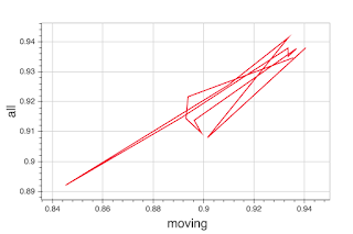
Right now if you have a multi-column DataFrame, you get what (to me) seems like inconsistent behavior – you get a plot with x and y taken from the first two columns. Something like the following:
charts.Line(df)
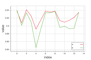
If you pass in a list of two series as the main (data) argument, you get two series plotted in parallel (with an implicit x). Something like:
charts.Line([df.iloc[:,0].tolist(), df.iloc[:,1].tolist()], legend=‘bottom_right’)
You’d get a results similar to the second from a straight df.plot() (i.e., Pandas’ matplotlib convenience wrappers), also IIRC this is how Bokeh 0.9 worked.
I’d be happy to try to submit a pull request or at least file an issue if folks think I’m barking up the right tree.
Best,
Dav

