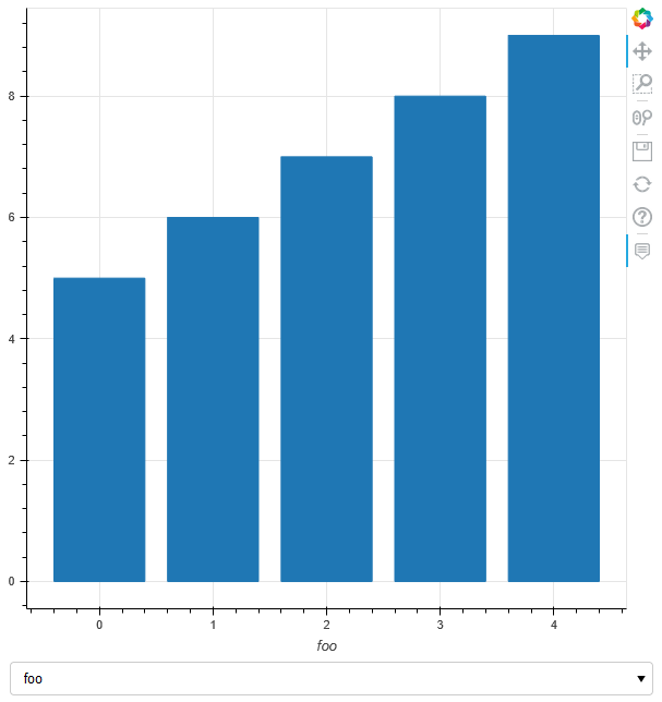
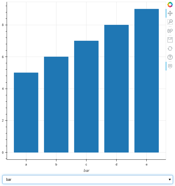
I want to create a bar plot in which I can swap the data that is displayed. This includes changing the x-axis of the data, which may come in forms of both numbers and strings. Also the (relative!) width of the bars should stay consistent.
If I explicitly initialize the figure with the x_range of one of the range types, the plot shows just fine. So bokeh is able to display an x-axis with strings as FactorRange. But this is static, and breaks when trying to update it.
If I start as DataRange1d and then switch the contents of source.data from list of numbers to list of strings, bokeh breaks with the browser message “could not set initial ranges”.
In order to support both numbers and strings, I effectively have to turn all displayed data into strings, via major_label_overrides.
I also have to recalculate the width of the bars manually on each update, in order to reach visual consistency.
In my actual use case, there is always a “flicker” when switching the data: First the height of the bars change, then their width updates, then the labels of the x-axis are updated. This is no dealbreaker, but annoying nevertheless.
My method is also error prone when the data contains mix of ints and floats and the overrides do not get properly overridden.
Ideally I would like to ditch the two “workaround” code segements.
Is there an easier solution to my problem?
Or would I have to turn this into a feature request like “Add support for dynamic update of Range type (e.g. DataRange1d → FactorRange)”?
import numpy as np
import pandas as pd
from bokeh.models import ColumnDataSource, Select, BasicTicker
from bokeh.plotting import figure, curdoc
from bokeh.layouts import column

def update(attr, old, new):
    """Update the contents of the CDS and the xaxis overrides."""
    plot.xaxis.axis_label = dropdown.value

    source_dict = (df
                   .reset_index()
                   .rename(columns={dropdown.value: 'x'})
                   .to_dict(orient='list')
                   )

    # Begin workaround 1
    # "Translate" str data into numbers and later use
    # 'major_label_overrides' to display the desired text
    source_dict['x_orig'] = source_dict['x']
    if df[dropdown.value].dtype == 'object':
        source_dict['x'] = list(range(0, len(df.index)))
    # End workaround 1

    source.data = source_dict

    # Begin workaround 2
    # Update label overrides and bar width
    if df[dropdown.value].dtype != 'object':
        width = round(min(np.diff(df[dropdown.value])) * 0.8, 4)
        ticker_range = BasicTicker()

        # overrides = dict()  # Empty dict is not enough for a reset
        overrides = dict(zip(df[dropdown.value],
                              df[dropdown.value].astype('str')))

    else:
        width = 0.8
        ticker_range = list(range(0, len(df.index)))
        overrides = dict(zip(ticker_range, df[dropdown.value]))

    plot.xaxis.ticker = ticker_range
    plot.xaxis.major_label_overrides = overrides
    r1.glyph.update(width=width)
    # End workaround 2

# Define the test data
df = pd.DataFrame(data={'foo': [0, 1, 2, 3, 4],
                        'fol': [10, 20, 30, 40, 50],
                        'bar': ['a', 'b', 'c', 'd', 'e'],
                        'baz': ['v', 'w', 'x', 'y', 'z']},
                  index=pd.Index([5, 6, 7, 8, 9], name='value'))

source = ColumnDataSource()  # Create an empty CDS

plot = figure(
    # x_range=df['bar'],  # Allows setting a "static" correct range type
    tooltips=[("Value y", "@{value}"),
              ("Value x", "@{x_orig}"),
              ],
    # sizing_mode='stretch_both',  # works in v2.4.3, but breaks v3.2.0
    )
# print(plot.x_range)

r1 = plot.vbar(source=source, x='x', top='value', width=0.8)

start_selection = 'foo'
# start_selection = 'bar'

dropdown = Select(value=start_selection, options=df.columns.to_list(),
                  sizing_mode='scale_width')
dropdown.on_change('value', update)  # Link the callback

layout = column([plot, dropdown])  # Create a layout

update(0, 0, 0)  # Perform an initial update of the ColumnDataSource

curdoc().add_root(layout)
curdoc().title = "Swappable Axis Range Type"