Sizing issues with gridplot

I have two plots: p as the main plot, and p_legend as a fixed sized plot acting as a legend for p. I set their corresponding width/height/sizing and put them in a gridplot, but find it very difficult to get the desired sizing behavior.

from bokeh.plotting import figure, show, gridplot, output_file, output_notebook
# output_notebook()
output_file('tmp.html')

p = figure(
    width=600,
    height=200,
    min_height=200,
    max_height=600,
    width_policy='max',
    height_policy='max',
    tools='fullscreen',
)

p.line(x=[1, 2, 3], y=[1, 2, 3], color='red')
p.line(x=[1, 2, 3], y=[2, 3, 4], color='blue')

p_legend = figure(
    width=300,
    height=22,
    min_height=22,
    max_height=22,
    # width_policy='fixed',
    # height_policy='fixed',
    sizing_mode='fixed',
    x_range=(-1, 100),
    y_range=(-1, 2),
    tools='',
)
p_legend.axis.visible = False
p_legend.grid.visible = False

p_legend.quad(top=[1], bottom=[0], left=[0], right=[1])

show(gridplot(children=[[p_legend], [p]], sizing_mode='stretch_both'))

With sizing_mode='stretch_width' for gridplot, it fits full width but it is on the top: can it be placed in the center?

With sizing_mode='stretch_both' for gridplot, individual plots have their correct sizes, but they are separated: can they be attached together and also centered?

Thanks.
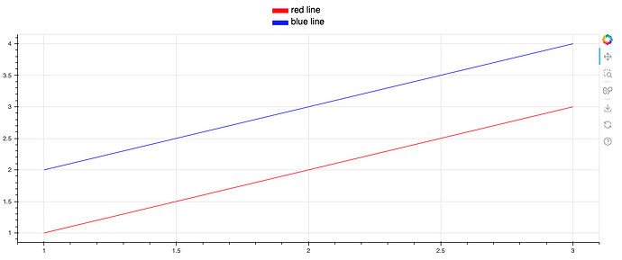
Here is a solution to make the fixed-width plot appear in the center and on top of the main plot.

from bokeh.plotting import figure, show, gridplot, output_notebook, column, row
output_notebook()

p = figure(
    height=400,
    sizing_mode='stretch_width',
)

p.line(x=[1, 2, 3], y=[1, 2, 3], color='red')
p.line(x=[1, 2, 3], y=[2, 3, 4], color='blue')

p_left = figure(height=60, sizing_mode='stretch_width', tools='')
p_left.toolbar.logo=None
p_left.outline_line_color = None
p_right = figure(height=60, sizing_mode='stretch_width', tools='')
p_right.toolbar.logo=None
p_right.outline_line_color = None
p_legend = figure(
    width=150,
    height=60,
    x_range=(-1, 20),
    y_range=(-4, 3),
    tools='',
)
p_legend.axis.visible = False
p_legend.grid.visible = False
p_legend.toolbar.logo=None
p_legend.outline_line_color = None
p_legend.quad(top=[1], bottom=[0], left=[0], right=[5], color='red')
p_legend.text(x=6, y=-0.5, text=['red line'])
p_legend.quad(top=[-2], bottom=[-3], left=[0], right=[5], color='blue')
p_legend.text(x=6, y=-3.5, text=['blue line'])

show(
    column(
        row(p_left, p_legend, p_right, sizing_mode='stretch_width'),
        p,
        sizing_mode='stretch_width'
    )
)

I used two empty figures on two sides of the legend plot so it would appear in the middle. The main problem I see is that it’s really hard to make the legend plot look good

This topic was automatically closed 90 days after the last reply. New replies are no longer allowed.