SOLVED: Datetime axis, missing values skipped, adaptive formatting

First post. Bokeh <3.

Having datetime axes formatted without missing data linearly interpolated (i.e. with missing entries omitted from the chart completely) is not an uncommon request.

Finding a solution that:

  • works for me,
  • doesn’t use extension models end-users would need NodeJS for, and
  • has the labels formatted in a resolution-adapted manner instead of a fixed string manner as with solutions involving p.xaxis.major_label_overrides,
    I’d like to share it with the community. The code works in evergreen browsers by using a FuncTickFormatter with JavaScript code to switch out label formatting function for one that first maps indexes to their corresponding dates, then uses DatetimeTickFormatter to format the labels
    concisely, regardless of their datetime resolution. Please find comments interspersed.

import pandas as pd

from bokeh.io import show
from bokeh.plotting import figure
from bokeh.transform import factor_cmap
from bokeh.models import ColumnDataSource,
FuncTickFormatter,
DatetimeTickFormatter

from bokeh.sampledata.stocks import GOOG

df = pd.DataFrame(GOOG)
df[‘inc’] = (df.open > df.close).astype(int).astype(str)
df[‘date’] = pd.to_datetime(df[‘date’]) # Have real dates in ‘date’ column
df.reset_index(drop=True, inplace=True) # And a simple range(0,n) index

source = ColumnDataSource(df)

Axis type must be linear and df.index a simple range index

p = figure(x_axis_type=‘linear’,
plot_width=1000,
tools=‘pan,wheel_zoom’,
active_scroll=‘wheel_zoom’,
active_drag=‘pan’)

Plot high-low segment and candles, colored appropriately

p.segment(‘index’, ‘high’, ‘index’, ‘low’, source=source, color=“black”)
p.vbar(‘index’, .9, ‘open’, ‘close’, source=source, line_color=‘black’,
fill_color=factor_cmap(‘inc’, [‘tomato’, ‘lime’], [‘0’, ‘1’]))

Override x axis formatter with a custom JS function formatter

Could avoid using FuncTickFormatter if GH-4272 were available

p.xaxis.formatter = FuncTickFormatter(
args=dict(
# We pass in the x axis itself, so we can access its
# ticks values
axis=p.xaxis[0],

    # An instance of DatetimeTickFormatter to nicely format
    # arbitrary precision datetimes
    formatter=DatetimeTickFormatter(days=['%d %b', '%a %d'],
                                    months=['%m/%Y', "%b %y"]),

    # Our column data source with 'date' column we will
    # map indexes through
    source=source,
),
code="""
    // We override this axis' formatter's `doFormat` method
    // with one that maps index ticks to dates. Some of those dates
    // are undefined (e.g. those whose ticks fall out of defined data
    // range) and we must filter out and account for those, otherwise
    // the formatter computes invalid visible span and returns some
    // labels as 'ERR'.
    // Note, after this assignment statement, on next plot redrawing,
    // our override `doFormat` will be called directly
    // -- FunctionTickFormatter.doFormat(), i.e. _this_ code, no longer
    // executes.  
   
    axis.formatter.doFormat = function (ticks) {
        const dates = ticks.map(i => source.data.date[i]),
              valid = t => t !== undefined,
              labels = formatter.doFormat(dates.filter(valid));
        let i = 0;
        return dates.map(t => valid(t) ? labels[i++] : '');
    };

    // Before the second redrawing when above doFormat will be called,
    // we are still within this current labels formatting.
    // FuncTickFormatter gets passed a single `tick` at a time, but
    // DatetimeTickFormatter requires all ticks at once to work.
    // We handle that by formatting all axis' ticks with the function
    // we constructed above and then just taking out the current tick.
    // Note: .tick_coords probably not public API
   
    const ticks = axis.tick_coords.major[0],
          labels = axis.formatter.doFormat(ticks);
    return labels[ticks.indexOf(tick)];

“”")

show(p)

``

The code exhibits some drawbacks:

  • ticks are not positioned as informedly rounded as would be if DatetimeTicker were used,
  • ticks outside of defined range are not labeled, and
  • when a single major tick is visible, it is formatted as %Y, because there is no range span for DatetimeTickFormatter to compute.
    The approach would benefit somewhat if FuncTickFormatter could be configured to accept the whole array of ticks at once instead of a single tick at a time. In particular, this would let us avoid the use of non-public-API axis.formatter.doFormat() and axis.tick_coords.major.

I’d like some input:

  • Could the above code or the approach be improved?
  • Might a PR extending FuncTickFormatter with something like returns_array = Bool(False, help=…) be reviewed favorably?
  • How do we proceed to such datetime axes stop being of workarounds and becoming API?
    Thanks!

datetime-skip-missing.py (3.26 KB)
Wow! Thanks a lot, a lot, a lot…You are my headache medicine!!! My hero!!

I have a OHLC stock chart with 15 minutes candlesticks…

I had weekends gaps and it’s so ugly in a stock chart.

Your solution works fine for me!! ;-)…I only change the

[‘tomato’, ‘lime’]

``

to

[‘lime’, ‘tomato’]

``

because the colors were inverted (bearish candlestick was “lime” and bullish candlesticj was “tomato”)

Thanks a lot, again…

I think like you, this type of issues must be resolved in Bokeh API in a native way.

···

El jueves, 1 de febrero de 2018, 12:44:25 (UTC+1), Kernc escribió:

First post. Bokeh <3.

Having datetime axes formatted without missing data linearly interpolated (i.e. with missing entries omitted from the chart completely) is not an uncommon request.

Finding a solution that:

  • works for me,
  • doesn’t use extension models end-users would need NodeJS for, and
  • has the labels formatted in a resolution-adapted manner instead of a fixed string manner as with solutions involving p.xaxis.major_label_overrides,
    I’d like to share it with the community. The code works in evergreen browsers by using a FuncTickFormatter with JavaScript code to switch out label formatting function for one that first maps indexes to their corresponding dates, then uses DatetimeTickFormatter to format the labels
    concisely, regardless of their datetime resolution. Please find comments interspersed.

import pandas as pd

from bokeh.io import show
from bokeh.plotting import figure
from bokeh.transform import factor_cmap
from bokeh.models import ColumnDataSource,
FuncTickFormatter,
DatetimeTickFormatter

from bokeh.sampledata.stocks import GOOG

df = pd.DataFrame(GOOG)
df[‘inc’] = (df.open > df.close).astype(int).astype(str)
df[‘date’] = pd.to_datetime(df[‘date’]) # Have real dates in ‘date’ column
df.reset_index(drop=True, inplace=True) # And a simple range(0,n) index

source = ColumnDataSource(df)

Axis type must be linear and df.index a simple range index

p = figure(x_axis_type=‘linear’,
plot_width=1000,
tools=‘pan,wheel_zoom’,
active_scroll=‘wheel_zoom’,
active_drag=‘pan’)

Plot high-low segment and candles, colored appropriately

p.segment(‘index’, ‘high’, ‘index’, ‘low’, source=source, color=“black”)
p.vbar(‘index’, .9, ‘open’, ‘close’, source=source, line_color=‘black’,
fill_color=factor_cmap(‘inc’, [‘tomato’, ‘lime’], [‘0’, ‘1’]))

Override x axis formatter with a custom JS function formatter

Could avoid using FuncTickFormatter if GH-4272 were available

p.xaxis.formatter = FuncTickFormatter(
args=dict(
# We pass in the x axis itself, so we can access its
# ticks values
axis=p.xaxis[0],

    # An instance of DatetimeTickFormatter to nicely format
    # arbitrary precision datetimes
    formatter=DatetimeTickFormatter(days=['%d %b', '%a %d'],
                                    months=['%m/%Y', "%b %y"]),

    # Our column data source with 'date' column we will
    # map indexes through
    source=source,
),
code="""
    // We override this axis' formatter's `doFormat` method
    // with one that maps index ticks to dates. Some of those dates
    // are undefined (e.g. those whose ticks fall out of defined data
    // range) and we must filter out and account for those, otherwise
    // the formatter computes invalid visible span and returns some
    // labels as 'ERR'.
    // Note, after this assignment statement, on next plot redrawing,
    // our override `doFormat` will be called directly
    // -- FunctionTickFormatter.doFormat(), i.e. _this_ code, no longer
    // executes.  
   
    axis.formatter.doFormat = function (ticks) {
        const dates = ticks.map(i => source.data.date[i]),
              valid = t => t !== undefined,
              labels = formatter.doFormat(dates.filter(valid));
        let i = 0;
        return dates.map(t => valid(t) ? labels[i++] : '');
    };

    // Before the second redrawing when above doFormat will be called,
    // we are still within this current labels formatting.
    // FuncTickFormatter gets passed a single `tick` at a time, but
    // DatetimeTickFormatter requires all ticks at once to work.
    // We handle that by formatting all axis' ticks with the function
    // we constructed above and then just taking out the current tick.
    // Note: .tick_coords probably not public API
   
    const ticks = axis.tick_coords.major[0],
          labels = axis.formatter.doFormat(ticks);
    return labels[ticks.indexOf(tick)];

“”")

show(p)

``

The code exhibits some drawbacks:

  • ticks are not positioned as informedly rounded as would be if DatetimeTicker were used,
  • ticks outside of defined range are not labeled, and
  • when a single major tick is visible, it is formatted as %Y, because there is no range span for DatetimeTickFormatter to compute.
    The approach would benefit somewhat if FuncTickFormatter could be configured to accept the whole array of ticks at once instead of a single tick at a time. In particular, this would let us avoid the use of non-public-API axis.formatter.doFormat() and axis.tick_coords.major.

I’d like some input:

  • Could the above code or the approach be improved?
  • Might a PR extending FuncTickFormatter with something like returns_array = Bool(False, help=…) be reviewed favorably?
  • How do we proceed to such datetime axes stop being of workarounds and becoming API?
    Thanks!

df[‘inc’] = (df.close > df.open).astype(int).astype(str)

``

Aye, right. That should have been:

`
Didn’t even notice. x)

Thanks.
`

mmmm…I want to plot some glyphs (small lines) only in a certain candlestick every day (maximun volume cluster for every day in only one candlestick), but with this approach, the plot is wrong because the traditional datetime xaxis is missing…can you give me any ideas??

Thanks!

···

El jueves, 1 de febrero de 2018, 12:44:25 (UTC+1), Kernc escribió:

First post. Bokeh <3.

Having datetime axes formatted without missing data linearly interpolated (i.e. with missing entries omitted from the chart completely) is not an uncommon request.

Finding a solution that:

  • works for me,
  • doesn’t use extension models end-users would need NodeJS for, and
  • has the labels formatted in a resolution-adapted manner instead of a fixed string manner as with solutions involving p.xaxis.major_label_overrides,
    I’d like to share it with the community. The code works in evergreen browsers by using a FuncTickFormatter with JavaScript code to switch out label formatting function for one that first maps indexes to their corresponding dates, then uses DatetimeTickFormatter to format the labels
    concisely, regardless of their datetime resolution. Please find comments interspersed.

import pandas as pd

from bokeh.io import show
from bokeh.plotting import figure
from bokeh.transform import factor_cmap
from bokeh.models import ColumnDataSource,
FuncTickFormatter,
DatetimeTickFormatter

from bokeh.sampledata.stocks import GOOG

df = pd.DataFrame(GOOG)
df[‘inc’] = (df.open > df.close).astype(int).astype(str)
df[‘date’] = pd.to_datetime(df[‘date’]) # Have real dates in ‘date’ column
df.reset_index(drop=True, inplace=True) # And a simple range(0,n) index

source = ColumnDataSource(df)

Axis type must be linear and df.index a simple range index

p = figure(x_axis_type=‘linear’,
plot_width=1000,
tools=‘pan,wheel_zoom’,
active_scroll=‘wheel_zoom’,
active_drag=‘pan’)

Plot high-low segment and candles, colored appropriately

p.segment(‘index’, ‘high’, ‘index’, ‘low’, source=source, color=“black”)
p.vbar(‘index’, .9, ‘open’, ‘close’, source=source, line_color=‘black’,
fill_color=factor_cmap(‘inc’, [‘tomato’, ‘lime’], [‘0’, ‘1’]))

Override x axis formatter with a custom JS function formatter

Could avoid using FuncTickFormatter if GH-4272 were available

p.xaxis.formatter = FuncTickFormatter(
args=dict(
# We pass in the x axis itself, so we can access its
# ticks values
axis=p.xaxis[0],

    # An instance of DatetimeTickFormatter to nicely format
    # arbitrary precision datetimes
    formatter=DatetimeTickFormatter(days=['%d %b', '%a %d'],
                                    months=['%m/%Y', "%b %y"]),

    # Our column data source with 'date' column we will
    # map indexes through
    source=source,
),
code="""
    // We override this axis' formatter's `doFormat` method
    // with one that maps index ticks to dates. Some of those dates
    // are undefined (e.g. those whose ticks fall out of defined data
    // range) and we must filter out and account for those, otherwise
    // the formatter computes invalid visible span and returns some
    // labels as 'ERR'.
    // Note, after this assignment statement, on next plot redrawing,
    // our override `doFormat` will be called directly
    // -- FunctionTickFormatter.doFormat(), i.e. _this_ code, no longer
    // executes.  
   
    axis.formatter.doFormat = function (ticks) {
        const dates = ticks.map(i => source.data.date[i]),
              valid = t => t !== undefined,
              labels = formatter.doFormat(dates.filter(valid));
        let i = 0;
        return dates.map(t => valid(t) ? labels[i++] : '');
    };

    // Before the second redrawing when above doFormat will be called,
    // we are still within this current labels formatting.
    // FuncTickFormatter gets passed a single `tick` at a time, but
    // DatetimeTickFormatter requires all ticks at once to work.
    // We handle that by formatting all axis' ticks with the function
    // we constructed above and then just taking out the current tick.
    // Note: .tick_coords probably not public API
   
    const ticks = axis.tick_coords.major[0],
          labels = axis.formatter.doFormat(ticks);
    return labels[ticks.indexOf(tick)];

“”")

show(p)

``

The code exhibits some drawbacks:

  • ticks are not positioned as informedly rounded as would be if DatetimeTicker were used,
  • ticks outside of defined range are not labeled, and
  • when a single major tick is visible, it is formatted as %Y, because there is no range span for DatetimeTickFormatter to compute.
    The approach would benefit somewhat if FuncTickFormatter could be configured to accept the whole array of ticks at once instead of a single tick at a time. In particular, this would let us avoid the use of non-public-API axis.formatter.doFormat() and axis.tick_coords.major.

I’d like some input:

  • Could the above code or the approach be improved?
  • Might a PR extending FuncTickFormatter with something like returns_array = Bool(False, help=…) be reviewed favorably?
  • How do we proceed to such datetime axes stop being of workarounds and becoming API?
    Thanks!

Can you share a minimal (non-)working example?​

Sure…
The CSV files are attached.

import pandas as pd

from bokeh.io import show

from bokeh.plotting import figure

from bokeh.transform import factor_cmap

from bokeh.models import ColumnDataSource, \

FuncTickFormatter, \

DatetimeTickFormatter

#from bokeh.sampledata.stocks import GOOG

read a CSV file

def read_csv(filename):

dataframes have an datetime index: “DateTimeSecs”

date_column = [“DateTimeSecs”]

index_column = “DateTimeSecs”

df = pd.read_csv(filename, parse_dates = date_column).set_index(index_column)

return df

plot candlestick chart

def plot_ohlcv(df):

df[‘inc’] = (df.open < df.close).astype(int).astype(str)

df[‘date’] = pd.to_datetime(df[‘date’]) # Have real dates in ‘date’ column

df[‘date’] = df.index # only assing the index to new column: “date”

df.reset_index(drop=True, inplace=True) # And a simple range(0,n) index

source = ColumnDataSource(df)

Axis type must be linear and df.index a simple range index

p = figure(x_axis_type=‘linear’,

plot_width=1000,

tools=‘pan,wheel_zoom’,

active_scroll=‘wheel_zoom’,

active_drag=‘pan’)

Plot high-low segment and candles, colored appropriately

p.segment(‘index’, ‘high’, ‘index’, ‘low’, source=source, color=“black”)

p.vbar(‘index’, .7, ‘open’, ‘close’, source=source, line_color=‘black’,

fill_color=factor_cmap(‘inc’, [‘tomato’, ‘lime’], [‘0’, ‘1’]))

Override x axis formatter with a custom JS function formatter

Could avoid using FuncTickFormatter if GH-4272 were available

p.xaxis.formatter = FuncTickFormatter(

args=dict(

We pass in the x axis itself, so we can access its

ticks values

axis=p.xaxis[0],

An instance of DatetimeTickFormatter to nicely format

arbitrary precision datetimes

formatter=DatetimeTickFormatter(days=[‘%d %b’, ‘%a %d’],

months=[‘%m/%Y’, “%b %y”]),

Our column data source with ‘date’ column we will

map indexes through

source=source,

),

code=“”"

// We override this axis’ formatter’s doFormat method

// with one that maps index ticks to dates. Some of those dates

// are undefined (e.g. those whose ticks fall out of defined data

// range) and we must filter out and account for those, otherwise

// the formatter computes invalid visible span and returns some

// labels as ‘ERR’.

// Note, after this assignment statement, on next plot redrawing,

// our override doFormat will be called directly

// – FunctionTickFormatter.doFormat(), i.e. this code, no longer

// executes.

axis.formatter.doFormat = function (ticks) {

const dates = ticks.map(i => source.data.date[i]),

valid = t => t !== undefined,

labels = formatter.doFormat(dates.filter(valid));

let i = 0;

return dates.map(t => valid(t) ? labels[i++] : ‘’);

};

// Before the second redrawing when above doFormat will be called,

// we are still within this current labels formatting.

// FuncTickFormatter gets passed a single tick at a time, but

// DatetimeTickFormatter requires all ticks at once to work.

// We handle that by formatting all axis’ ticks with the function

// we constructed above and then just taking out the current tick.

// Note: .tick_coords probably not public API

const ticks = axis.tick_coords.major[0],

labels = axis.formatter.doFormat(ticks);

return labels[ticks.indexOf(tick)];

“”")

return p

Plot a glyph (small vbar) in EVERY CANDLE.

It marks the price where the maximum volume is traded.

def plot_candle_vpoc(df, p):

df[‘date’] = df.index # Have real dates in ‘date’ column

df.reset_index(drop=True, inplace=True) # And a simple range(0,n) index

create a small vbar

size = 0.00001

df[“vpoc_max_top”] = df[“vpoc_max”] + size

df[“vpoc_max_bottom”] = df[“vpoc_max”] - size

source = ColumnDataSource(df)

p.vbar(‘index’, .7, ‘vpoc_max_bottom’, ‘vpoc_max_top’, source=source, line_color=‘black’,fill_color=“black”)

return p

Plot a small glyph (small vbar, but MORE GREATER THAN glyphs in previous function)

Similar to candle VPOC, but only marks ONE CANDLE EVERY DAY:

the price where the maximum volume is traded in that day.

def plot_cluster(df, p):

df[‘date’] = df.index # Have real dates in ‘date’ column

df.reset_index(drop=True, inplace=True) # And a simple range(0,n) index

create a small vbar

size = 0.00001

df[“vpoc_max_top”] = df[“vpoc_max”] + size

df[“vpoc_max_bottom”] = df[“vpoc_max”] - size

source = ColumnDataSource(df)

p.vbar(‘index’, 2, ‘vpoc_max_bottom’, ‘vpoc_max_top’, source=source, fill_color=“red”, line_color=“green”)

return p

read the CSV’s

df_ohlcv = read_csv(“df_ohlcv.csv”)

df_candle_vpoc = read_csv(“df_candle_vpoc.csv”)

df_max_cluster_volume = read_csv(“df_max_cluster_volume.csv”)

p = plot_ohlcv(df_ohlcv) # OK, no problem

p = plot_candle_vpoc(df_candle_vpoc, p) # OK, no problem, EVERY CANDLE has a VPOC

p = plot_cluster(df_max_cluster_volume, p) # PROBLEM: every day only ONE CANDLE has the maximum volume

show(p)

``

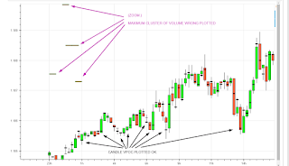
The OHLC plot is OK.

The Candle VPOC plot is OK (every candle has a small glyph, a black vbar).

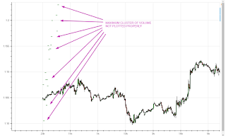
The maximum cluster of volume plot is wrong. Only one candle a day needs to be marked. The glyph is plotted in the left side of the chart

Thanks in advance.

df_candle_vpoc.csv (78.1 KB)

df_max_cluster_volume.csv (1.16 KB)

df_ohlcv.csv (141 KB)

···

El lunes, 5 de febrero de 2018, 22:22:51 (UTC+1), Kernc escribió:

Can you share a minimal (non-)working example?​

In plot_cluster(), your cluster df gets its own separate range 0…N index. To plot correctly on the same x axis, all data frames need to share the same index (range or otherwise). You should restructure your code to merge cluster data into ohlcv data before converting it into ColumnDataSource, like so:

ohlcv = pd.read_csv(’/tmp/df_ohlcv.csv’)
cluster = pd.read_csv(’/tmp/df_max_cluster_volume.csv’)

merged = ohlcv.merge(cluster, on=‘DateTimeSecs’, how=‘outer’) # SQL-like “outer” join
merged.head() # See image

``

Now reset the index and plot vbars for ‘vpoc_max’ and it should work. :+1:

Thanks. Your solution works fine.

Other issue is when you zooming the chart, the candle time changes depending on the zoom level you are visualizing… the more you zoom, the more accurate the candle time is.

Any ideas??

Thanks again.

···

El miércoles, 7 de febrero de 2018, 2:55:46 (UTC+1), Kernc escribió:

In plot_cluster(), your cluster df gets its own separate range 0…N index. To plot correctly on the same x axis, all data frames need to share the same index (range or otherwise). You should restructure your code to merge cluster data into ohlcv data before converting it into ColumnDataSource, like so:

ohlcv = pd.read_csv(‘/tmp/df_ohlcv.csv’)
cluster = pd.read_csv(‘/tmp/df_max_cluster_volume.csv’)

merged = ohlcv.merge(cluster, on=‘DateTimeSecs’, how=‘outer’) # SQL-like “outer” join
merged.head() # See image

``

Now reset the index and plot vbars for ‘vpoc_max’ and it should work. :+1:

the more you zoom in, the more accurate the label is.

I don’t understand the question. Is there a problem? :wink:

You can adapt the format of labels at different zoom levels by passing custom format specifiers to DatetimeTickFormatter formatter passed into FuncTickFormatter’s args=.

Sorry, I have not explained well.
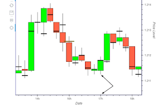
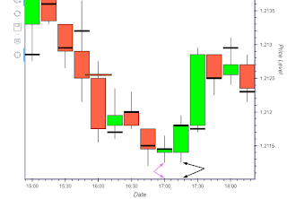
What I want to tell you is that in the first picture, the candlestick at 17:00h is different than the candlestick in the second picture at 17:00h, at the same time in xaxis.

Both pictures shows the same chart at different zoom level. The second picture has more zoom and it is more accurated…

I mean that if I want to get the candlestick “exact time”, I need to zoom the chart too much.

Do you think I can solve the problem with DatetimeTickFormatter??

Thanks so much.

···

El miércoles, 7 de febrero de 2018, 23:18:51 (UTC+1), Kernc escribió:

the more you zoom in, the more accurate the label is.

I don’t understand the question. Is there a problem? :wink:

You can adapt the format of labels at different zoom levels by passing custom format specifiers to DatetimeTickFormatter formatter passed into FuncTickFormatter’s args=.

Ah, I see. In the first figure, the time shows 17h whereas it is in fact 17h-ish (17h15), as observed in the second figure.
You could remedy it by passing a formatter with a different hourly format: formatter=DatetimeTickFormatter(hours=[‘%Hh’, ‘%H:%M’], …) E.g. if you changed it to “%H:%M”, the label (in your first figure) would say correctly “17:15”.

The fact that ticks are not positioned at round o’clock interval has got to do with the first mentioned drawback:

ticks are not positioned as informedly rounded as would be if DatetimeTicker were used.

To overcome that, you’d have to override p.xaxis.ticker to something other than the linear BasicTicker LinearAxis sets by default. You’re on your own there, though, but if you figure something out, please do tell. :slight_smile: