Space / Gap between figures

imagen

hello. I was doing this:
show(column(gridplot([[p1], [pa], [p2], [p3]], toolbar_location = ‘right’), \ gridplot([[s1]], toolbar_location = None)))
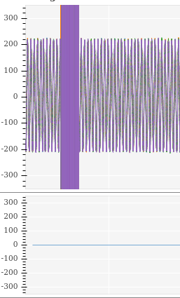
p1 pa,p2 has xaxis disabled, but a line and a gap remains:
as you can see in the above images,between both plots there is still being separation. How can I avoid the gap? I don’t find issues about this in the repo

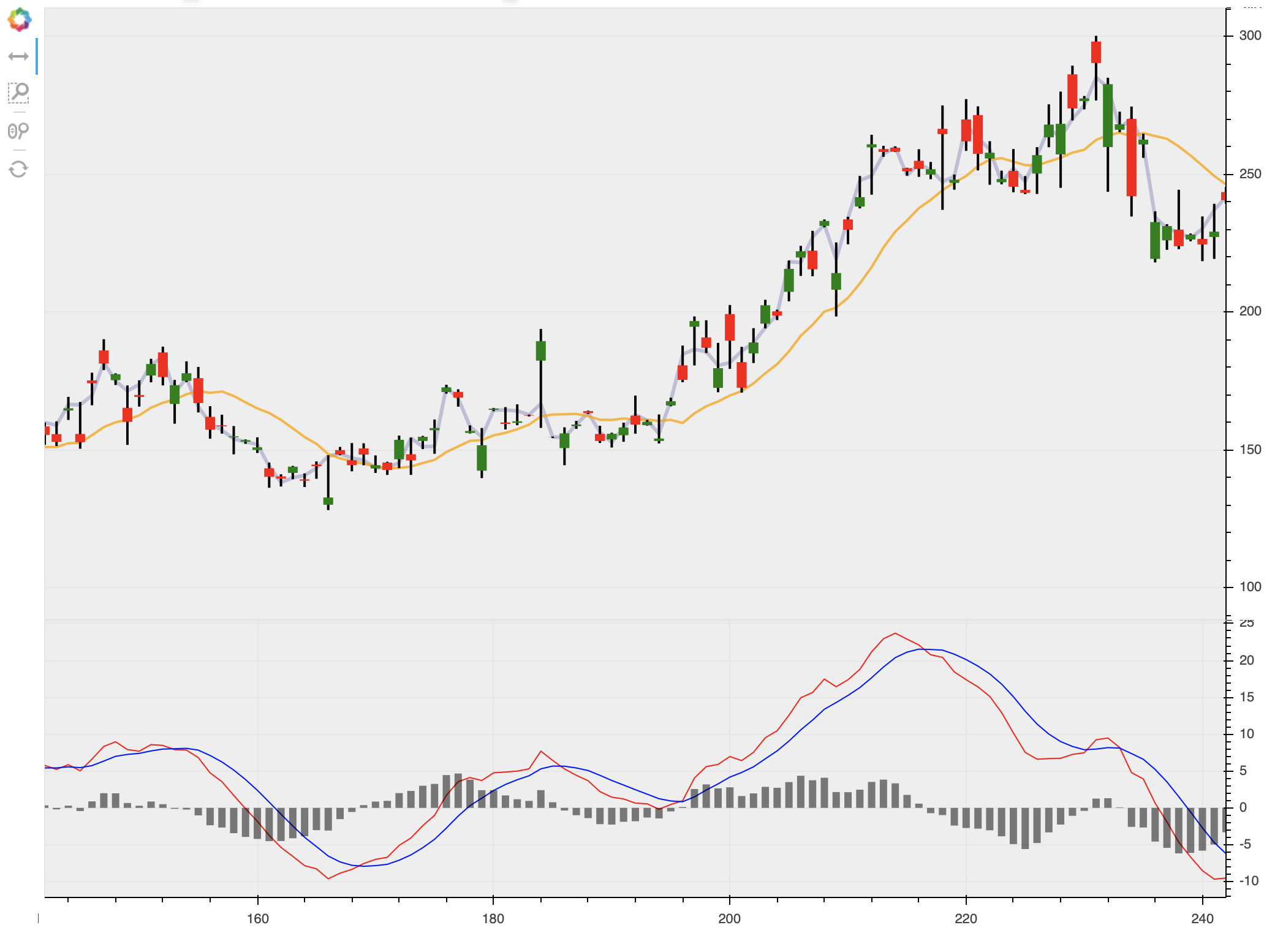
Hi @vmasip it would be helpful if you could share a complete, minimal example, so that we can run to to investigate and figure out what is going on in your specific case. Otherwise, all I can do is point you to the OHLC example:

Which does not have any gap between two plots

as a reference.

import numpy as np
from bokeh.layouts import gridplot
from bokeh.plotting import figure, show, output_file
from bokeh.sampledata.stocks import AAPL, GOOG, IBM, MSFT
from bokeh.plotting import figure, show, output_notebook

output_notebook()

def datetime(x):
    return np.array(x, dtype=np.datetime64)

p1 = figure(x_axis_type="datetime", title="Stock Closing Prices")
p1.grid.grid_line_alpha=0.3
p1.xaxis.axis_label = 'Date'
p1.yaxis.axis_label = 'Price'

p1.line(datetime(AAPL['date']), AAPL['adj_close'], color='#A6CEE3', legend_label='AAPL')
p1.line(datetime(GOOG['date']), GOOG['adj_close'], color='#B2DF8A', legend_label='GOOG')
p1.line(datetime(IBM['date']), IBM['adj_close'], color='#33A02C', legend_label='IBM')
p1.line(datetime(MSFT['date']), MSFT['adj_close'], color='#FB9A99', legend_label='MSFT')
p1.legend.location = "top_left"
p1.xaxis.visible = False


aapl = np.array(AAPL['adj_close'])
aapl_dates = np.array(AAPL['date'], dtype=np.datetime64)

window_size = 30
window = np.ones(window_size)/float(window_size)
aapl_avg = np.convolve(aapl, window, 'same')

p2 = figure(x_axis_type="datetime")
p2.grid.grid_line_alpha = 0
p2.xaxis.axis_label = 'Date'
p2.yaxis.axis_label = 'Price'
p2.ygrid.band_fill_color = "olive"
p2.ygrid.band_fill_alpha = 0.1
p2.xaxis.visible = False


p2.circle(aapl_dates, aapl, size=4, legend_label='close',
          color='darkgrey', alpha=0.2)

p2.line(aapl_dates, aapl_avg, legend_label='avg', color='navy')
p2.legend.location = "top_left"


show(gridplot([[p1],[p2]], plot_width=400, plot_height=400))  # open a browser

@vmasip please always apply code formatting to code in posts. You can do that by putting triple backtick ``` fences around code blocks in the editor or using the </> button in the editor palette. You don’t appear to be setting any min_border values to zero. Look for that in the example I linked.