Hi all,So my data for my stacked bar chart looks as follows:
Week of Stat d1_stat d2_stat d3_stat d4_stat d5_stat \
0 Mar-06 count 1.000000 1.000000 1.000000 1.000000 1.000000
1 Mar-06 mean 0.001877 3.985551 28.992111 0.105810 1.071979
2 Mar-06 std NaN NaN NaN NaN NaN
3 Mar-06 min 0.001877 3.985551 28.992111 0.105810 1.071979
4 Mar-06 25% 0.001877 3.985551 28.992111 0.105810 1.071979
5 Mar-06 50% 0.001877 3.985551 28.992111 0.105810 1.071979
6 Mar-06 75% 0.001877 3.985551 28.992111 0.105810 1.071979
7 Mar-06 max 0.001877 3.985551 28.992111 0.105810 1.071979
8 Mar-13 … … … … … …
9 Mar-13 … … … … … …
…
``
A row is a data point for a week and weeks repeat themselves in the data frame as to get multiple statistics for each week as seen in the example. That functionality is handled when the graph is created. The d# here represents each step of each column (d1 first step, d2 second, and so on). So, for example, I want to show a hover tooltip that shows: min, max, and count for the week of Mar-06 (Mar-06 will be one column in the bar graph). I also want this hover tooltip to change values depending on the step you are moused over (the d# would change between steps)
Is this possible?
Thanks,
Reuben
P.S. Here is an example of what the graph looks like
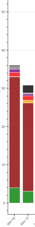
Just to avoid confusion this is what a full data frame would resemble. The dots for d1-d6 represent values and that’s what the DF is graphed based off of. “Week of” is the x axis and the y is each d column. With each d# being each stack for each week
d1 d2 d3 d4 d5 d6 Week of Stat d1_stat d2_stat d3_stat d4_stat d5_stat \
0 . . . . . . Mar-06 count 1.000000 1.000000 1.000000 1.000000 1.000000
1 . . . . . . Mar-06 mean 0.001877 3.985551 28.992111 0.105810 1.071979
2 . . . . . . Mar-06 std NaN NaN NaN NaN NaN
3 Mar-06 min 0.001877 3.985551 28.992111 0.105810 1.071979
4 continue down Mar-06 25% 0.001877 3.985551 28.992111 0.105810 1.071979
5 Mar-06 50% 0.001877 3.985551 28.992111 0.105810 1.071979
6 Mar-06 75% 0.001877 3.985551 28.992111 0.105810 1.071979
7 Mar-06 max 0.001877 3.985551 28.992111 0.105810 1.071979
8 Mar-13 … … … … … …
9 Mar-13 … … … … … …
``
···
On Tuesday, August 16, 2016 at 10:38:25 AM UTC-4, Reuben Jacobs wrote:
Hi all,So my data for my stacked bar chart looks as follows:
Week of Stat d1_stat d2_stat d3_stat d4_stat d5_stat \
0 Mar-06 count 1.000000 1.000000 1.000000 1.000000 1.000000
1 Mar-06 mean 0.001877 3.985551 28.992111 0.105810 1.071979
2 Mar-06 std NaN NaN NaN NaN NaN
3 Mar-06 min 0.001877 3.985551 28.992111 0.105810 1.071979
4 Mar-06 25% 0.001877 3.985551 28.992111 0.105810 1.071979
5 Mar-06 50% 0.001877 3.985551 28.992111 0.105810 1.071979
6 Mar-06 75% 0.001877 3.985551 28.992111 0.105810 1.071979
7 Mar-06 max 0.001877 3.985551 28.992111 0.105810 1.071979
8 Mar-13 … … … … … …
9 Mar-13 … … … … … …
…
``
A row is a data point for a week and weeks repeat themselves in the data frame as to get multiple statistics for each week as seen in the example. That functionality is handled when the graph is created. The d# here represents each step of each column (d1 first step, d2 second, and so on). So, for example, I want to show a hover tooltip that shows: min, max, and count for the week of Mar-06 (Mar-06 will be one column in the bar graph). I also want this hover tooltip to change values depending on the step you are moused over (the d# would change between steps)
Is this possible?
Thanks,
Reuben
P.S. Here is an example of what the graph looks like
Hi R euben - I think you’re running into
this issue:
···
https://github.com/bokeh/bokeh/issues/4347
On 8/16/16 8:01 AM, Reuben Jacobs
wrote:
Just to avoid confusion this is what a full data
frame would resemble. The dots for d1-d6 represent values and
that’s what the DF is graphed based off of. “Week of” is the x
axis and the y is each d column. With each d# being each stack
for each week
d1 d2 d3
d4 d5 d6 Week of
Stat
d1_stat d2_stat d3_stat d4_stat d5_stat
\
0
. .
.
.
.
.
Mar-06
count 1.000000
1.000000
1.000000
1.000000
1.000000
1
. .
.
.
.
.
Mar-06
mean 0.001877
3.985551
28.992111
0.105810
1.071979
2
. .
.
.
.
.
Mar-06
std NaN
NaN
NaN
NaN
NaN
3
Mar-06
min 0.001877
3.985551
28.992111
0.105810
1.071979
4
continue
down Mar-06
25%
0.001877
3.985551
28.992111
0.105810
1.071979
5
Mar-06
50%
0.001877
3.985551
28.992111
0.105810
1.071979
6
Mar-06
75%
0.001877
3.985551
28.992111
0.105810
1.071979
7
Mar-06
max 0.001877
3.985551
28.992111
0.105810
1.071979
                8

                    Mar-13
      ...
        ...
         ...
         ...
      ...
       ...

                9

                    Mar-13
      ...
       ...
             ...
         ...
      ...
      ...
``
On Tuesday, August 16, 2016 at 10:38:25 AM UTC-4, Reuben
Jacobs wrote:
Hi all,So my data for my stacked bar chart
looks as follows:
Week of Stat d1_stat d2_stat
d3_stat d4_stat d5_stat \
0 Mar-06
count 1.000000 1.000000
1.000000 1.000000 1.000000
1 Mar-06
mean 0.001877 3.985551
28.992111 0.105810 1.071979
2 Mar-06
std
NaN NaN
NaN NaN NaN
3 Mar-06
min 0.001877 3.985551
28.992111 0.105810 1.071979
4 Mar-06
25% 0.001877 3.985551
28.992111 0.105810 1.071979
5 Mar-06
50% 0.001877 3.985551
28.992111 0.105810 1.071979
6 Mar-06
75% 0.001877 3.985551
28.992111 0.105810 1.071979
7 Mar-06
max 0.001877 3.985551
28.992111 0.105810 1.071979
                      8             Mar-13             ...
...                ...                ...
        ...              ...

                      9             Mar-13             ...
… …
… … …
...
``
A row is a data point for a week and weeks repeat
themselves in the data frame as to get multiple
statistics for each week as seen in the example. That
functionality is handled when the graph is created. The
d# here represents each step of each column (d1 first
step, d2 second, and so on). So, for example, I want to
show a hover tooltip that shows: min, max, and count for
the week of Mar-06 (Mar-06 will be one column in the bar
graph). I also want this hover tooltip to change values
depending on the step you are moused over (the d# would
change between steps)
Is this possible?
Thanks,
Reuben
P.S. Here is an example of what the graph looks like
–
You received this message because you are subscribed to the Google
Groups “Bokeh Discussion - Public” group.
To unsubscribe from this group and stop receiving emails from it,
send an email to [email protected].
  To post to this group, send email to [email protected].

  To view this discussion on the web visit [https://groups.google.com/a/continuum.io/d/msgid/bokeh/c13728f8-d4ad-4176-9918-5bf6373dd5b9%40continuum.io](https://groups.google.com/a/continuum.io/d/msgid/bokeh/c13728f8-d4ad-4176-9918-5bf6373dd5b9%40continuum.io?utm_medium=email&utm_source=footer).

  For more options, visit [https://groups.google.com/a/continuum.io/d/optout](https://groups.google.com/a/continuum.io/d/optout).
–
Sarah Bird
Developer, Bokeh
[

](http://continuum.io)
Hi Sarah,
Looks promising. I will look into it. Although, I am using a bar chart not a plot nor am I using Jupyter Notebook.
Thanks,
Reuben
···
On Tuesday, August 16, 2016 at 4:03:47 PM UTC-4, Sarah Bird wrote:
Hi R euben - I think you’re running into
this issue: https://github.com/bokeh/bokeh/issues/4347
On 8/16/16 8:01 AM, Reuben Jacobs > wrote:
Just to avoid confusion this is what a full data
frame would resemble. The dots for d1-d6 represent values and
that’s what the DF is graphed based off of. “Week of” is the x
axis and the y is each d column. With each d# being each stack
for each week
d1 d2 d3
d4 d5 d6 Week of
Stat
d1_stat d2_stat d3_stat d4_stat d5_stat
\
0
. .
.
.
.
.
Mar-06
count 1.000000
1.000000
1.000000
1.000000
1.000000
1
. .
.
.
.
.
Mar-06
mean 0.001877
3.985551
28.992111
0.105810
1.071979
2
. .
.
.
.
.
Mar-06
std NaN
NaN
NaN
NaN
NaN
3
Mar-06
min 0.001877
3.985551
28.992111
0.105810
1.071979
4
continue
down Mar-06
25%
0.001877
3.985551
28.992111
0.105810
1.071979
5
Mar-06
50%
0.001877
3.985551
28.992111
0.105810
1.071979
6
Mar-06
75%
0.001877
3.985551
28.992111
0.105810
1.071979
7
Mar-06
max 0.001877
3.985551
28.992111
0.105810
1.071979
                8

                    Mar-13
      ...
        ...
         ...
         ...
      ...
       ...

                9

                    Mar-13
      ...
       ...
             ...
         ...
      ...
      ...
``
On Tuesday, August 16, 2016 at 10:38:25 AM UTC-4, Reuben > > Jacobs wrote:
Hi all,So my data for my stacked bar chart
looks as follows:
Week of Stat d1_stat d2_stat
d3_stat d4_stat d5_stat \
0 Mar-06
count 1.000000 1.000000
1.000000 1.000000 1.000000
1 Mar-06
mean 0.001877 3.985551
28.992111 0.105810 1.071979
2 Mar-06
std
NaN NaN
NaN NaN NaN
3 Mar-06
min 0.001877 3.985551
28.992111 0.105810 1.071979
4 Mar-06
25% 0.001877 3.985551
28.992111 0.105810 1.071979
5 Mar-06
50% 0.001877 3.985551
28.992111 0.105810 1.071979
6 Mar-06
75% 0.001877 3.985551
28.992111 0.105810 1.071979
7 Mar-06
max 0.001877 3.985551
28.992111 0.105810 1.071979
                      8             Mar-13             ...
...                ...                ...
        ...              ...

                      9             Mar-13             ...
… …
… … …
...
``
A row is a data point for a week and weeks repeat
themselves in the data frame as to get multiple
statistics for each week as seen in the example. That
functionality is handled when the graph is created. The
d# here represents each step of each column (d1 first
step, d2 second, and so on). So, for example, I want to
show a hover tooltip that shows: min, max, and count for
the week of Mar-06 (Mar-06 will be one column in the bar
graph). I also want this hover tooltip to change values
depending on the step you are moused over (the d# would
change between steps)
Is this possible?
Thanks,
Reuben
P.S. Here is an example of what the graph looks like
–
You received this message because you are subscribed to the Google
Groups “Bokeh Discussion - Public” group.
To unsubscribe from this group and stop receiving emails from it,
send an email to [email protected].
  To post to this group, send email to [email protected].

  To view this discussion on the web visit [https://groups.google.com/a/continuum.io/d/msgid/bokeh/c13728f8-d4ad-4176-9918-5bf6373dd5b9%40continuum.io](https://groups.google.com/a/continuum.io/d/msgid/bokeh/c13728f8-d4ad-4176-9918-5bf6373dd5b9%40continuum.io?utm_medium=email&utm_source=footer).

  For more options, visit [https://groups.google.com/a/continuum.io/d/optout](https://groups.google.com/a/continuum.io/d/optout).
–
Sarah Bird
Developer, Bokeh
    [
      <img alt="Continuum Analytics" src="https://lh6.googleusercontent.com/proxy/VYgVjggTk1hCXSN9wFkffE3I6kxTvJ51tT4KvDXOuKbs1WyFG66k7kt2-vkDimbyxfWtP-d1paJmstMYhPPnDYSUF4rLPoYM2GM2QFM=w5000-h5000" style="width:150px;min-height:30px" height="30px" width="150px">
    ](http://continuum.io)
