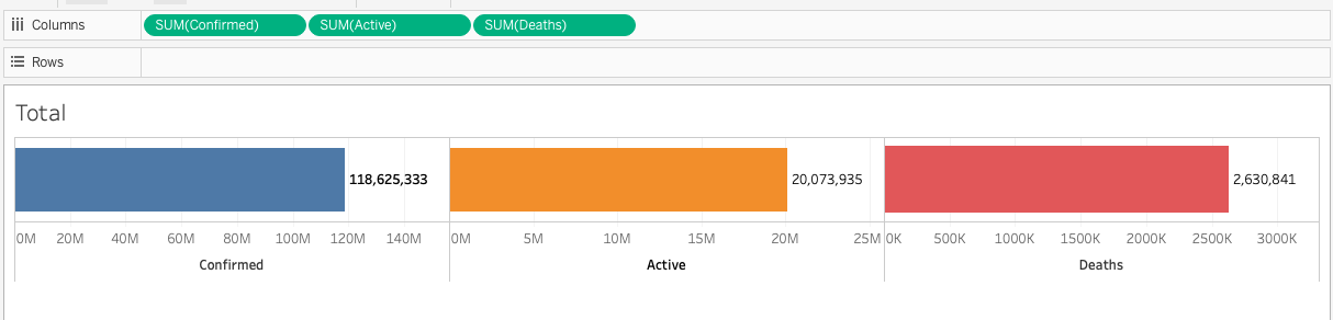
Hi All,
How to create a chart as per the image attached in bokeh.
Hi @Ashish_Kumar the best way to tap in to the expertise in this forum is to make some attempt yourself first, and then share the code you tried, so that people here can offer concrete suggestions. Your question is also not specific enough. Are you just asking about the “plot” parts? Or the entire thing including widgets? Questions should be detailed and specific, so that people can be certain they are actually answering the right question.
Otherwise all we can really to do is point to (hopefully) relevant documentation:
Hi Bryan,
To replicate the given screenshot using bokeh, I have written the following code.
with the given code I am able to plot as per below screenshot. Do let me know what needs to be done to show the plot as in the original post
import pandas as pd
from bokeh.io import output_notebook, show
output_notebook()
main_df = pd.read_csv('https://raw.githubusercontent.com/CSSEGISandData/COVID-19/web-data/data/cases_country.csv')
print(main_df.head())

from bokeh.plotting import figure
from bokeh.models import NumeralTickFormatter, Label
from bokeh.layouts import row

def plot_figure(sum_confirmed, i, element):
    plt = figure(plot_width=300, plot_height=100, y_range=sum_confirmed['cols'], toolbar_location=None)
    plt.hbar(y=sum_confirmed['cols'],left=0, right=sum_confirmed['sums'], height=0.5, color='pink')

    labels = Label(x=int(sum_confirmed['sums']) + 100000, y=15, text=f"{str(sum_confirmed['sums'][i])}",
                   y_units='screen', render_mode='css',
                    text_font_size='8pt')

    plt.xaxis[0].formatter = NumeralTickFormatter(format="0a")
    plt.xaxis.minor_tick_line_color =None
    plt.xaxis.major_tick_line_color =None
    plt.yaxis.major_label_text_font_size = '0pt'
    plt.yaxis.minor_tick_line_color =None
    plt.yaxis.major_tick_line_color =None
    plt.xaxis.axis_label=element
    plt.yaxis.visible = False
    plt.grid.visible = False
    plt.add_layout(labels)
    return plt

plot_list = []
for i, element in enumerate(sum_df['cols']):
    plot = plot_figure(sum_df.query(f'cols == "{element}"'), i, element)
    plot_list.append(plot)
show(row(plot_list))
This is still way too vague to answer. There are lots of potential differences with what you just posted and the original. I can’t read your mind to know which of them is important to you. You need to ask specific technical questions, that have specific technical answers e.g.
You are already setting the color of the bars:
plt.hbar(..., color='pink')
You will just need to pass whatever different color you actually want, instead of “pink”. Bokeh accepts a variety of different color formats:
Appearance — Bokeh 3.3.2 Documentation
How to show the labels on right side of the bar so that the other plots does not overlap?
You need to make more space for the labels by adjusting the x-range, for example:
plt = figure(..., x_range=(0, end_val))
It looks like all your plots are on completely different scales[1], so you would need to set a different end value for each plot. Alternatively, you could put the text over the bar on the left, instead of the right.
How to set the outer boundaries of the bars and the extended line highlighted in red?
There’s not any currently setting to do that. You can open a GitHub Issue to request it as a new feature. If you really need that look now, the only workaround I can think of would be to double the size of the y-range and them move the axis from the bottom edge of the plot, in to the middle of the plot, as in this example:
https://github.com/bokeh/bokeh/blob/branch-2.4/examples/plotting/file/fixed_axis.py
Then you could draw those lines manually with any number of standard Bokeh glyphs (line, segment, etc).
As an aside: this display makes no sense to me from a visualization perspective. The point of having bars in the first place, is to have multiple of them, on the same scale, in order to facilitate comparison along a single dimension. In this case, with the scales all different, there is not any point to having bars. It would be better (and clearer) to just display the numbers in a large font and get rid of the pointless bars. ↩︎