On Mar 11, 2017, at 11:42, Sayak Paul <[email protected]> wrote:
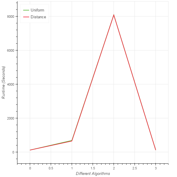
The quantity is ofcourse the difference but I am trying to show two lines which will indeed show the distinction in one plot.
Regards,
Sayak Paul
On Mar 11, 2017 11:08 PM, "Sayak Paul" <[email protected]> wrote:
But the picture does not show the distinction.
Regards,
Sayak Paul
On Mar 11, 2017 10:45 PM, "Bryan Van de ven" <[email protected]> wrote:
Hi Sayak,
I'd suggest using the .line method from bokeh.plotting, which gives you easier access to finer grained control over things like line dashing, log axes, etc. This code does a bit better job:
from bokeh.io import output_file, show
from bokeh.plotting import figure
x = [1,2,3,4]
uniform = [110.14, 678.01, 8081.62, 111.11]
distance = [108.33, 641.44, 8070.54 , 107.92]
p = figure(title='Different Algorithms', y_axis_type="log", plot_width=900, plot_height=400)
p.yaxis.axis_label = 'Runtime (Seconds)'
p.line(x, uniform, legend="Uniform", color="firebrick", alpha=0.5, line_width=5)
p.line(x, distance, legend="Distance", color="navy", line_dash="dashed", line_width=3)
output_file("foo.html")
show(p)
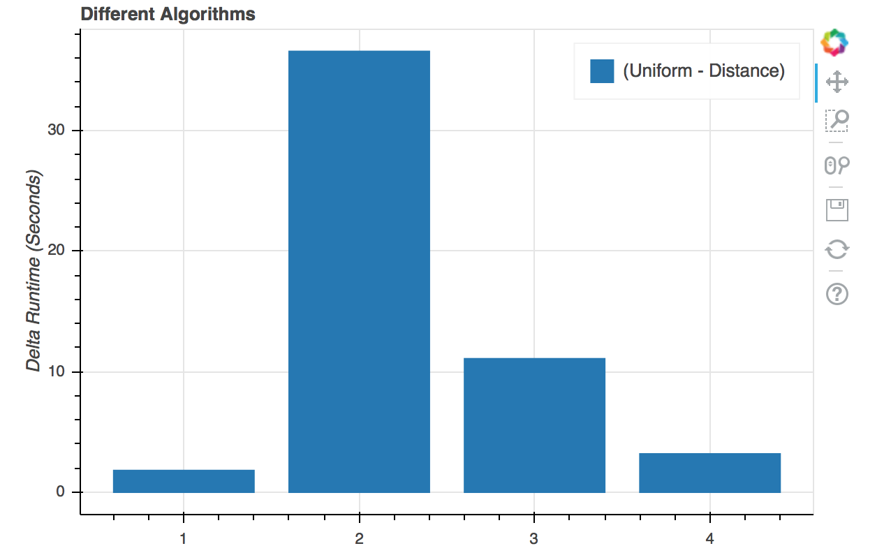
But mostly, I think you are just using the wrong kind of plot. If it is the difference you care about, then you should plot the difference directly, so that it's actually what is apparent. This code:
from bokeh.io import output_file, show
from bokeh.plotting import figure
x = [1,2,3,4]
uniform = [110.14, 678.01, 8081.62, 111.11]
distance = [108.33, 641.44, 8070.54 , 107.92]
delta = [x-y for x,y in zip(uniform, distance)]
p = figure(title='Different Algorithms', plot_height=400)
p.yaxis.axis_label = 'Delta Runtime (Seconds)'
p.vbar(x, top=delta, width=0.8, legend="(Uniform - Distance)")
output_file("foo.html")
Yields the plot below, which I would consider much better if the quantity of interest is the difference:
show(p)<Screen Shot 2017-03-11 at 11.13.08.png>
On Mar 11, 2017, at 05:17, Sayak Paul <[email protected]> wrote:
I am using the following Python code:
from bokeh.charts import Step, show, output_file, Line
# build a dataset where multiple columns measure the same thing
data = dict(Uniform=[
            110.14,  678.01, 8081.62, 111.11],

        Distance=[

            108.33, 641.44, 8070.54 , 107.92],

        )
# create a line chart where each column of measures receives a unique color and dash style
line = Line(data, y=['Uniform', 'Distance'],
        color=['Uniform', 'Distance'],

        xlabel = 'Different Algorithms', ylabel='Runtime (Seconds)', legend=True)
output_file("steps.html", title="line.py")
show(line)
You can find the output in the attachment. I want to make the distinction of the two lines clearer.
Thanks and Regards,
Sayak Paul,
Placement Representative,
Department of IT,
Netaji Subhash Engineering College,
2013 - 17
Phone: +918981257929
Email-ID: [email protected]
--
You received this message because you are subscribed to the Google Groups "Bokeh Discussion - Public" group.
To unsubscribe from this group and stop receiving emails from it, send an email to [email protected].
To post to this group, send email to [email protected].
To view this discussion on the web visit https://groups.google.com/a/continuum.io/d/msgid/bokeh/CAGa_XGHfFaixfP680VpSJ5see5bsChkBGAqrVxMLRPqfcWoHJQ%40mail.gmail.com\.
For more options, visit https://groups.google.com/a/continuum.io/d/optout\.
<bokeh_plot.png>
--
You received this message because you are subscribed to the Google Groups "Bokeh Discussion - Public" group.
To unsubscribe from this group and stop receiving emails from it, send an email to [email protected].
To post to this group, send email to [email protected].
To view this discussion on the web visit https://groups.google.com/a/continuum.io/d/msgid/bokeh/A5B05F69-D567-4D82-BB9E-4A857302CC2E%40continuum.io\.
For more options, visit https://groups.google.com/a/continuum.io/d/optout\.
--
You received this message because you are subscribed to the Google Groups "Bokeh Discussion - Public" group.
To unsubscribe from this group and stop receiving emails from it, send an email to [email protected].
To post to this group, send email to [email protected].
To view this discussion on the web visit https://groups.google.com/a/continuum.io/d/msgid/bokeh/CAGa_XGE6%3DtOgehEx713h681NwYb3fps46ZPRfka2gOufGxCCXg%40mail.gmail.com\.
For more options, visit https://groups.google.com/a/continuum.io/d/optout\.