@Time Inaccurate display (cb_data.indices repeat )

TimeInaccurate

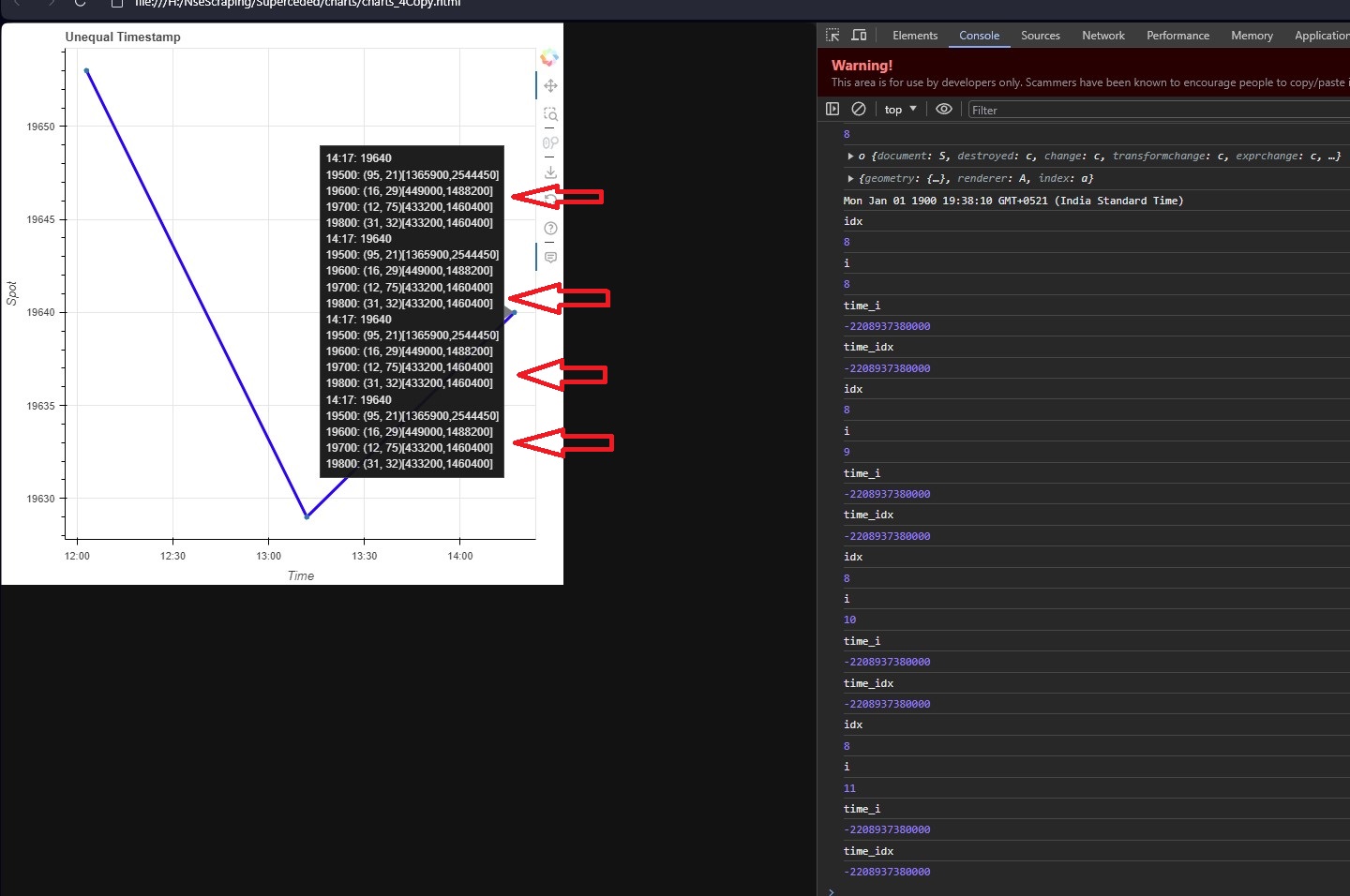
@Time used to display the current hovered time (nested dataframe), is showing inaccurate reading and doesn’t match with the corresponding Time Axis .

Possibly due to the cb_data.index.lineindices value being same for different points(refer gif) .

How to resolve this ?


from bokeh.models import NumeralTickFormatter, LinearAxis, Range1d, DatetimeTickFormatter, ColumnDataSource, HoverTool, \
    CustomJS
from bokeh.plotting import figure, show, output_file
from pandasPivot.numberFormat import  pad_func

import pandas as pd


def chartInteractive_func(df):

    pd.set_option('display.max_rows', None)
    pd.set_option('display.max_columns', None)

    pd.to_datetime(df['Time'], format='%H:%M')

    SOURCE = ColumnDataSource(data = df)
    print("SOURCE")
    print(SOURCE.data)


    jsHover = """
        var tooltipString = '';
        var data = source.data;
        const idx = cb_data.index.line_indices;
        if (idx.length > 0){
            console.log(idx);
            const date = new Date(data['Time'][idx]);
            const timeStr = new Intl.DateTimeFormat('en-US', {hour12: false, timeZone: 'GMT-0', timeStyle: 'short'}).format(date);
            tooltipString += timeStr + ": @Spot<br>"
            tooltipString += "Time inaccurate (Spot accurate)><br>"
            tooltipString += "line_indices same over adjacent points"
            
       }
       
        hover.tooltips = tooltipString;
    
    """


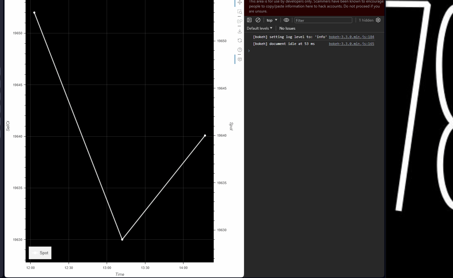
    plot = figure(title=f'Index repeats for Nested dataframe(Time inaccurate)', x_axis_label="Time",x_axis_type="datetime",y_axis_label = "SellOi",background_fill_color="black",sizing_mode="stretch_both")

    df['Time'] = pd.to_datetime(df['Time'], format='%H:%M')
    df.sort_values(by='Time', inplace=True)
    # plot.xaxis.formatter = DatetimeTickFormatter(hours=["%H:%M"])
    plot.xaxis.formatter = DatetimeTickFormatter(
        days="%Y-%m-%d",
        hours="%H:%M:%S",
        minutes="%H:%M"
    )
    # Set the x-axis and y-axis line dash
    plot.xgrid.grid_line_alpha = 0.2
    plot.ygrid.grid_line_alpha = 0.2


    # spotAxis
    spotAxis_min = df["Spot"].min()
    spotAxis_max = df["Spot"].max()
    padY = pad_func(0.1, spotAxis_min, spotAxis_max)
    plot.extra_y_ranges["spotAxis"] = Range1d(start=spotAxis_min - padY, end=spotAxis_max + padY)
    plot.add_layout(LinearAxis(y_range_name="spotAxis", axis_label="Spot"), 'right')


    #r1 Hover Tooltip
    spotLine = plot.line( source= SOURCE,x = "Time",y =  "Spot", line_width=3, line_color="white",
              visible= True, alpha=0.8, muted_color="white", muted_alpha=0.1,
              legend_label='Spot', y_range_name="spotAxis")

    spotCircle =  plot.circle_dot(x = "Time" , y = "Spot",size = 5, color="white",legend_label='Spot', y_range_name="spotAxis", source= SOURCE)


    hoverTool = HoverTool(tooltips=None)
    cb = CustomJS(args={'source': SOURCE, 'hover': hoverTool}, code=jsHover)
    hoverTool.callback = cb
    hoverTool.renderers = [spotLine]
    plot.add_tools(hoverTool)


    # Interactive legend
    plot.legend.location = 'bottom_left'
    plot.legend.orientation = "vertical"
    plot.legend.click_policy="mute"


    show(plot)


def dataFeed():
    data = {
           "Time": ["12:03", "12:03", "12:03", "12:03", "13:12", "13:12", "13:12", "13:12", "14:17", "14:17", "14:17",
                 "14:17"],
        "Spot": [19653, 19653, 19653, 19653, 19629, 19629, 19629, 19629, 19640, 19640, 19640, 19640],
        "Strike": [19500, 19600, 19700, 19800, 19500, 19600, 19700, 19800, 19500, 19600, 19700, 19800],
        "cLtp": [99, 174, 167, 167, 91, 165, 161, 93, 95, 16, 12, 31],
        "pLtp": [49, 24, 42, 25, 51, 74, 36, 53, 21, 29, 75, 32],


    }

    df = pd.DataFrame(data)

    # Convert the 'Time' column to datetime
    df['Time'] = pd.to_datetime(df['Time'], format='%H:%M')
    df.sort_values(by='Time', inplace=True)

    chartInteractive_func(df)


dataFeed()

If you can not use CustomJSHover then for line_indices in CustomJS you would need to make a calculation of which index is the nearest. Something like the following might work where one uses the geometry x-value of hover to determine which data piont is nearest:

const idx = cb_data.index.line_indices;

if (idx.length > 0) {
    const x = cb_data['geometry'].x;
    const idx_dx = data['Time'][idx[0]+1] - data['Time'][idx];
    const x_dx = (x - data['Time'][idx]) / idx_dx;

    var indices = idx[0];

    if (x_dx > 0.5) {
      indices += 1;
    }

   // ... more code
}

Hi , couldn’t get your solution to work.But it was possible to resolve the hitzone overlap by setting the hovertooltip renderer = “circle” .
However now bokehjs is REPEATING TOOLTIPS since the same timestamp has 4 entires .How to show the tooltip only once for same timestamp with multiple entries?

CODE:

import pandas as pd
from bokeh.models import HoverTool, ColumnDataSource, DatetimeTickFormatter, CustomJS
from bokeh.plotting import figure, show

data = {
    "Time": ["12:03", "12:03", "12:03", "12:03", "13:12", "13:12", "13:12", "13:12", "14:17", "14:17", "14:17", "14:17"],
    "Spot": [19653, 19653, 19653, 19653, 19629, 19629, 19629, 19629, 19640, 19640, 19640, 19640],
    "Strike": [19500, 19600, 19700, 19800, 19500, 19600, 19700, 19800, 19500, 19600, 19700, 19800],
    "cLtp": [99, 174, 167, 167, 91, 165, 161, 93, 95, 16, 12, 31],
    "pLtp": [49, 24, 42, 25, 51, 74, 36, 53, 21, 29, 75, 32],
    "cSellOi": [851500, 267500, 379050, 382350, 1324350, 389700, 438850, 1318250, 1365900, 449000, 433200, 433200],
    "pSellOi": [2530350, 1615600, 1656000, 1606500, 2542100, 1598450, 1646950, 2519050, 2544450, 1488200, 1460400, 1460400],
}

df = pd.DataFrame(data)

df['Time'] = pd.to_datetime(df['Time'], format='%H:%M')
df.sort_values(by='Time', inplace=True)

source = ColumnDataSource(df)

plot = figure(
    x_axis_label="Time",
    y_axis_label="Spot",
    x_axis_type="datetime",
    title="Unequal Timestamp ",
)

# plot.line(x='Time', y='Spot', source=source, line_width=3, line_color="blue")
pLine = plot.line(x='Time', y='Spot', source=source, line_width=3, line_color="blue")
pCircle = plot.circle_dot(x='Time', y='Spot', source=source)


plot.xaxis.formatter = DatetimeTickFormatter(
    days="%Y-%m-%d",
    hours="%H:%M:%S",
    minutes="%H:%M"
)

# Create a custom JavaScript callback for the hover tool


jsHover = '''
    var data = source.data;
    var tooltipString = '';
    
    const idx = cb_data.index.indices[0];
    
    if (idx !== undefined){ 
        console.log(idx);
        console.log(source);
        console.log(cb_data);
        
        const date = new Date(data['Time'][idx]);
        console.log(date);
        const timeStr = new Intl.DateTimeFormat('en-US', {hour12: false, timeZone: 'GMT-0', timeStyle: 'short'}).format(date);
                
        tooltipString += timeStr + ": @Spot<br>";
        
        for (var i = idx ; i < (idx + 4) ; i++) {
            var time_i = data['Time'][i] 
            var time_idx = data['Time'][idx] 


            if (time_i == time_idx) {
            
            console.log("idx");
            console.log(idx);
            console.log("i");
            console.log(i);
            console.log("time_i");
            console.log(time_i);
            console.log("time_idx");
            console.log(time_idx);
                   
            var cLtp_cur = data['cLtp'][i]
            var pLtp_cur = data['pLtp'][i]
            var cSellOi_cur = data['cSellOi'][i]
            var pSellOi_cur = data['pSellOi'][i]
            
            tooltipString += data['Strike'][i] + ": (" + cLtp_cur + ", " + pLtp_cur + ")[" + cSellOi_cur + "," + pSellOi_cur + "] <br>";
        }  else {
                break;
            }
         }
        
        hover.tooltips = tooltipString;
    }

'''

hoverTool = HoverTool(tooltips=None,renderers = [pCircle])


cb = CustomJS(args={'source': source,'hover': hoverTool}, code=jsHover)
hoverTool.callback = cb
plot.add_tools(hoverTool)
show(plot)

I am not able to test your code since I am on the road. But I will assume that since you have 4 of the same x,y data points you get 4 of the same tooltip information.
Without knowing your use case, but have you considered just having the x,y data you need (not repeated) in the CDS and pass the other information as a dictionary in CustomJS argument? A python dictionary is called an object in JS.

Or why not create the tooltip information upfront and have as a field in CDS?

This topic was automatically closed 90 days after the last reply. New replies are no longer allowed.