On Jan 19, 2015, at 4:40 PM, [email protected] wrote:
Add categorical y axis · Issue #1727 · bokeh/bokeh · GitHub
On Monday, January 19, 2015 at 5:33:06 PM UTC-5, matdr...@gmail.com wrote:
Already tried and here is the result:
It is still a numerical axis that is being rendered...
But in the meantime, is there a way to hide the y axis?
thanks,
Mat
On Monday, January 19, 2015 at 5:16:23 PM UTC-5, Bryan Van de ven wrote:
It just occurs to me that twin axis probably does not yet work with categorical axes, unfortunately. You could try changing the definition of y_extra_ranges to "Dict(String, Instance(Range))" and see if things work out of the box, but I would be surprised. Can you make a GH issue with this information?
Bryan
> On Jan 19, 2015, at 10:47 AM, matdr...@gmail.com wrote:
>
> Bryan, two problems...
>
> 1) I am trying to put on the y axis strings, so I am doing this:
>
> plot.extra_y_ranges = {"series": FactorRange(factors=self.series)}
>
> but I do get this error:
>
> "expected an element of Dict(String, Instance(Range1d)), got {'series': <bokeh.models.ranges.FactorRange object at 0x109e12c90>}"
>
> How it is possible to add another type of axis?
>
>
> 2) How can I hide the original y axis in order to display only the second one?
>
>
> thanks,
> Mat
>
>
>
> On Monday, January 19, 2015 at 10:51:03 AM UTC-5, Bryan Van de ven wrote:
> Mat,
>
> That looks great! You can add an additional y-axis, you can see an example here:
>
> https://github.com/bokeh/bokeh/blob/master/examples/plotting/file/twin_axis.py
>
> Basically you configure the plot with an extra (named) range, then then you can add a new axis that refers to that range.
>
> Bryan
>
> > On Jan 19, 2015, at 9:45 AM, matdr...@gmail.com wrote:
> >
> > Hello Bryan,
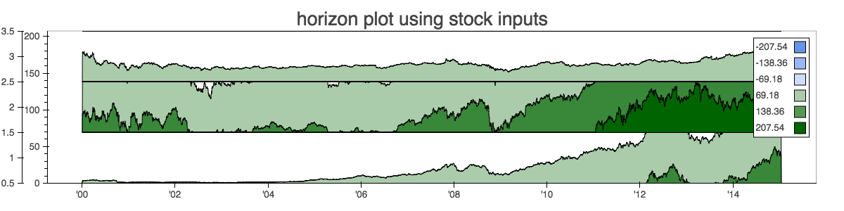
> > still made some progress... I decided to play with overlapping area and alpha colors finally.
> >
> > There is one last thing I cannot find how to fix: the y axis.
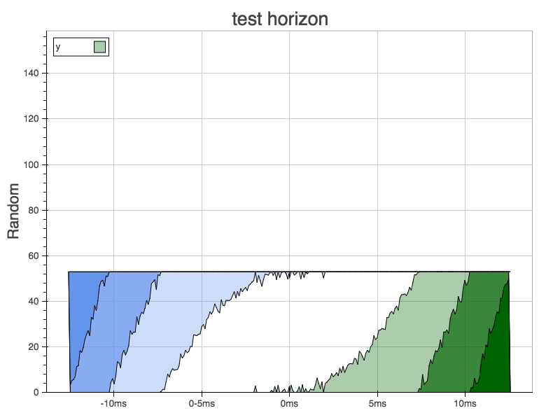
> > I need a linear axis even if I smash folds together and number not really match the ticks on the axis. Instead, what I would like to do is display is something similar to a categorical axis that represent the name of each serie of the time series. Is is possible to add another y axis on the plot?
> >
> >
> >
> > Here is the current output of the chart
> >
> > thanks,
> > Mat
> >
> >
> >
> > On Monday, January 19, 2015 at 10:27:21 AM UTC-5, Bryan Van de ven wrote:
> > Hi Mathieu,
> >
> > There's two ways:
> >
> > * draw overlapping patches that have alpha < 1 so that the alpha values stack up and the shade of each patch is different.
> >
> > * draw non-overlapping patches that have their color set explicitly
> >
> > The latter offers more control but the former may be easier. You can see an example of "stacking areas" by hand here:
> >
> > http://bokeh.pydata.org/en/latest/docs/gallery/brewer.html
> >
> > There is also a bokeh.charts.Area high level schematic interface but it may not (curretntly) offer enough control for you.
> >
> > Thanks, I lookk forward to seeing the result!
> >
> > Bryan
> >
> >
> > > On Jan 18, 2015, at 12:56 PM, matdr...@gmail.com wrote:
> > >
> > > Hello,
> > > I've been working on this horizon graph for some time and here is a little snapshot here of my progress (some credits from this post on stackoverflow: python - Implementing horizon charts in matplotlib - Stack Overflow)
> > > I would need to know if it would be possible to stack different graphs one on top of the others like cubism.js is doing, any clues on how to do it?
> > >
> > > I will send a patch once I cleanup a bit the code.
> > >
> > > thanks,
> > >
> > >
> > > Mat
> > >
> > >
> > > On Wednesday, January 14, 2015 at 2:42:21 AM UTC-5, Mathieu Drapeau wrote:
> > > Hello Bryan,
> > > I am working on an implementation of the horizon graphs and I am wondering if it is possible to make inverted patch glyphs? Instead of filling under the line, to fill above the line.
> > >
> > > thanks,
> > > Mat
> > >
> > >
> > >
> > > On Friday, January 2, 2015 at 2:34:33 PM UTC-5, Bryan Van de ven wrote:
> > > Mat,
> > >
> > > There are currently (as of 0.7) no high level functions for constructing horizon charts, although it has been suggested for possible inclusion in the bokeh.charts interface. I do think a horizon chart would make a great addition to bokeh.charts, but for it to happen in the short term, would probably require a pull request from an interested new contributor. (If you have any interest in working up a bokeh.charts.Horizon PR please let us know!) That said, Bokeh can certainly draw everything needed for a horizon chart, but right now you'd have to compute all the horizons and specify the low level lines, patches, etc, to draw yourself.
> > >
> > > Thanks,
> > >
> > > Bryan
> > >
> > >
> > > > On Jan 2, 2015, at 1:28 PM, matdr...@gmail.com wrote:
> > > >
> > > > Hello,
> > > >
> > > > There is a kind of graph that is great for large analysis of time series data: horizon charts.
> > > > It exists this js library Cubism.js which implement this type of graph.
> > > >
> > > > Wondering if it would be easily possible to integrate with bokeh?
> > > >
> > > > thanks,
> > > > Mat
> > > >
> > > > --
> > > > You received this message because you are subscribed to the Google Groups "Bokeh Discussion - Public" group.
> > > > To unsubscribe from this group and stop receiving emails from it, send an email to bokeh+un...@continuum.io.
> > > > To post to this group, send email to bo...@continuum.io.
> > > > To view this discussion on the web visit https://groups.google.com/a/continuum.io/d/msgid/bokeh/69b45de1-d24e-4562-9284-324fcb581b79%40continuum.io\.
> > > > For more options, visit https://groups.google.com/a/continuum.io/d/optout\.
> > >
> > >
> > > --
> > > You received this message because you are subscribed to the Google Groups "Bokeh Discussion - Public" group.
> > > To unsubscribe from this group and stop receiving emails from it, send an email to bokeh+un...@continuum.io.
> > > To post to this group, send email to bo...@continuum.io.
> > > To view this discussion on the web visit https://groups.google.com/a/continuum.io/d/msgid/bokeh/b6b43c21-ee53-46ad-89ca-35569e815745%40continuum.io\.
> > > For more options, visit https://groups.google.com/a/continuum.io/d/optout\.
> >
> >
> > --
> > You received this message because you are subscribed to the Google Groups "Bokeh Discussion - Public" group.
> > To unsubscribe from this group and stop receiving emails from it, send an email to bokeh+un...@continuum.io.
> > To post to this group, send email to bo...@continuum.io.
> > To view this discussion on the web visit https://groups.google.com/a/continuum.io/d/msgid/bokeh/b6c2dec1-70cf-4172-96c4-01703ff0bd81%40continuum.io\.
> > For more options, visit https://groups.google.com/a/continuum.io/d/optout\.
>
>
> --
> You received this message because you are subscribed to the Google Groups "Bokeh Discussion - Public" group.
> To unsubscribe from this group and stop receiving emails from it, send an email to bokeh+un...@continuum.io.
> To post to this group, send email to bo...@continuum.io.
> To view this discussion on the web visit https://groups.google.com/a/continuum.io/d/msgid/bokeh/55f21f34-8251-4957-bb59-b21677b966f0%40continuum.io\.
> For more options, visit https://groups.google.com/a/continuum.io/d/optout\.
--
You received this message because you are subscribed to the Google Groups "Bokeh Discussion - Public" group.
To unsubscribe from this group and stop receiving emails from it, send an email to [email protected].
To post to this group, send email to [email protected].
To view this discussion on the web visit https://groups.google.com/a/continuum.io/d/msgid/bokeh/fe46d1fd-1bdd-4d52-aee0-d788c2283430%40continuum.io\.
For more options, visit https://groups.google.com/a/continuum.io/d/optout\.