Tooltips not displaying for Circle with radius_dimension on y axis

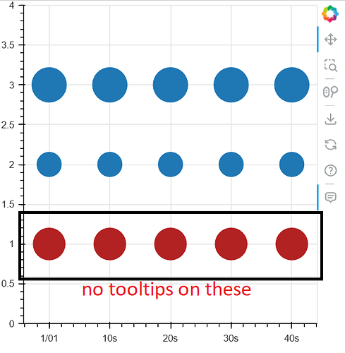
Hello, I am trying to display a tooltip on mouseover for a Circle glyph with a data-based radius using y-axis scaling.

Example:

from bokeh.plotting import ColumnDataSource, figure, show
from bokeh.models import DatetimeTickFormatter


source = ColumnDataSource(data=dict(
    x=[0, 10000, 20000, 30000, 40000],
    y1=[1, 1, 1, 1, 1],
    y2=[2, 2, 2, 2, 2],
    y3=[3, 3, 3, 3, 3],
))
p = figure(width=400, height=400, y_range=[0, 4], tooltips=[("example", "value")])
p.xaxis.formatter = DatetimeTickFormatter()
c1 = p.circle('x', 'y1', radius=0.2, radius_dimension='y', source=source, color='firebrick')  # no tooltips :(
c2 = p.circle('x', 'y2', radius=2000, radius_dimension='x', source=source)
c3 = p.circle('x', 'y3', size=40, source=source)
show(p)

In the above example:
c1 (red) is the problematic one with no tooltips, and is scaled on data using the y axis.
c2 has tooltips, and is scaled on data using the x axis.
c3 has tooltips, and is scaled on pixels.

I cannot tell if this is a bug or if I am using this tool incorrectly, please let me know what you think! If a bug, perhaps the tooltip mouseover rendering is always scaling off the x dimension instead of y?

Thanks!
To be honest, radius_dimension is a hack and always has been, and not even an especially useful one. I would not be surprised iif we try to get rid of it altogether in the near future. Fundamentally, using circles with a radius specified in data units is just not a sensible thing to do, either from a “math” POV or from a “datavis” POV. Can you use screen units here (i.e. specify a size instead of a radius)? Those do make sense, since pixels are square. I would regard using scatter markers scaled in screen units to be the correct approach from a data visualization standpoint when the scales are not aligned.

Thanks for the reply! I was trying to scale on data units because for the plot I am trying to make, I’d like to render the circle markers on top of hbar glyphs. Picture a gantt chart but with markers (sometimes) rendered at the ends of the bars. I was not able to find a way to scale the height of the hbars in screen units, and I want to keep the “end markers” scaled appropriately to the height of the bars, so I was trying to scale them in the same way.

For example, if my hbar height is 0.9 (data units), I could use the circles with radius 0.45 and the heights of the glyphs now match. Please let me know if you can recommend a better way to do this!

In that case, I would recommend approximating the circles with one of the polygon glyphs and a fair number of points for each (probably will want to define a little helper function to generate the points along a circle or half-circle, given a radius at the endpoint of a bar).

Unfortunately I think I’ve run into another wrinkle - I have scrolling and panning enabled for the x axis only to allow users to mousewheel zoom in on a segment of the x axis without disturbing the y axis. I would like the “end marker” glyphs to remain the same shape on zoom and to not scale in size horizontally. This is something that the radius_dimension feature allowed, but I think using polygons might not allow me to do this?

Thanks again for the continued help!

@ubrec I am afraid I don’t have any other immediate suggestions. If this is a hard requirement for you then you might consider looking at other tools for the time being.

1 Like

This topic was automatically closed 90 days after the last reply. New replies are no longer allowed.