from lesson 03_Data_ Sources_&_Transformations
color=linear_cmap('x', 'Viridis256', 0, 100))
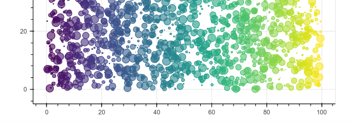
For the most part, I think I understand this one. But the resulting plot produces clear color bands (stripes? columns?) which I do not see explained by the code.
- Where is the x axis cut off that transitions from one color to another?
- Why isn’t this transition even more granular in the number of transitional colors presented?
- To my naked human eyeball, there are only about 6 colors here, not 100 and certainly not 256.
- Why not have the color algorithm mapped to the random values produced in the dict?
- Would that produce the more granular visual effect I’m suggesting?