Thanks! That works great. One thing I noticed is that I can't zoom nor
hover over the chart (I built my document from modifications to
taylor_server.py, which doesn't seem to support this either). Do you
know why?
Josh
On Thu, Aug 28, 2014 at 11:06 AM, Hugo Shi <[email protected] > <mailto:[email protected]>> wrote:
btw what you're trying to do should be doable with the high level API.
from bokeh.plotting import *
output_file("line.html", title="line.py example")
source = ColumnDataSource(data=dict(
x  = [-1, 1,2,3],

y  = [-1, 1,2,4]
))
plot = line(x="x", y="y", line_color="blue", line_width=2,
source=source, plot_width=800, plot_height=400)
plot.circle(x="x", y="y", line_color="red", line_width=2,
radius=0.2, source=source)
show()
On 08/28/2014 10:13 AM, Bryan Van de Ven wrote:
Josh,
the data needs to be a vector, also the glyph needs the ranges:
from bokeh.objects import *
from bokeh.glyphs import *
source = ColumnDataSource(data=dict(
x  = [-1, 1,2,3],

y  = [-1, 1,2,4]
))
xdr = DataRange1d(sources=[source.__columns("x")])
ydr = DataRange1d(sources=[source.__columns("y")])
plot = Plot(x_range=xdr, y_range=ydr, plot_width=800,
plot_height=400)
line_f = Line(x="x", y="y", line_color="blue", line_width=2)
line_f_glyph = Glyph(data_source=source, xdata_range=xdr,
ydata_range=ydr, glyph=line_f)
plot.renderers.append(line_f___glyph)
# Adding a circle to the plot
circle_f = Circle(x="x", y="y", line_color="red",
line_width=2, radius=0.2)
circle_f_glyph =
Glyph(data_source=__ColumnDataSource(data={'x':[0]__,
'y':[0]}), xdata_range=xdr, ydata_range=ydr, glyph=circle_f)
plot.renderers.append(circle___f_glyph)
#######
xaxis = LinearAxis(plot=plot)
plot.below.append(xaxis)
yaxis = LinearAxis(plot=plot)
plot.left.append(yaxis)
Note that a new PR just merged makes the lower level API a
little easier to use.
On Aug 28, 2014, at 9:05 AM, Josh Wasserstein > <[email protected] <mailto:[email protected]>> wrote:
Sorry, I meant to say, that I tried this:
plot = Plot(x_range=xdr, y_range=ydr, plot_width=800,
plot_height=400)
line_f = Line(x="x", y="y", line_color="blue", line_width=2)
line_f_glyph = Glyph(data_source=source, xdata_range=xdr,
ydata_range=ydr, glyph=line_f)
plot.renderers.append(line_f___glyph)
circle_f = Circle(x="x", y="y", line_color="red",
line_width=2)
circle_f_glyph =
Glyph(data_source=__ColumnDataSource({'x':0, 'y':0}),
glyph=circle_f)
plot.renderers.append(circle___f_glyph)
if I comment out the last three lines, everything works
fine (I get axes labels)
Josh
On Thu, Aug 28, 2014 at 9:58 AM, Josh Wasserstein > <[email protected] <mailto:[email protected]>> > wrote:
Hi,
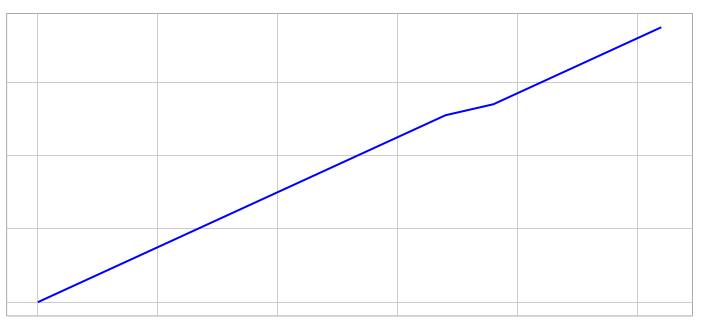
I am trying to add a circle to an existing plot with no
luck. In fact, if I try to add a circle I get no axes (see
image below). What am I doing wrong? <Screen Shot
2014-08-28 at 9.57.35 AM.png>
Here is the relevant part of the code
source = ColumnDataSource(data=dict(
x = ,
y =
))
xdr = DataRange1d(sources=[source.__columns("x")])
ydr = DataRange1d(sources=[source.__columns("y")])
plot = Plot(x_range=xdr, y_range=ydr, plot_width=800,
plot_height=400)
line_f = Line(x="x", y="y", line_color="blue", line_width=2)
line_f_glyph = Glyph(data_source=source, xdata_range=xdr,
ydata_range=ydr, glyph=line_f)
# Adding a circle to the plot
circle_f = Circle(x="x", y="y", line_color="red",
line_width=2)
circle_f_glyph =
Glyph(data_source=__ColumnDataSource({'x':0, 'y':0}),
glyph=circle_f)plot.renderers.__append(line_f_glyph)
#######
plot.renderers.append(line_f___glyph)
plot.renderers.append(circle___f_glyph)
xaxis = LinearAxis(plot=plot)
plot.below.append(xaxis)
yaxis = LinearAxis(plot=plot)
plot.left.append(yaxis)
Josh
--
You received this message because you are subscribed to
the Google Groups "Bokeh Discussion - Public" group.
To unsubscribe from this group and stop receiving emails
from it, send an email to [email protected]
<mailto:bokeh%[email protected]>__.
To post to this group, send email to [email protected]
<mailto:[email protected]>.
To view this discussion on the web visit
https://groups.google.com/a/__continuum.io/d/msgid/bokeh/__CAD4ivxWVz___9YmNvtzx66dMMdGyF36a%__3DtiqPG3vc_wrFwyTtuNA%40mail.__gmail.com
<https://groups.google.com/a/continuum.io/d/msgid/bokeh/CAD4ivxWVz_9YmNvtzx66dMMdGyF36a%3DtiqPG3vc_wrFwyTtuNA%40mail.gmail.com>\.
For more options, visit
https://groups.google.com/a/__continuum.io/d/optout
<https://groups.google.com/a/continuum.io/d/optout>\.
--
You received this message because you are subscribed to the Google
Groups "Bokeh Discussion - Public" group.
To unsubscribe from this group and stop receiving emails from it,
send an email to [email protected]
<mailto:bokeh%[email protected]>__.
To post to this group, send email to [email protected]
<mailto:[email protected]>.
To view this discussion on the web visit
https://groups.google.com/a/__continuum.io/d/msgid/bokeh/__53FF457B.8050407%40gmail.com
<https://groups.google.com/a/continuum.io/d/msgid/bokeh/53FF457B.8050407%40gmail.com>\.
For more options, visit
https://groups.google.com/a/__continuum.io/d/optout
<https://groups.google.com/a/continuum.io/d/optout>\.
--
You received this message because you are subscribed to the Google
Groups "Bokeh Discussion - Public" group.
To unsubscribe from this group and stop receiving emails from it, send
an email to [email protected]
<mailto:[email protected]>.
To post to this group, send email to [email protected]
<mailto:[email protected]>.
To view this discussion on the web visit
https://groups.google.com/a/continuum.io/d/msgid/bokeh/CAD4ivxXgOK6CuRQpfcO8X%3Dvdaho-c-9dgBW53OwcN646CLfqmg%40mail.gmail.com
<https://groups.google.com/a/continuum.io/d/msgid/bokeh/CAD4ivxXgOK6CuRQpfcO8X%3Dvdaho-c-9dgBW53OwcN646CLfqmg%40mail.gmail.com?utm_medium=email&utm_source=footer>\.
For more options, visit https://groups.google.com/a/continuum.io/d/optout\.