I wrote a function that updates a Column Data Source to a Slider value and uses that CDS as a source for a circle plot. I am finding that sometimes the plot works great, but other times I will throw a Size mismatch error – despite the fact that column lengths are in fact equal at every value of the filter. As an example of a “change” that will cause the plot to have a script error: I will slightly change the logic of a grouped column to make the data less aggregated, changing nothing else about the function/code, and will then throw an error. If I play around with filtering the data, I’ve found pockets of the data that will not throw an error - but I can’t find a pattern that indicates why.
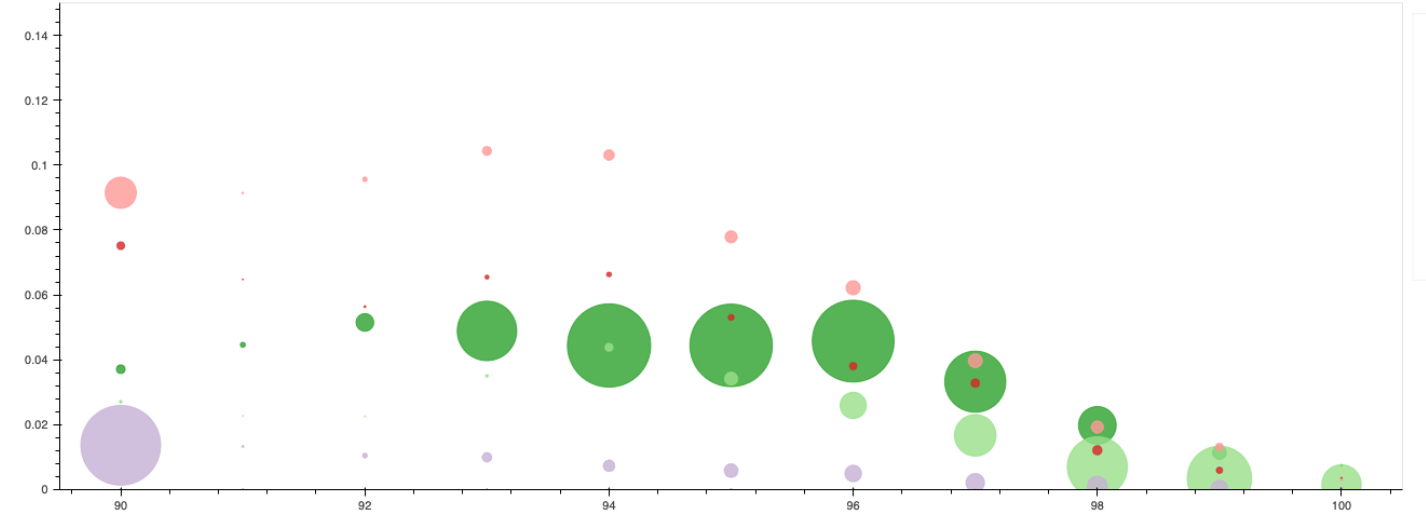
Below is an example of the functioning plot [the slider is above, and filtering the CDS on a date column]. I’ve found that when I slightly alter the data (more or less groups [bubbles] per value on the x-axis), it can trigger the size mismatch error]
def bubble_chart(df, metric,
                note_dictionary = False):

    #update metric column name to "metric" for easier dynamic functions
    df = df.rename(columns={metric:'metric'})

    #slider struggles handling monthly timestamp values - so instead use an index -- later we create a Div to show the actual date string the index corresponds to

    date_values = df.groupby('acquired_month').size().reset_index().reset_index().rename(columns= {'index':'date_value'})
    date_values['date_value'] = date_values['date_value']

    df = df.merge(date_values[['acquired_month',
                              'date_value']], on = 'acquired_month',how = 'left')
    string_month_list = df['acquired_month'].dt.strftime('%Y-%m').sort_values(ascending=True).unique()

    #use this variable to incorporate dynamic notes for each month flash
    if note_dictionary:
        list_update = []
        for val in string_month_list:
            try:
                list_update.append(val + ': ' + note_dictionary[val])
            except:
                #exception for where certain months do not have a note
                list_update.append(val)
        string_month_list = list_update
    else:
        pass


    #create slider
    date_slider = Slider(title='Acquired Month', bar_color = 'blue', start=df.date_value.min(), end=df.date_value.max(), step=1,value=df.date_value.min())

    #create div
    div = Div(text= f'<b>{string_month_list[0]}</b>')

    #create source and reference source variables -- the reference source will never change, but the source will update depending on the slider values
    source = ColumnDataSource(df)
    ref_source = ColumnDataSource(df)

    #general structure of JS code below: create variables for each column of data, create new variables by looping through the original columns and finding the values at the same index where the Slider value exists.
    #then update the source data columns to use the filtered columns from the reference source
    #lastly, update the Div text using the Slider value

    js_code = """

    var source_data = source.data
    var ref_source_data = ref_source.data

    var date_value = ref_source_data['date_value']
    var rate = ref_source_data['metric']
    var size = ref_source_data['all_time_index']
    var share = ref_source_data['share_by_month_cohort']
    var rounded_itacs = ref_source_data['rounded_acquired_itacs']
    var color = ref_source_data['color']
    var prod = ref_source_data['first_product']
    var month = ref_source_data['acquired_month']
    var alpha = ref_source_data['alpha']


    var date_value_ = []
    var rate_ = []
    var size_ = []
    var share_ = []
    var rounded_itacs_ = []
    var color_ = []
    var prod_ = []
    var month_ = []
    var alpha_ = []

    var f = date_slider.value

    for(var i=0; i < date_value.length; i++){
        if (date_value[i] == f ) {
            date_value_.push(date_value[i]);
            rate_.push(rate[i]);
            size_.push(size[i]);
            share_.push(share[i]);
            rounded_itacs_.push(rounded_itacs[i]);
            color_.push(color[i]);
            prod_.push(prod[i]);
            month_.push(month[i]);
            alpha_.push(alpha[i]);

        }
    }

    source_data['date_value'] = date_value_
    source_data['metric'] = rate_
    source_data['all_time_index'] = size_
    source_data['share_by_month_cohort'] = share_
    source_data['rounded_acquired_itacs'] = rounded_itacs_
    source_data['color'] = color_
    source_data['first_product'] = prod_
    source_data['acquired_month'] = month_
    source_data['alpha'] = alpha_

    div.text = string_month_list[f]

    source.change.emit();
    """


    #create plot figure and layout
    p = figure(title = f'{metric} cut by acquring product + first itacs',
               width=1500, height=500, y_range=(0, 0.15), background_fill_color = 'white')
    p.xgrid.grid_line_color = None
    p.ygrid.grid_line_color = None
    p.add_layout(Legend(), 'right')


    #create actual circle plot, using "source" as the source, since this data will update as the Slider value updates
    p.circle('rounded_acquired_itacs',
             'metric',
             legend_field = 'first_product',
             size = 'all_time_index',
             color = 'color',
             source = source,
             alpha='alpha'
            )


    #create customjs callback
    callback=CustomJS(args=dict(source=source,
                                ref_source=ref_source,
                                div=div,
                                string_month_list = string_month_list,
                               date_slider = date_slider
#                                 itacs_slider = itacs_slider
                               ),

                      code=js_code)


    hover = HoverTool(tooltips=[
        ('Product','@first_product'),
        ('Acquired ITACs', '@rounded_acquired_itacs'),
        (f'{metric}', '@metric{0, 0.000}'),
        ('Share of Cohort', '@share_by_month_cohort{0,0.00}')

    ])

    p.add_tools(hover)


    #initiate impact of js code
    date_slider.js_on_change('value', callback)
#     itacs_slider.js_on_change('value',itacs_callback)


    layout = column(
        date_slider,
                    div,
#                     itacs_slider,
                    p,
                   )

    html = file_html(layout, CDN, "plot_adoption")
    displayHTML(html)