Vbar_stack with different categories; how to get category attributes and secondary values displayed in tooltips

Hi,

I am trying to make stacked bar plot with unrelated categories in each stack.
All examples I have found are based on using the same categories.

I found example/solution with pivoting the data. While this creates a plot as expected it seems ‘wrong’ to create a sparse matrix for a simple data set. Additionally I have ‘other uses’ for the original datasource in my plot, now I have to provide what is essentially the same data twice.
I couldnt find anyting build-in to handle this. Anyone has a reference to a an example on doing a stacked bar plot from a normalised relational dataset.
Or am I better of creating the individual glyphs myself directly from my dataset (a reference to an example for that would also be appreciated)

I have some additional problems even with pivoting the data. I have tertiary categories (category attributes) that are functions of (attribtues of) the the 2 primary categories AND a secondary value beside the primary value used for the bar plot (bar height), which I would like to have in my dataset and display in a hover tool.

The following example show the essence. First a working simple plot on a simple pivot. Then a more advanced pivot that give a dataframe with the tertiary categories (attributes) and secondary values, but as the dimensions of the dataframe is now arrays I am not sure how to reference them in the plotting.

The second plot doesn’t work - I know why, but how do I achieve what I want.
Achieving it might be easier if I go generate the glyphs myself directly from the dataset (going back to my first point).
A reference for an example of that would be appreciated. I.e. advanced enough to create the glyphs in such a way that it can reference back to the original dataframe with references for the fields needed for hovertool and sizing.

Thanks in advance for any help. I am fairly new with bokeh


from pandas import DataFrame
import  bokeh.io
# from bokeh.charts import show
from bokeh.models import DatetimeTickFormatter
from bokeh.models import ColumnDataSource
import bokeh.plotting
from bokeh.plotting import figure

import bokeh.palettes


sales = DataFrame.from_records(
    [{'Brand': 'Ford', 'Origin': 'USA', 'Model': 'Mustang', 'Type': 'Car', 'Sales': 4, 'Value': 10000},
     {'Brand': 'Ford', 'Origin': 'USA', 'Model': 'Mondeo', 'Type': 'Car', 'Sales': 6, 'Value': 4000},
     {'Brand': 'Ford', 'Origin': 'USA', 'Model': 'Transit', 'Type': 'Van', 'Sales': 2, 'Value': 3000},
     {'Brand': 'Honda', 'Origin': 'Japan', 'Model': 'Accord', 'Type': 'Car', 'Sales': 7, 'Value': 3500},
     {'Brand': 'Honda', 'Origin': 'Japan', 'Model': 'Civic', 'Type': 'Car', 'Sales': 3, 'Value': 1500},
     {'Brand': 'Volkswagen', 'Origin': 'Germany', 'Model': 'Beetle', 'Type': 'Car', 'Sales': 2, 'Value': 2000},
     {'Brand': 'Volkswagen', 'Origin': 'Germany', 'Model': 'Passat', 'Type': 'Car', 'Sales': 4, 'Value': 2800}
    ]
)


#sales_piv = sales.pivot(index="Brand", columns="Model", values=["Value", 'Sales'])  #.fillna(0)
sales_piv = sales.pivot(index="Brand", columns="Model", values="Sales").fillna(0)
print(sales_piv)

p=figure(x_range=sales_piv.index.tolist(),
         height=1000,
         title="Sales pr Brand",
         tools="hover,tap",
         tooltips=[("Brand", "???"),
            ("Model", "$name"),
            ("Sales", "@$name{0.00}")]
         )

p.vbar_stack(sales_piv.columns.tolist(), x='Brand', width=0.9, color=bokeh.palettes.viridis(sales_piv.columns.size), source=sales_piv)

bokeh.plotting.output_file('sales1.html')
bokeh.plotting.show(p)

#More advanced - does not work

sales_piv = sales.pivot(index=["Brand", "Origin"], columns=["Model", "Type"], values=["Sales", "Value"]).fillna(0)
# Alternatively 'Origin' could be in columns that would also eliminate any issues where different rows attributed same Brand to different Origins!
print(sales_piv)

#Do I need to do something here to 're-index' my sales_piv DF to be indexed on "Brand" alone and having the other index columns as normal attributes?

#Do I need to do something here to 're-column' my sales_piv DF


p=figure(x_range=[x[0] for x in sales_piv.index.tolist()], # this extract the Brand correctly but that will then be usable to lookup for the individual plots
         height=1000,
         title="Sales pr Brand",
         tools="hover,tap",
         tooltips=[("Brand", "???"),
                   ("Model", "$name"),
                   ("Origin", "???"),
                   ("Type", "???"),
                   ("Sales", "@$name{0}"),
                   ("Value", "???")]
)


p.vbar_stack([x[1]  for x in sales_piv.columns.tolist() if x[0] == 'Sales'], # this exctract the Model correctly for finding the stacking value but it cannot lookup in the dataframe
             x='Brand',
             width=0.9,
             color=bokeh.palettes.viridis(([x[1]  for x in sales_piv.columns.tolist() if x[0] == 'Sales']).__len__()),
             source=sales_piv)

bokeh.plotting.output_file('sales2.html')
bokeh.plotting.show(p)

I’m afraid you lost me from the start. Normally the categories are the coordinates that specify where the bars are plotted along the axis, so if the bars don’t have the same categories, then they also won’t have the same the same location on the axis… which means they can’t be stacked together by definition, since they don’t line up at all.

So either we are using terminology differently, or I am just misunderstanding something fundamental about what you are saying. Either way, I don’t have a clear mental picture of what you are trying to achieve. The very best thing you can provide right now is an actual picture or image of the exact kind of chart you are trying to obtain, so that it’s clear visually what is intended.

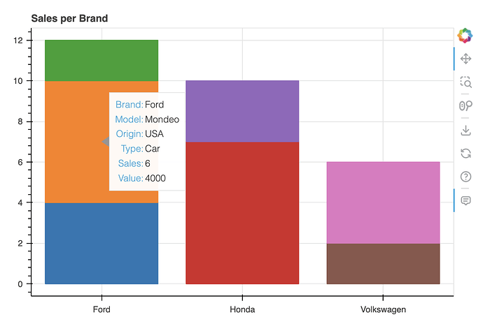
If I understand correctly, you want to be able to preserve data other that number of sales so you can show them in your hover tool. I’m not sure if that’s possible with vbar_stack but I think you can do it by calculating the y coordinates and just use vbar. Let me know if I’m misunderstanding your question but here is how I would implement what I described above:

import pandas as pd
from bokeh.io import output_notebook, show
from bokeh.plotting import figure
from bokeh.models import ColumnDataSource
from bokeh.palettes import Category10_10
from bokeh.models import HoverTool
output_notebook()

sales = pd.DataFrame.from_records(
    [{'Brand': 'Ford', 'Origin': 'USA', 'Model': 'Mustang', 'Type': 'Car', 'Sales': 4, 'Value': 10000},
     {'Brand': 'Ford', 'Origin': 'USA', 'Model': 'Mondeo', 'Type': 'Car', 'Sales': 6, 'Value': 4000},
     {'Brand': 'Ford', 'Origin': 'USA', 'Model': 'Transit', 'Type': 'Van', 'Sales': 2, 'Value': 3000},
     {'Brand': 'Honda', 'Origin': 'Japan', 'Model': 'Accord', 'Type': 'Car', 'Sales': 7, 'Value': 3500},
     {'Brand': 'Honda', 'Origin': 'Japan', 'Model': 'Civic', 'Type': 'Car', 'Sales': 3, 'Value': 1500},
     {'Brand': 'Volkswagen', 'Origin': 'Germany', 'Model': 'Beetle', 'Type': 'Car', 'Sales': 2, 'Value': 2000},
     {'Brand': 'Volkswagen', 'Origin': 'Germany', 'Model': 'Passat', 'Type': 'Car', 'Sales': 4, 'Value': 2800}
    ]
)

sales['high'] = sales.groupby('Brand')['Sales'].cumsum()
sales['low'] = sales['high'] - sales['Sales']
sales['color'] = [Category10_10[x] for x in sales.index]

source = ColumnDataSource(data=sales)
p = figure(
    title="Sales per Brand",
    x_range=sales['Brand'].unique(), height=400
)
p.vbar(x='Brand', bottom='low', top='high', width=0.8, color='color', source=source)
h = HoverTool(
    tooltips=[
        ('Brand', '@Brand'),
        ('Model', '@Model'),
        ('Origin', '@Origin'),
        ('Type', '@Type'),
        ('Sales', '@Sales'),
        ('Value', '@Value'),
    ],
)
p.add_tools(h)
show(p)

1 Like

Thanks,
That’s so simple :slight_smile:

I saw something similar in an example, but there were comments to that solution directing to the ‘new’ vbar_stack for stacked bars and also the example was generating the individual glyphs, which is not necessary.

@Bryan : Terminology is not easy. I don’t think there is concensus. I trust the provided solution explain my intention better than I could myself.
The stacked bars allow for 2 categorizations to be visually represented; one on the x-axis (the bars) and one on the y-axis (the stacking).
If the categorizations are independent (orthogonal) the vbar_stack-method is suitable. If they are dependent the bar-method is suitable but does require the simple positioning calculation to be done.

Next step:
I already have a way using jscript to then switch between two plots displaying respectively the ‘Value’ and ‘Sales’ attribute as the height defining attribute in plotting. Simply having 2 sets of ‘low’ and ‘high’ values in the dataframe is reasonable to pre-calculate

Another possible ‘extension’ I was looking at, which seems a bit more problematic is: having on the client side is filtering on ‘Type’. I.e. a set of checkboxes which allow the user to interactively (de)select the individual Type’s (Car, Van, Truck, Motorcycle, …). Adding a JS on each glyph to hide it based on selected types is probably fairly easy, but recalculate the high and low gets trickier.
It will be possible in JS, but for now I think I will do this server-side
(This is not an invite to/request for help :slight_smile: I have to do some of the work myself :slight_smile: )

Check this out → Update vbar_stack in a standalone html? - #3 by CarlMarx Should get you started :smiley:

1 Like