Warming Stripes now with Bokeh and random data!
from bokeh.plotting import figure, show, output_file
from bokeh.models import LinearColorMapper, ColorBar, BasicTicker, ColumnDataSource
from bokeh.layouts import column
from bokeh.models import Title
import pandas as pd
import numpy as np
from bokeh.palettes import RdBu11
def create_stripes_plot(data, year_col, value_col,
title="Warming Stripes", subtitle=None,
width=1200, height=400,
palette=None, reference_period=None,
output_path=None):
"""
Create a 'warming stripes' visualization using Bokeh.
Parameters:
-----------
data : pandas.DataFrame
Data containing years and temperature/value data
year_col : str
Column name for years
value_col : str
Column name for values (e.g., temperature anomaly)
title : str
Main plot title
subtitle : str
Optional subtitle
width : int
Plot width in pixels
height : int
Plot height in pixels
palette : list
Optional color palette (defaults to blue-white-red)
reference_period : tuple
Optional (start_year, end_year) to calculate baseline average
output_path : str
Optional file path to save HTML output
Returns:
--------
bokeh.plotting.figure
The configured Bokeh figure
"""
# Prepare data
df = data.copy().sort_values(year_col).reset_index(drop=True)
# Calculate anomaly relative to reference period if specified
if reference_period:
start_year, end_year = reference_period
baseline = df[(df[year_col] >= start_year) &
(df[year_col] <= end_year)][value_col].mean()
df['anomaly'] = df[value_col] - baseline
plot_value = 'anomaly'
else:
plot_value = value_col
# Calculate stripe boundaries
df['left'] = df[year_col] - 0.5
df['right'] = df[year_col] + 0.5
df['bottom'] = 0
df['top'] = 1
# Default palette (blue to white to red)
if palette is None:
palette = list(reversed(RdBu11)) # Blue (cold) to Red (warm)
# Create color mapper
color_mapper = LinearColorMapper(
palette=palette,
low=df[plot_value].min(),
high=df[plot_value].max()
)
# Create ColumnDataSource
source = ColumnDataSource(df)
# Create figure without axes
p = figure(tools = "hover,save",tooltips=[(year_col, f"@{year_col}"), (value_col, f"@{value_col}")],
width=width,
height=height,
x_range=(df[year_col].min() - 0.5, df[year_col].max() + 0.5),
y_range=(0, 1)
)
# Plot vertical stripes (one per year)
p.quad(
left='left',
right='right',
bottom='bottom',
top='top',
color={'field': plot_value, 'transform': color_mapper},
line_color=None,
source=source,
hover_line_color='lime',
hover_line_width=2
)
# Add color bar
color_bar = ColorBar(
color_mapper=color_mapper,
ticker=BasicTicker(desired_num_ticks=10),
label_standoff=12,
location=(0, 0),
title="°C" if "temp" in value_col.lower() else "Value"
)
p.add_layout(color_bar, 'right')
# Styling
p.xaxis.axis_label = None
p.yaxis.visible = False
p.xgrid.visible = False
p.ygrid.visible = False
p.outline_line_color = None
# Add year labels at key points
key_years = []
min_year = df[year_col].min()
max_year = df[year_col].max()
key_years = list(range(int(min_year), int(max_year), 20))
p.xaxis.ticker = key_years
p.xaxis.major_label_text_font_size = "12pt"
# Add reference period markers if specified
if reference_period:
start_year, end_year = reference_period
# Add text annotations
p.text(x=[start_year], y=[1.05], text=[str(start_year)],
text_align="center", text_font_size="10pt")
p.text(x=[end_year], y=[1.05], text=[str(end_year)],
text_align="center", text_font_size="10pt")
# Create title layout
title_obj = Title(text=title, text_font_size="16pt")
p.add_layout(title_obj, 'above')
if subtitle:
subtitle_obj = Title(text=subtitle, text_font_size="10pt", text_font_style="italic")
p.add_layout(subtitle_obj, 'above')
# Save to file if specified
if output_path:
output_file(output_path)
return p
# ============================================================================
# EXAMPLE 1: Global Temperature Stripes (Like Ed Hawkins' warming stripes)
# ============================================================================
# Generate realistic temperature data from 1880-2023
years = list(range(1880, 2024))
np.random.seed(42)
# Create temperature anomaly with warming trend
temp_data = []
for i, year in enumerate(years):
# Base trend: cooling until 1910, then warming acceleration
if year < 1910:
trend = -0.3 + (year - 1880) * 0.002
elif year < 1980:
trend = -0.2 + (year - 1910) * 0.005
else:
trend = 0.15 + (year - 1980) * 0.02
# Add natural variability
noise = np.random.normal(0, 0.1)
temp_anomaly = trend + noise
temp_data.append({
'year': year,
'temperature_anomaly': -temp_anomaly
})
temp_df = pd.DataFrame(temp_data)
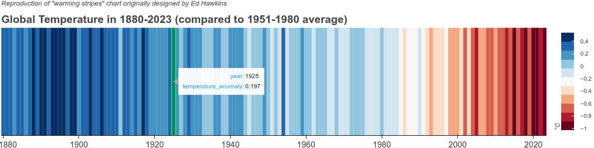
plot1 = create_stripes_plot(
data=temp_df,
year_col='year',
value_col='temperature_anomaly',
title='Global Temperature in 1880-2023 (compared to 1951-1980 average)',
subtitle='Reproduction of "warming stripes" chart originally designed by Ed Hawkins',
reference_period=(1951, 1980),
height=300,
output_path='example1_warming_stripes.html'
)
show(plot1)
# ============================================================================
# EXAMPLE 2: Arctic Sea Ice Extent Stripes
# ============================================================================
# Generate Arctic sea ice extent data (declining trend)
ice_years = list(range(1979, 2024))
ice_data = []
for i, year in enumerate(ice_years):
# Declining trend with variability
base_extent = 7.5 - (year - 1979) * 0.08 # Million km²
noise = np.random.normal(0, 0.3)
extent = base_extent + noise
ice_data.append({
'year': year,
'ice_extent': extent
})
ice_df = pd.DataFrame(ice_data)
plot2 = create_stripes_plot(
data=ice_df,
year_col='year',
value_col='ice_extent',
title='Arctic Sea Ice Extent 1979-2023',
subtitle='Minimum extent (million km²) - showing declining trend',
height=300,
output_path='example2_arctic_ice.html'
)
show(plot2)
# ============================================================================
# EXAMPLE 3: Ocean Heat Content Stripes
# ============================================================================
# Generate ocean heat content data (increasing trend)
ocean_years = list(range(1960, 2024))
ocean_data = []
for i, year in enumerate(ocean_years):
# Increasing trend with acceleration
if year < 1990:
trend = (year - 1960) * 2
else:
trend = 60 + (year - 1990) * 8
noise = np.random.normal(0, 15)
heat_content = trend + noise
ocean_data.append({
'year': year,
'ocean_heat': heat_content
})
ocean_df = pd.DataFrame(ocean_data)
# Custom palette (cool to hot)
ocean_palette = ['#08519c', '#3182bd', '#6baed6', '#9ecae1', '#c6dbef',
'#fee5d9', '#fcae91', '#fb6a4a', '#de2d26', '#a50f15']
plot3 = create_stripes_plot(
data=ocean_df,
year_col='year',
value_col='ocean_heat',
title='Ocean Heat Content 1960-2023',
subtitle='Upper 2000m heat content anomaly (10²² Joules)',
palette=ocean_palette,
height=300,
output_path='example3_ocean_heat.html'
)
show(plot3)