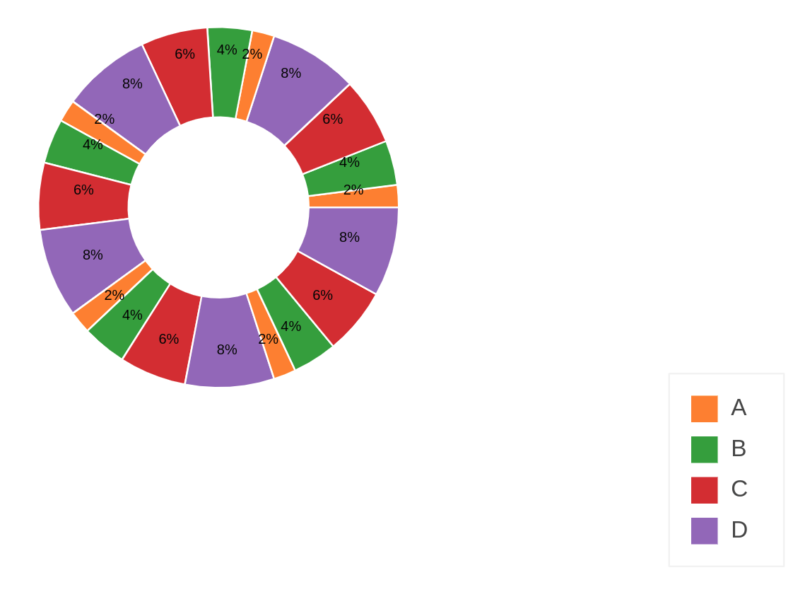
Thanks a lot Filippo but, weirdly enough!, your code does not work for me. I want percentage TEXTS on the Pie chart. Please take a look at my code; I used some Cos, Sin trick to do that; however, when the chart width changes the texts might get scattered for some reason! Mathematically it should be always correct, I guess it might be because of Bokeh inner dimension which I don’t know how exactly they work.
from math import pi

from bokeh.palettes import Category10

from bokeh.models.sources import ColumnDataSource

from bokeh.plotting import figure

from bokeh.transform import cumsum

from bokeh.models import Legend, HoverTool, LabelSet, LegendItem

from bokeh.io import output_notebook, show, push_notebook

import numpy as np

output_notebook()

value = [10,20,30,40]*5

data = {'name': ["A", "B","C","D"]*5,

'value': value,

'angle': [v/sum(value)*2*pi for v in value],

'cumulative_angle':[(sum(value[0:i+1])- (item/2))/sum(value)*2*pi for i,item in enumerate(value)],

'percentage': [d/sum(value)*100 for d in value],

'color': Category10[5][1:]*5}

data['label'] = ["{:.0f}%".format(p) for p in data['percentage']]

data['cos'] = np.cos(data['cumulative_angle'])*0.3

data['sin'] = np.sin(data['cumulative_angle'])*0.3

source = ColumnDataSource(data=data)

TOOLTIPS = [

("Value", "@value"),

("Percentage", "@percentage{0.2f}%")

]

p = figure(plot_height=600,plot_width=600,x_range=(-1,1), y_range=(-1,1), tools='hover',

tooltips=TOOLTIPS, title="My Donut Chart", toolbar_location=None)

r = p.annular_wedge(x=0, y=0, inner_radius=0.2, outer_radius=0.4,

start_angle=cumsum('angle', include_zero=True), end_angle=cumsum('angle'),

line_color="white", fill_color='color', fill_alpha=1, source=source)

legend = Legend(items=[LegendItem(label=dict(field="name"), renderers=[r])], location=(0, 80))

p.add_layout(legend, 'right')

labels = LabelSet(x='cos', y='sin', text="label", y_offset=0,

text_font_size="6pt", text_color="black",

source=source, text_align='center')

p.add_layout(labels)

p.axis.axis_label=None

p.axis.visible=False

p.grid.grid_line_color = None

p.outline_line_color = None

show(p)
it results in:
any improvement, idea etc. is appreciated! also, I only get the hover when I run YOUR code. Thanks
Hi,
I don’t have the original chart anymore but I’ll post you the full code of a newer version of it. This is designed to start at pi/2 clockwise, which is the reference style for a pie chart. When I originally designed the chart, there was a problem with creating pie charts clockwise, so what I did was creating a chart anticlockwise starting from the smaller bin, which has the practical effect of creating it clockwise starting from the biggest bin. Please note that this code still works in Bokeh 1.x but it might not be the most elegant way to do it (this code outputs to the Jupyter Notebook but if you want an HTML just uncomment the corresponding line at the end):
import pandas as pd
import numpy as np
from bokeh.plotting import figure, output_file, ColumnDataSource, save, output_notebook, show
from bokeh.models import HoverTool
from bokeh.palettes import Category20
example source data
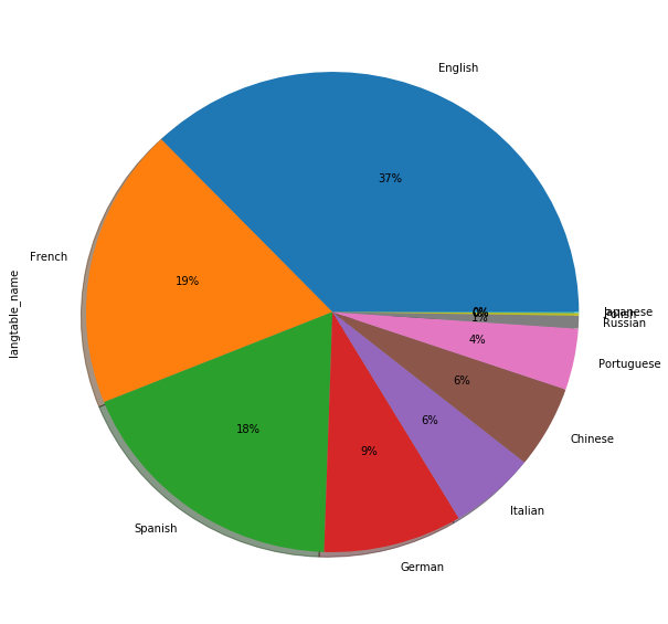
languages = pd.Series([‘Japanese’, ‘Polish’, ‘Russian’, ‘Portuguese’])
counts = pd.Series([12, 45, 67, 98])
calculate the percentages of each language
percentage = counts/counts.sum()
calculate the cumulative distribution of percentages, necessary for the Bokeh chart
cumulative = counts.cumsum()/counts.sum()
#creating the series starting with zero and shifted of one position compared to cumulative
necessary for the Bokeh chart
cumulative_s = cumulative.copy()
cumulative_s[0] = 0
cumulative_s[1:] = cumulative[:-1]
calculating the start and end points for the chart
+ 0.5*np.pi means letting the bigger language start from 12:00 and anticlockwise
starts = cumulative_s2np.pi + 0.5*np.pi
ends = cumulative2np.pi + 0.5*np.pi
colour = pd.Series(Category20[cumulative.shape[0]], index=cumulative.index)
#creating a dataframe out of the information created so far, and then converting it to a ColumnDataSource
complete = pd.DataFrame({“count”: counts,
“percentage”: percentage,
“cumulative_s”: starts,
“cumulative”: ends,
“label”: languages,
“colour”: colour,
})
source = ColumnDataSource(data=complete)
hover tool definition
hover = HoverTool(tooltips=[(“language”,“@label”),
(“percentage”, “@percentage{%0.2f}”)
])
chart definition
p = figure(tools=[“save”, hover], title=“Downloaded languages”)
p.wedge(x=0, y=0, radius=0.9, start_angle=“cumulative_s”, end_angle=“cumulative”, color=“colour”, source=source)
p.toolbar.logo = None
p.toolbar_location = None
p.xgrid.visible = False
p.ygrid.visible = False
p.axis.visible = False
#Output to static HTML file
#output_file(“test.html”)
#Output to Jupyter Notebook
show(p)
``
Could you please kindly post your full code for it? I’d highly appreciate it.
Dear all,
I solved it on my own; I had to move everything inside the ColumnDataSource, included the start_angle, end_angle and colours.
This is the final code that worked (with hovertool):
hover = HoverTool(tooltips=[(“language”,“@label”),
(“percentage”, “@percentage{%0.2f}”)
])
p = figure(x_range=(-1,1), y_range=(-1,1),tools=[“save”, hover], title=“Languages”)
p.wedge(x=0, y=0, radius=1, start_angle=“cumulative_s”, end_angle=“cumulative”, color=“colour”, source=source)
``
Thank you, I love Bokeh and I wish I’ll be able to contribute in a near future.
Dear all,
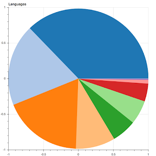
I am working on a set of data where I have a list of languages and a number of users per language. Since I want to move all my works to Bokeh I was trying to create a pie chart which I had created before using Pandas/Matplotlib. The original chart is the following:
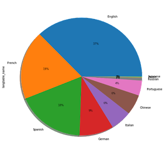
After working a bit with the wedge I was able to recreate the pie chart but I still can’t figure out how to add the labels on the chart, either with the hover (preferred) or also directly onto the chart.
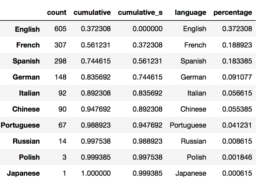
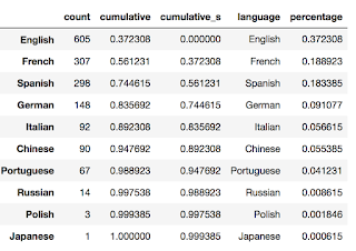
The data comes from this pandas.DataFrame which was converted to a ColumnDataSource:
And the code used is the following:
starts = [p2np.pi for p in source.data[‘cumulative_s’]]
ends = [p2np.pi for p in source.data[‘cumulative’]]
p = figure(x_range=(-1,1), y_range=(-1,1),tools=[“save”], title=“Languages”)
p.wedge(x=0, y=0, radius=1, start_angle=starts, end_angle=ends, color=Category20[complete.shape[0]])
``
Thanks in advance for your help
*This e-mail and any
attachments may contain confidential information and is intended for use solely
by the addressee(s). If you are not the
intended recipient of this e-mail, please be aware that any dissemination,
distribution, copying, or other use of the e-mail in whole or in part, is
strictly prohibited. If you have
received this e-mail in error, please notify the sender and permanently delete
the original and all copies of the e-mail, attachments, and any printouts. *****
···
On Wednesday, January 23, 2019 at 3:59:09 AM UTC-5, Filippo B wrote:
On Tuesday, 22 January 2019 16:37:02 UTC+1, hk331 wrote:
On Wednesday, January 3, 2018 at 1:00:41 PM UTC-5, Filippo B wrote:
On Wednesday, 3 January 2018 17:29:48 UTC+1, Filippo B wrote: