Dear all,
I solved it on my own; I had to move everything inside the ColumnDataSource, included the start_angle, end_angle and colours.
This is the final code that worked (with hovertool):
hover = HoverTool(tooltips=[(“language”,“@label”),
(“percentage”, “@percentage{%0.2f}”)
])
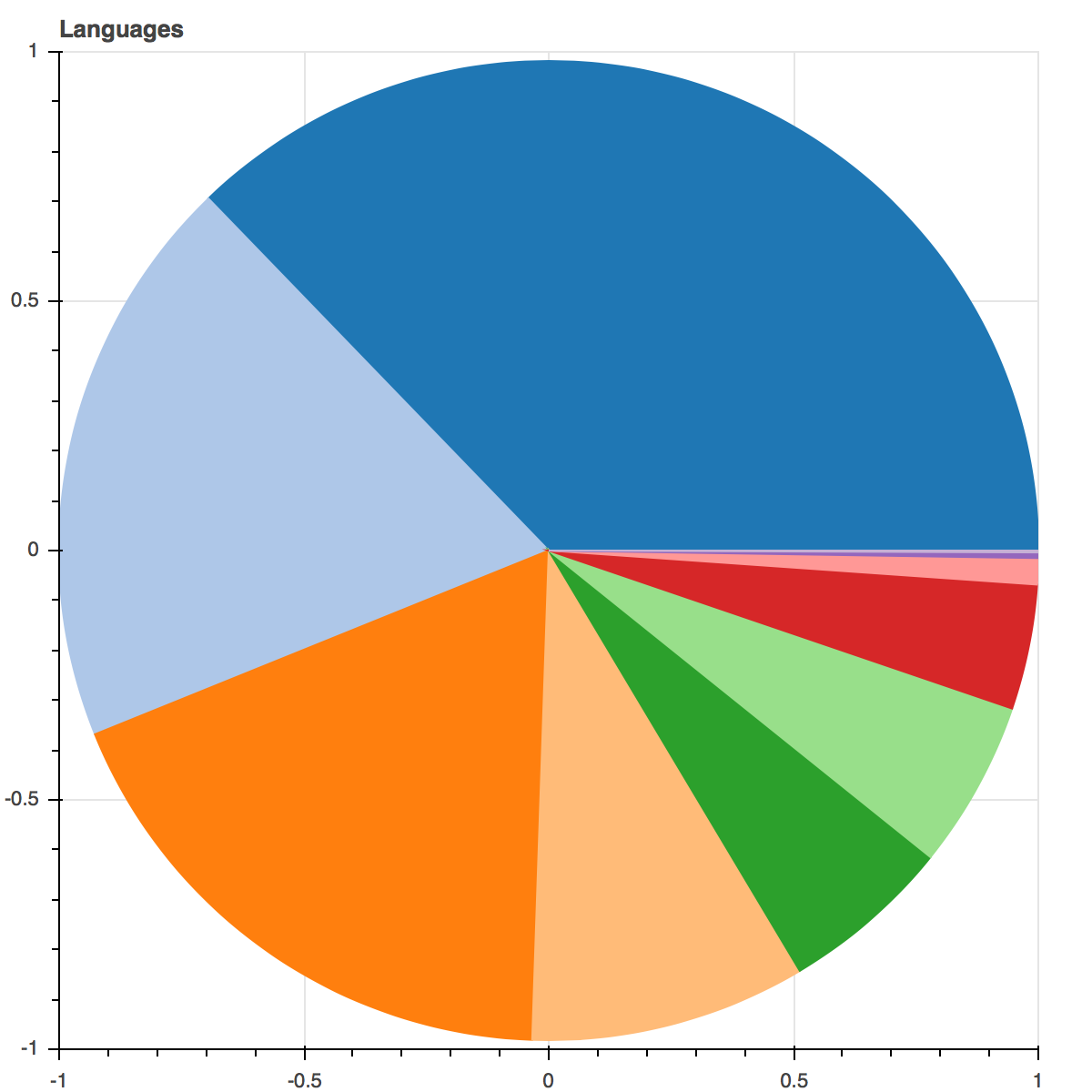
p = figure(x_range=(-1,1), y_range=(-1,1),tools=[“save”, hover], title=“Languages”)
p.wedge(x=0, y=0, radius=1, start_angle=“cumulative_s”, end_angle=“cumulative”, color=“colour”, source=source)
``
Thank you, I love Bokeh and I wish I’ll be able to contribute in a near future.
···
On Wednesday, 3 January 2018 17:29:48 UTC+1, Filippo B wrote:
Dear all,
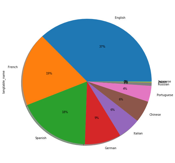
I am working on a set of data where I have a list of languages and a number of users per language. Since I want to move all my works to Bokeh I was trying to create a pie chart which I had created before using Pandas/Matplotlib. The original chart is the following:
After working a bit with the wedge I was able to recreate the pie chart but I still can’t figure out how to add the labels on the chart, either with the hover (preferred) or also directly onto the chart.
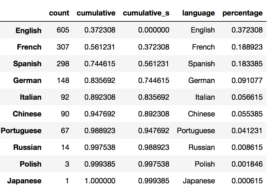
The data comes from this pandas.DataFrame which was converted to a ColumnDataSource:
And the code used is the following:
starts = [p2np.pi for p in source.data[‘cumulative_s’]]
ends = [p2np.pi for p in source.data[‘cumulative’]]p = figure(x_range=(-1,1), y_range=(-1,1),tools=[“save”], title=“Languages”)
p.wedge(x=0, y=0, radius=1, start_angle=starts, end_angle=ends, color=Category20[complete.shape[0]])
``
Thanks in advance for your help