What kind of plots for schedules and "timecard"?

Nothing too crazy here. Looking through examples and not finding what I need for schedules and timecards. Basically there are three elements:

  • employee schedules (IE. start 0600 and end 1400)
  • clock-in/clock-out AKA “timecard” (IE. start 0555 and end 1415)
  • plotted against the full hours of operation (0500 - 2200)

Here is typical data in Pandas:

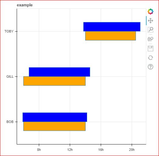
employees = [('BOB', datetime(2022,12,1,6,0,0), datetime(2022,12,1,14,0,0), datetime(2022,12,1,5,54,0), datetime(2022,12,1,14,12,0)),
            ('GILL', datetime(2022,12,1,6,0,0), datetime(2022,12,1,14,0,0), datetime(2022,12,1,6,43,0), datetime(2022,12,1,14,35,0)),
            ('TOBY', datetime(2022,12,1,14,0,0), datetime(2022,12,1,20,30,0), datetime(2022,12,1,13,45,0), datetime(2022,12,1,21,5,0))]
labels = ['name', 'schedulein', 'scheduleout', 'clockin', 'clockout']
df = pd.DataFrame.from_records(employees, columns=labels)

The display should have the employee name on the y-axis and the full schedule (open to close) on the x-axis. Then, each employee’s schedule and time card are stacked as horizontal bar aligned to employee name on the y-axis.

Sounds like hbar or rect on a categorical y axis?

Here’s where I ended up last.

from bokeh.models import ColumnDataSource, HBar, Grid
from bokeh.plotting import figure, show

employee_names_list = ['BOB', 'GILL', 'TOBY']
schedule_offsets = [('BOB', -0.1), ('GILL', -0.1), ('TOBY', -0.1)]
timeclock_offsets = [('BOB', 0.1), ('GILL', 0.1), ('TOBY', 0.1)]

schedulein_list = [datetime(2022,12,1,6,0,0), datetime(2022,12,1,6,0,0), datetime(2022,12,1,14,0,0)]
scheduleout_list = [datetime(2022,12,1,14,0,0), datetime(2022,12,1,14,0,0), datetime(2022,12,1,20,30,0)]
clockin_list = [datetime(2022,12,1,5,54,0), datetime(2022,12,1,6,43,0), datetime(2022,12,1,13,45,0)]
clockout_list = [datetime(2022,12,1,14,12,0), datetime(2022,12,1,14,35,0), datetime(2022,12,1,21,5,0)]

p = figure(width=500, height=500, y_range=employee_names_list, x_axis_type='datetime', title="example")
p.hbar(y=schedule_offsets, left=schedulein_list, right=scheduleout_list, height=0.2, fill_color="orange")
p.hbar(y=timeclock_offsets, left=clockin_list, right=clockout_list, height=0.2, fill_color="blue")

show(p)

This link from SO was helpful to figure out the hbar parameter left, right. Categorical offsets helped me also figure out how to put the two plots together.

I didn’t find an efficient way to use Pandas beyond list(df[<some column>].values)
I also don’t intuitively understand the height, offset values (0.2, 0.1 of what?), but that’s a matter of refinement.

Right now I’m stuck on a need to PNG. I’m developing my project in Jupyter, and later I would like to have a web page portal, but between this time I need to email the results as an image or file attachment. Working on this now.

If you have selenium in your python environment, you can use export_png to dump the plot out as a png.

Alternatively that little floppy disk tool downloads a png of the current plot view for you :smiley:

This topic was automatically closed 90 days after the last reply. New replies are no longer allowed.