What would i like to do?
I would like to create line chart with having multiple axes.
I referred to the following site.
I executed the following code.
from bokeh.models import DataRange1d, LinearAxis
from bokeh.plotting import figure, output_file, save
output_file("graph.html")
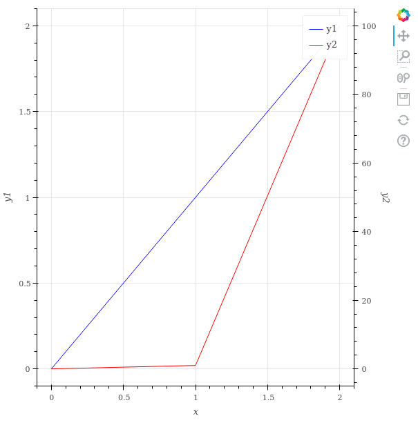
x = [0, 1, 2]
y1 = [0, 1, 2]
y2 = [0, 1, 100]
fig = figure(x_axis_label="x", y_axis_label="y1")
y_range_name = "secondary_axis"
fig.extra_y_ranges = {y_range_name: DataRange1d(end=max(y2) * 1.05)}
fig.line(x=x, y=y1, legend_label="y1", color="blue")
fig.line(
x=x,
y=y2,
legend_label="y2",
color="red",
y_range_name=y_range_name,
)
fig.add_layout(
LinearAxis(
y_range_name=y_range_name,
axis_label="y2",
),
"right",
)
save(fig)
Maximum value of y1 is 2, but range y1 axes is 0 to 100. The range is too wide !
Why is this happening?
And what should I do to make range y1 axes narrow.
Additional
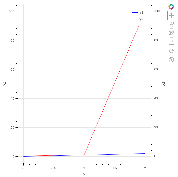
When swapping y1 for y2, range y1 axes is narrow.
y1 = [0, 1, 100]
y2 = [0, 1, 2]
Environmental
- Python3.10.2
- bokeh 2.4.3
p.s.
I asked Japanese Stackoverflow, but no one answers.