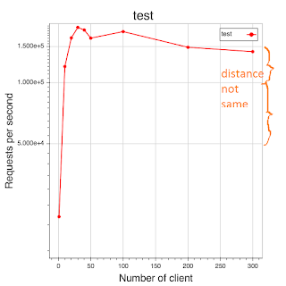
why doesn't the y-axis have same distance

Hi,

I wrote a test script to display some data. Here is the script:

from bokeh.plotting import figure, output_file, show

x = [1, 10, 20, 30, 40, 50, 100, 200, 300]
y = [21939, 119904, 165837, 186567, 181159, 165289, 177935, 149031, 141843]

ymin = min(y)
ymax = max(y)

p = figure(
#tools=“save”, y_axis_type=“log”, y_range=[ymin, ymax], title=“test”,
tools=“save”, y_axis_type=“log”, title=“test”,
x_axis_label=‘Number of client’, y_axis_label=‘Requests per second’
)

output_file(“test.html”)

p.line(x, y, legend=“test”, line_color=“red”, line_width=2)
p.circle(x, y, size=6, legend=“test”, line_color=“red”, fill_color=“red”)

show the results

show(p)

``

After the executing, I find the y-axis show:

5.000e+4
1.000e+5
1.500e+5

but distance between them in the chart are not same, how can I set them as fixed same distance, like x-axis?

Thanks,
Linbo
log scale - https://en.wikipedia.org/wiki/Logarithmic_scale
y_axis_type=“log”

···

2016-04-08 5:03 GMT-04:00 [email protected]:

Hi,

I wrote a test script to display some data. Here is the script:

from bokeh.plotting import figure, output_file, show

x = [1, 10, 20, 30, 40, 50, 100, 200, 300]
y = [21939, 119904, 165837, 186567, 181159, 165289, 177935, 149031, 141843]

ymin = min(y)
ymax = max(y)

p = figure(
#tools=“save”, y_axis_type=“log”, y_range=[ymin, ymax], title=“test”,
tools=“save”, y_axis_type=“log”, title=“test”,
x_axis_label=‘Number of client’, y_axis_label=‘Requests per second’
)

output_file(“test.html”)

p.line(x, y, legend=“test”, line_color=“red”, line_width=2)
p.circle(x, y, size=6, legend=“test”, line_color=“red”, fill_color=“red”)

show the results

show(p)

``

After the executing, I find the y-axis show:

5.000e+4
1.000e+5
1.500e+5

but distance between them in the chart are not same, how can I set them as fixed same distance, like x-axis?

Thanks,
Linbo

You received this message because you are subscribed to the Google Groups “Bokeh Discussion - Public” group.

To unsubscribe from this group and stop receiving emails from it, send an email to [email protected].

To post to this group, send email to [email protected].

To view this discussion on the web visit https://groups.google.com/a/continuum.io/d/msgid/bokeh/de3e1c1d-ed53-44a2-915d-bac28c947204%40continuum.io.

For more options, visit https://groups.google.com/a/continuum.io/d/optout.

Christian Tremblay, ing.

Tél : 450-305-6177, 225

Cell : 450-577-0538

Courriel : [email protected]

Prenez

**le contrôle **de votre bâtiment

Thanks, I will have a try.

···

2016-04-08 21:35 GMT+08:00 Christian Tremblay [email protected]:

log scale - https://en.wikipedia.org/wiki/Logarithmic_scale
y_axis_type=“log”

You received this message because you are subscribed to the Google Groups “Bokeh Discussion - Public” group.

To unsubscribe from this group and stop receiving emails from it, send an email to [email protected].

To post to this group, send email to [email protected].

To view this discussion on the web visit https://groups.google.com/a/continuum.io/d/msgid/bokeh/CAOm3oNnUeY4rRhcEUym0KdjuEO_i2GQ2foDx2-10mGnAfSUz3Q%40mail.gmail.com.

For more options, visit https://groups.google.com/a/continuum.io/d/optout.

Christian Tremblay, ing.

Tél : 450-305-6177, 225

Cell : 450-577-0538

Courriel : [email protected]

Prenez

**le contrôle **de votre bâtiment

2016-04-08 5:03 GMT-04:00 [email protected]:

Hi,

I wrote a test script to display some data. Here is the script:

from bokeh.plotting import figure, output_file, show

x = [1, 10, 20, 30, 40, 50, 100, 200, 300]
y = [21939, 119904, 165837, 186567, 181159, 165289, 177935, 149031, 141843]

ymin = min(y)
ymax = max(y)

p = figure(
#tools=“save”, y_axis_type=“log”, y_range=[ymin, ymax], title=“test”,
tools=“save”, y_axis_type=“log”, title=“test”,
x_axis_label=‘Number of client’, y_axis_label=‘Requests per second’
)

output_file(“test.html”)

p.line(x, y, legend=“test”, line_color=“red”, line_width=2)
p.circle(x, y, size=6, legend=“test”, line_color=“red”, fill_color=“red”)

show the results

show(p)

``

After the executing, I find the y-axis show:

5.000e+4
1.000e+5
1.500e+5

but distance between them in the chart are not same, how can I set them as fixed same distance, like x-axis?

Thanks,
Linbo

You received this message because you are subscribed to the Google Groups “Bokeh Discussion - Public” group.

To unsubscribe from this group and stop receiving emails from it, send an email to [email protected].

To post to this group, send email to [email protected].

To view this discussion on the web visit https://groups.google.com/a/continuum.io/d/msgid/bokeh/de3e1c1d-ed53-44a2-915d-bac28c947204%40continuum.io.

For more options, visit https://groups.google.com/a/continuum.io/d/optout.

To be specific, you are currently using a log scale, which is why things "are not evenly spaced". On a log scale, it is decades that are evenly spaced, i.e. 10, 100, 1000 are all evenly spaced. If you want a linear scale, that is the default, so remove the y_axis_type="log" that you currently have.

Bryan

···

On Apr 9, 2016, at 7:09 PM, liao linbo <[email protected]> wrote:

Thanks, I will have a try.

2016-04-08 21:35 GMT+08:00 Christian Tremblay <[email protected]>:
log scale - Logarithmic scale - Wikipedia
y_axis_type="log"

Christian Tremblay, ing.
Tél : 450-305-6177, 225
Cell : 450-577-0538
Courriel : [email protected]

Prenez
le contrôle de votre bâtiment

2016-04-08 5:03 GMT-04:00 <[email protected]>:

Hi,

I wrote a test script to display some data. Here is the script:

from bokeh.plotting import figure, output_file, show

x = [1, 10, 20, 30, 40, 50, 100, 200, 300]
y = [21939, 119904, 165837, 186567, 181159, 165289, 177935, 149031, 141843]

ymin = min(y)
ymax = max(y)

p = figure(
    #tools="save", y_axis_type="log", y_range=[ymin, ymax], title="test",
    tools="save", y_axis_type="log", title="test",
    x_axis_label='Number of client', y_axis_label='Requests per second'
)

output_file("test.html")

p.line(x, y, legend="test", line_color="red", line_width=2)
p.circle(x, y, size=6, legend="test", line_color="red", fill_color="red")

# show the results
show(p)

After the executing, I find the y-axis show:

5.000e+4
1.000e+5
1.500e+5

but distance between them in the chart are not same, how can I set them as fixed same distance, like x-axis?

Thanks,
Linbo

--
You received this message because you are subscribed to the Google Groups "Bokeh Discussion - Public" group.
To unsubscribe from this group and stop receiving emails from it, send an email to [email protected].
To post to this group, send email to [email protected].
To view this discussion on the web visit https://groups.google.com/a/continuum.io/d/msgid/bokeh/de3e1c1d-ed53-44a2-915d-bac28c947204%40continuum.io\.
For more options, visit https://groups.google.com/a/continuum.io/d/optout\.

--
You received this message because you are subscribed to the Google Groups "Bokeh Discussion - Public" group.
To unsubscribe from this group and stop receiving emails from it, send an email to [email protected].
To post to this group, send email to [email protected].
To view this discussion on the web visit https://groups.google.com/a/continuum.io/d/msgid/bokeh/CAOm3oNnUeY4rRhcEUym0KdjuEO_i2GQ2foDx2-10mGnAfSUz3Q%40mail.gmail.com\.

For more options, visit https://groups.google.com/a/continuum.io/d/optout\.

--
You received this message because you are subscribed to the Google Groups "Bokeh Discussion - Public" group.
To unsubscribe from this group and stop receiving emails from it, send an email to [email protected].
To post to this group, send email to [email protected].
To view this discussion on the web visit https://groups.google.com/a/continuum.io/d/msgid/bokeh/CAPCz0zpsUnWfXLauw4d6B_tRt5X_7_PiTZZ1cP0wGx%2B8QsCzCg%40mail.gmail.com\.
For more options, visit https://groups.google.com/a/continuum.io/d/optout\.