from os.path import dirname, join
#import numpy as np
import pandas.io.sql as psql
import sqlite3 as sql
import pandas as pd
from pandas import DataFrame
import numpy as np
from pandas.util.testing import assert_frame_equal
from bokeh.client import push_session
from bokeh.plotting import figure,output_file,show
from bokeh.charts import Bar,Area,Line
from bokeh.models import ColumnDataSource, HoverTool, HBox, VBoxForm,CustomJS,VBox
from bokeh.models.widgets import Slider, Select, TextInput
from bokeh.io import curdoc,vform
#whole_data read
data_all=pd.read_table(‘results/newresults’,sep=’ \t’,names=[‘name’,‘company’,‘industry’,‘location’])
#three
local_counts=data_all[‘location’].value_counts()
industry_counts=data_all[‘industry’].value_counts()
company_counts=data_all[‘company’].value_counts()
local_counts.to_csv(‘out3.csv’,sep=‘,’)
industry_counts.to_csv(‘out4.csv’,sep=‘,’)
company_counts.to_csv(‘out5.csv’,sep=‘,’)
industry_counts1=pd.read_csv(‘out4.csv’,names=[‘industry’,‘numbers’],sep=‘,’)
local_counts1=pd.read_csv(‘out3.csv’,names=[‘location’,‘numbers’],sep=‘,’)
company_counts1=pd.read_csv(‘out5.csv’,names=[‘company’,‘numbers’],sep=‘,’)
test=industry_counts1[‘industry’]
a=test.values
test.to_csv(‘outout.csv’,sep=‘,’)
test1=pd.read_csv(‘outout.csv’)
test1=test1.T
#test1.to_csv(‘new.csv’)
#f=open(‘finaltest/output.txt’,‘w’)
#f.write(str(a))
#f.close()
#zimu=[‘a’,‘b’,‘c’,‘d’,‘e’,‘f’,‘h’,‘i’,‘j’,‘k’]
#b=np.loadtxt(‘new.csv’,str,delimiter=‘,’)
#print b
a=company_counts1[‘company’].values
np.savetxt(‘here2.csv’,a,fmt=‘%s’)
company=np.loadtxt(‘here2.csv’,str,delimiter=‘\n’)
company=list(company)
b=local_counts1[‘location’].values
np.savetxt(‘here3.csv’,b,fmt=‘%s’)
location=np.loadtxt(‘here3.csv’,str,delimiter=‘\n’)
location=list(location)
c=industry_counts1[‘industry’].values
np.savetxt(‘here4.csv’,c,fmt=‘%s’)
industry=np.loadtxt(‘here4.csv’,str,delimiter=‘\n’)
industry=list(industry)
#industry=[‘Computer Software’,‘Information Technology and Services’,‘Research’,‘Financial Services’,‘Chemicals’,‘Biotechnology’,‘Higher Education’,‘Electrical/Electronic Manufacturing’,‘Pharmaceuticals’,‘Telecommunications’]
#location=[‘Chengdu, Sichuan, China’,‘China’,‘Beijing City, China’,‘Shanghai City, China’,‘Shenzhen, Guangdong, China’,‘Greater New York City Area’,‘San Francisco Bay Area’,‘Canada’,‘Shanghai Suburb, China’,‘Greater Boston Area’]
#company=[‘Sichuan University’,‘Intel’,‘Huawei’,‘IBM’,‘Tencent’,‘Apple’,‘Google’,‘Microsoft’,‘EMC’,‘Motorola Solutions’]
indus_height=industry_counts1[‘numbers’][:10]
y_indus_height=indus_height/2.0
local_height=local_counts1[‘numbers’][:10]
y_local_height=local_height/2.0
company_height=company_counts1[‘numbers’][:10]
y_company_height=company_height/2.0
hover=HoverTool(tooltips=[
("type","@x"),

("number","@height")

])
output_file(‘tot.html’)
indus_counts_array=industry_counts1[‘numbers’].values
indus_counts_array=np.array(indus_counts_array)
y_indus_counts_array=indus_counts_array/2.0
axis_map = {
“Current Location”:location,
“Current Industry”:industry,
“Current Company”:company
}
y_map ={
“Current Location”:local_counts1,
“Current Industry”:industry_counts1
}
height_map={
“Current Location”:y_local_height,
“Current Industry”:y_indus_height,
“Current Company”:y_company_height
}
new_axis_map={
“Current Location”:‘location’,
“Current Industry”:‘industry’,
“Current Company”:‘company’
}
source = ColumnDataSource(data=dict(x=,y=,height=))
cities=TextInput(title=‘location name’)
companies=TextInput(title=‘company name’)
industries=TextInput(title=‘industry name’)
x_axis=Select(title=‘X axis’,options=sorted(axis_map.keys()),value=‘Current Industry’)
plot = figure(plot_height=600, plot_width=800, title=“”, toolbar_location=None, tools=[hover],x_range=industry[:10],y_range=[0,2000])
plot.rect(x=‘x’,y=‘y’,width=.8,height=‘height’,source=source)
plot.xaxis.major_label_orientation = np.pi/3
controls=[x_axis,cities,companies,industries]
inputs=HBox(VBoxForm(*controls))
def select_types():
city_val=cities.value.strip()
company_val=companies.value.strip()
industry_val=industries.value.strip()
selected=data_all.copy()
if(city_val!=“”):
selected=selected[selected[‘location’].str.contains(city_val)==True]
if(company_val!=“”):
selected=selected[selected[‘company’].str.contains(company_val)==True]
if(industry_val!=“”):
selected=selected[selected[‘industry’].str.contains(industry_val)==True]
return selected
def update(attrname,old,new):
df=select_types()
#plot.xaxis.axis_label=x_axis.value
plot.yaxis.axis_label=‘numbers’
if df.equals(data_all)==True:
source.data=dict(
x=axis_map[x_axis.value][:10],
y=height_map[x_axis.value][:10],
height=height_map[x_axis.value][:10]*2.0
)
plot.tools=[hover]
plot.xaxis.major_label_orientation = np.pi/3
plot.x_range.factors=axis_map[x_axis.value][:10]
height_value=height_map[x_axis.value][:10]*2
new_height=height_value.values
plot.y_range.end=new_height[0]+200
else:
df=df[new_axis_map[x_axis.value]].value_counts()
df.to_csv(‘example.csv’,sep=‘,’)
df_counts=pd.read_csv(‘example.csv’,names=[new_axis_map[x_axis.value],‘numbers’],sep=‘,’)
d=df_counts[new_axis_map[x_axis.value]].values
np.savetxt(‘here5.csv’,d,fmt=‘%s’)
here=np.loadtxt(‘here5.csv’,str,delimiter=‘\n’)
here=list(here)
here_height=df_counts[‘numbers’]
y_here_height=here_height/2.0
source.data=dict(
x=here[:10],
y=y_here_height[:10],
height=here_height[:10]
)
plot.tools=[hover]
plot.xaxis.major_label_orientation=np.pi/3
plot.x_range.factors=here[:10]
new_height=here_height[:10].values
plot.y_range.end=new_height[0]+200
#plot.rect(x=axis_map[x_axis.value],y=height_map[x_axis.value],height=height_map[x_axis.value]*2.0)
#plot.x_range.on_change(‘_bounds_as_factors’,update)
x_axis.on_change(‘value’,update)
cities.on_change(‘value’,update)
companies.on_change(‘value’,update)
industries.on_change(‘value’,update)
#filters=VBox(x_axis)
#tot=HBox(filters,plot)
#show(tot)
curdoc().add_root(HBox(inputs,plot))
this is my complete code, and I can’t upload my results file.
在 2016年6月6日星期一 UTC+8上午2:25:49,Bryan Van de ven写道:
···
Please provide a complete code sample. That is, one that someone could immediately run without modification, to see the problem. I can’t speculate about what the issue might be without running the code, and I can’t run it if it is not a complete script. Also FYI I am technically on vacation so any response from me will probably be at least a few days away.
Bryan
On Jun 5, 2016, at 02:40, Qiwei Peng [email protected] wrote:
firstly: this is my update code:
def update(attrname,old,new):
plot.xaxis.axis_label=x_axis.value
plot.yaxis.axis_label=‘numbers’
source.data=dict(
x=axis_map[x_axis.value],
y=height_map[x_axis.value],
height=height_map[x_axis.value]*2.0
)
plot.x_range.factors=axis_map[x_axis.value]
plot.rect(x=axis_map[x_axis.value],y=height_map[x_axis.value],height=height_map[x_axis.value]*2.0)
after updating only the first bar shows its hover while the other bars don’t :
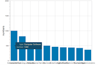
secondly: you may see the x_axis name above, they are too long to show correctly, how can I change them to an angle so to show correctly like bar chart’s x_axis
many thanks
–
You received this message because you are subscribed to the Google Groups “Bokeh Discussion - Public” group.
To unsubscribe from this group and stop receiving emails from it, send an email to [email protected].
To post to this group, send email to [email protected].
To view this discussion on the web visit https://groups.google.com/a/continuum.io/d/msgid/bokeh/2d1ff885-5f4d-45e1-90f0-4ed32ebe615f%40continuum.io.
For more options, visit https://groups.google.com/a/continuum.io/d/optout.
