I couldn’t find a issue on github for this, but I guess it’s a bug. Please confirm, so I can fill an issue.
When I plot with rect, and the X axis is categorical or numerical, it works as expected. But it the X axis is a list of dates, then the width property is ignored, and the rectangles painted are really narrow.
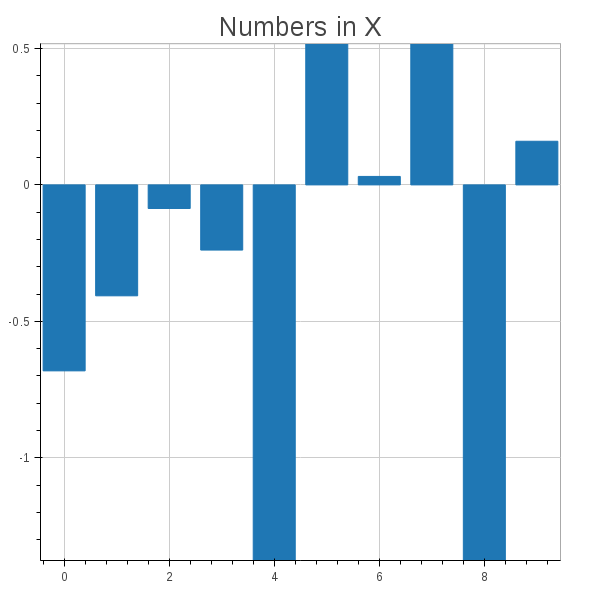
See this example, when the plots are the same, except for the type of the X axis, and in one case it works well, and in the other doesn’t.
import datetime
import numpy as np
import pandas as pd
import bokeh.plotting as plt
x1 = np.arange(10)
x2 = pd.date_range(datetime.date(2014, 1, 1), datetime.date(2014, 1, 10))
y = np.random.randn(10)
p1 = plt.figure(title=‘Numbers in X’)
p1.rect(x1, y/2, 0.8, y)
p2 = plt.figure(title=‘Dates in X’)
p2.rect(x2, y/2, 0.8, y)
plt.show(plt.VBox(p1, p2))
``
The resulting plots are these: