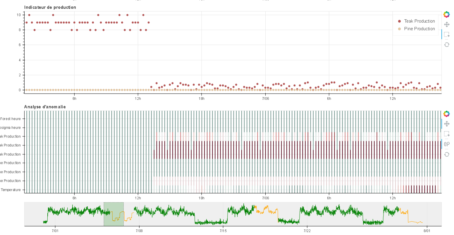
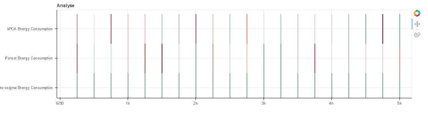
Here is the code with the issue : a useless width parameter resulting in very narrow rectangles.
`import random
import datetime
from bokeh.layouts import column
from bokeh.models import ColumnDataSource, CustomJS, Slider, LinearColorMapper
from bokeh.plotting import figure, show
from bokeh.transform import transform

estampilles = [datetime.datetime(2014, 6, 30, 0, 15),
 datetime.datetime(2014, 6, 30, 0, 30),
 datetime.datetime(2014, 6, 30, 0, 45),
 datetime.datetime(2014, 6, 30, 1, 0),
 datetime.datetime(2014, 6, 30, 1, 15),
 datetime.datetime(2014, 6, 30, 1, 30),
 datetime.datetime(2014, 6, 30, 1, 45),
 datetime.datetime(2014, 6, 30, 2, 0),
 datetime.datetime(2014, 6, 30, 2, 15),
 datetime.datetime(2014, 6, 30, 2, 30),
 datetime.datetime(2014, 6, 30, 2, 45),
 datetime.datetime(2014, 6, 30, 3, 0),
 datetime.datetime(2014, 6, 30, 3, 15),
 datetime.datetime(2014, 6, 30, 3, 30),
 datetime.datetime(2014, 6, 30, 3, 45),
 datetime.datetime(2014, 6, 30, 4, 0),
 datetime.datetime(2014, 6, 30, 4, 15),
 datetime.datetime(2014, 6, 30, 4, 30),
 datetime.datetime(2014, 6, 30, 4, 45),
 datetime.datetime(2014, 6, 30, 5, 0)]

anomaly_names = ['twosigma Energy Consumption',
 'iForest Energy Consumption',
 'kPCA Energy Consumption',
 ]
coordinate_name = ['twosigma Energy Consumption_coor',
 'iForest Energy Consumption_coor',
 'kPCA Energy Consumption_coor',
 ]

source_dic = dict()
source_dic["estampilles"] = estampilles
source_dic[anomaly_names[0]] = [0 for i in range(20)]
source_dic[anomaly_names[1]] = [random.random() for i in range(20)]
source_dic[anomaly_names[2]] = [random.random() for i in range(20)]
source_dic[coordinate_name[0]] = [anomaly_names[0] for i in range(20)]
source_dic[coordinate_name[1]] = [anomaly_names[1] for i in range(20)]
source_dic[coordinate_name[2]] = [anomaly_names[2] for i in range(20)]

source = ColumnDataSource(source_dic)
colors = ["#75968f", "#a5bab7", "#c9d9d3", "#e2e2e2", "#dfccce", "#ddb7b1", "#cc7878", "#933b41", "#550b1d"]
mapper = LinearColorMapper(palette=colors, low=0, high=1)
p = figure(title="Analyse", tools="pan, wheel_zoom", y_range=tuple(anomaly_names), plot_width=1200, plot_height=300,
x_axis_type="datetime")
for j, name in list(zip(range(len(anomaly_names)), anomaly_names)):
    p.rect(x="estampilles", y=coordinate_name[j], width=100, height=1, color=transform(name, mapper), dilate=True,
source=source)

show(p)`