Hi All,
actually I try to create an application that should bring physicians and corona patients together. A patient can provide vital data and a physican can evaluate this in information in order to support and monitor patients in quarantine.
For this reason i want to track and visualize body temperature over a period of time. On my database I have stored temperature and measuring time. For loading the data I use a script called “vital_data_visualizer.py”
def get_vital_data(patient_id):
    patient = Patient.objects.get(pk=patient_id)
    raw_vital_data = VitalData.objects.filter(patient=patient)

    data = []

    for vital_data in raw_vital_data:
        dict = {}
        dict['temperature'] = vital_data.body_temperature
        dict['measuring_time'] = vital_data.body_temperature_measuring_time
        data.append(dict)

    return data

def create_df(patient_id):

    data = get_vital_data(patient_id)

    #create DataFrame
    df = pd.DataFrame(data)
    df['measuring_time'] = pd.to_datetime(df['measuring_time'])
    print(df.head())

    return df
In my view I create the figure and the glyph. Following the code snippet:
 source = ColumnDataSource(vital_data_visualizer.create_df(patient_id))

    #Create Figure
    plot = figure(title='Fever Course', x_axis_type='datetime')
    plot.line('temperature', 'measuring_time', color='red', line_width=5, source=source)

    script, div = components(plot)
The created view looks like this:
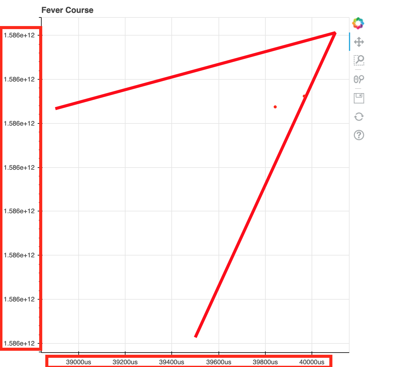
So my question is: How can I change the “values” on the x-axis from nanoseconds to days?
The values on y-axis are to high. Basically it should show the body temperature in degree centigrade (e.g. 38.2 or 39.0 etc.).
I am very thankful for any hint or help.
Greetings, Paul
PS: I hope this post was not too bad… It is my first one ever in a community