X_axis_type="log" not working

What are you trying to do?

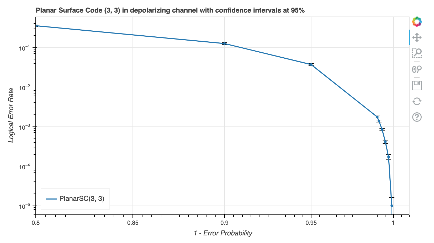
I’m trying to plot some lines on a plot with both axis in log scale.

What have you tried that did NOT work as expected? If you have also posted this question elsewhere (e.g. StackOverflow), please include a link to that post.

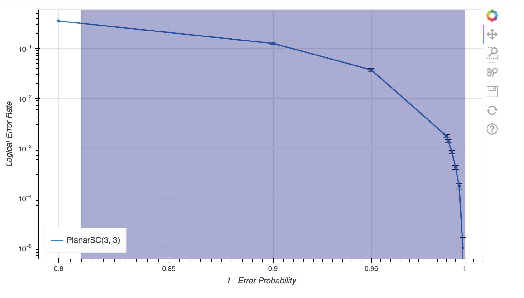
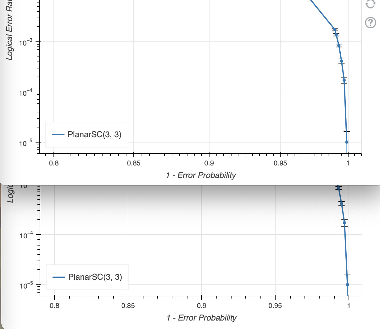
I tried to change x_range because I read that including x=0 could mess up the log but that was not the case. I’m using Whisker so maybe there’s some kind of bug there with log scale?

If this is a question about Bokeh code, please post a Minimal, Reproducible Example so that reviewers can test and see what you see. A guide to do this is here:

I’m using a helper function to plot lines and whiskers:

def add_entry(p, x, y, n_tot, color=None, legend_label=None):
    p.line(x, y, line_width=2, color=color, legend_label=legend_label)
    p.circle(x, y, color=color)
    
    CI_95 = np.sqrt(y * (1 - y) / n_tot) * np.sqrt(2) * erfinv(0.95)
    source_error = ColumnDataSource(data=dict(base=x, upper=y + CI_95, lower=y - CI_95))
    p.add_layout(Whisker(source=source_error, base="base", upper="upper", lower="lower", line_color=color))
    return p

This is the code for the plot:

df = load_data(filepath)

p = figure(
    title=f"Planar Surface Code ({col_qb}, {row_qb}) in depolarizing channel with confidence intervals at 95%",
    sizing_mode="stretch_width",
    max_width=800,
    plot_height=450,
    x_axis_label="1 - Error Probability",
    y_axis_label="Logical Error Rate",
    x_axis_type="log",
    y_axis_type="log",
)
#p.xaxis.ticker = SingleIntervalTicker(interval=0.1)

p = add_entry(
    p,
    x=1 - df.error_probability,
    y=df.logical_error_rate,
    n_tot=df.decoded_codes,
    color=palette[0],
    legend_label="PlanarSC(3, 3)"
)

p.legend.location = "bottom_left"

show(p)

@facorazza we really need a complete Minimal Reproducible Example in order to speculate.

Yes of course.

This is the data which should be saved in a file and loaded with load_data with the corresponding file path:

0.2, 2827, 1000, 0.3537318712415989
0.1, 7963, 1000, 0.12558081125204068
0.05, 27049, 1000, 0.036969943435986544
0.01, 571333, 1000, 0.0017502927364601729
0.009, 722255, 1000, 0.0013845525472305487
0.007, 999999, 842, 0.000842000842000842
0.005, 999999, 413, 0.000413000413000413
0.003, 999999, 171, 0.000171000171000171
0.001, 999999, 10, 1.000001000001e-05

and this is the code:

import numpy as np
import pandas as pd

from bokeh.io import output_notebook
from bokeh.plotting import figure, show
from bokeh.palettes import d3
from bokeh.models import ColumnDataSource, Whisker
from bokeh.models.tickers import SingleIntervalTicker
from scipy.special import erfinv

palette = d3["Category20"][20]

def load_data(filepath):
    return pd.read_csv(
        filepath,
        sep=",",
        header=None,
        names=["error_probability", "decoded_codes", "decoding_errors", "logical_error_rate"]
    ).sort_values("error_probability")

def add_entry(p, x, y, n_tot, color=None, legend_label=None):
    p.line(x, y, line_width=2, color=color, legend_label=legend_label)
    p.circle(x, y, color=color)
    
    CI_95 = np.sqrt(y * (1 - y) / n_tot) * np.sqrt(2) * erfinv(0.95)
    source_error = ColumnDataSource(data=dict(base=x, upper=y + CI_95, lower=y - CI_95))
    p.add_layout(Whisker(source=source_error, base="base", upper="upper", lower="lower", line_color=color))
    return p

filepath = "INSERT FILEPATH"

df = load_data(filepath)

p = figure(
    title=f"Planar Surface Code ({col_qb}, {row_qb}) in depolarizing channel with confidence intervals at 95%",
    sizing_mode="stretch_width",
    max_width=800,
    plot_height=450,
    x_axis_label="1 - Error Probability",
    y_axis_label="Logical Error Rate",
    x_axis_type="log",
    y_axis_type="log",
)
#p.xaxis.ticker = SingleIntervalTicker(interval=0.1)

p = add_entry(
    p,
    x=1 - df.error_probability,
    y=df.logical_error_rate,
    n_tot=df.decoded_codes,
    color=palette[0],
    legend_label="PlanarSC(3, 3)"
)

p.legend.location = "bottom_left"

show(p)
2 Likes

@facorazza

I suspect this is a visual perception issue and not something wrong with the underlying plotting routines.

For your example, the independent data are within a single decade of the log10 scale and all pushed towards the upper end [0.8,1.0]. Within this range, the spacing between the log10(x) values are very close to linear.

So things look linear but I suspect they actually are not. (I did a very rudimentary check with crosshairs on the screen which give pixel locations in screen units and the vertical major ticks at 0.8, 0.85, etc. are decreasing slightly as you’d expect. Its almost visible to the naked eye too if you really squint

1 Like

Hi @facorazza ,

First of all, thank you for your very well-written question with details and code!

It looks like your issue may be a result of the scale of your data. When I look at your x-values, 1 - df.error_probability, I see that all values are between 0.800 and 1. There is a line in the code that defines the log ticker that says for intervals < 2, treat the axis as linear. There was probably a good reason for this, but it’s not documented. :slight_smile:

However! Using your example, I was able to add a p.x_range.start = 0 near the end of the script, and that displayed an obvious log axis just fine.

I wish I knew or could remember why log tickers revert to linear for small intervals. Unfortunately the repo history is clouded behind a couple of filesystem re-orgs plus an entire rewrite from CoffeeScript to TypeScript. The behavior has been there at least 6-7 years if not since the very beginning. If anyone is interested to discuss this behavior or propose changes, please feel free to open a dev discussion on GitHub: Discussions · bokeh/bokeh · GitHub At a minimum it should get documented better, though.

2 Likes

Interesting. It is not clear to me what intervals corresponds to in the current context.

However, if I shift the original poster’s data to the lower end of the decade, viz subtracting 0.7 in the add_entry() function, the log10 nonlinearity becomes more visually apparent.

I don’t think I’ve changed what the definition of intervals is by doing so.

p = add_entry(
    p,
    x=1 - df.error_probability - 0.7,
    y=df.logical_error_rate,
    n_tot=df.decoded_codes,
    color=palette[0],
    legend_label="PlanarSC(3, 3)"
)

1 Like

To convince myself that it still seems to be an issue of visual perception in the current scenario, I added a square glyph with the x-coordinate at 0.90 and manually played with the size property so that it touches the x=1.0 grid line.

The thinking here is that the marker glyphs all have sizes in screen units. So, if the x-axis was truly linear it should also touch the x=0.8 grid line. It does not.


p.square(x=0.9, y=0.003, size=615, color='navy', alpha=0.333)

1 Like

OK some things probably could use some more explanation:

It is not clear to me what intervals corresponds to in the current context.

It’s the number of decades between the range low and range high

To convince myself that it still seems to be an issue of visual perception in the current scenario,

It is that, I did not explain the “linear” comment very well earlier and having thought about it I now recall what is going on. The “linear” there refers only to the way “nice numbers” are chosen for ticks. Everything is still on a log scale, with the axis spacing and positioning that entails. What is different is how the ticks are chosen. Specifically, when there are more than two decades in the range, the priority for “nice” tick numbers is powers of the log base. But that obviously cannot be a good criteria when there are less than two decades. In that case, the choice of tick values falls back to basically the same “nice number” algorithm that the linear ticker uses [1]


  1. more or less: power-of-ten multiples of 1, 2 and 5 ↩︎

3 Likes

Lastly worth saying to @facorazza:

TLDR; this is working as expected. Where there is less than one decade of range, the criteria for choosing what ticks to draw changes. But the positions those ticks that are chosen are correctly positioned on a log scale. You can observe this by comparing output with and without log x-axs set:

The same tick values were chosen to show, but they are displayed in different physical locations (as expected, owing to log vs non-log scale).

If you want the “log plot look” you basically have two options:

  • make sure your ranges span at least two decades (setting start/end manually if necessary, or adding more range padding maybe)
  • implement a custom ticker in JS that does what you want
2 Likes

Thank you guys that cleared things up

2 Likes