Hello all! 
I’m getting stuck with my code:
let me explain my problem, this is part of my code:
    TOOLTIPS = [
                ("Tipo de plan", "@plan_id"),
                ("total", "@total"),
                ]
    p = figure(x_range=src['plan_id'], plot_height=350, title="Fruit Counts by Year", toolbar_location=None, tools="hover", tooltips= TOOLTIPS)
    p.vbar(x='plan_id', top='total', width=0.7, source=source, line_color='white', alpha=0.6, legend_field= 'plan_id')
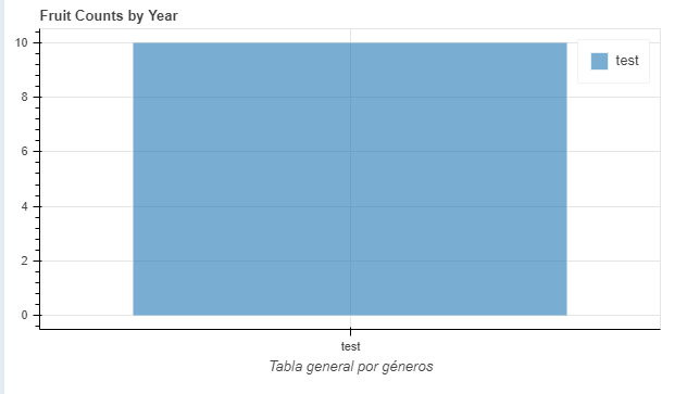
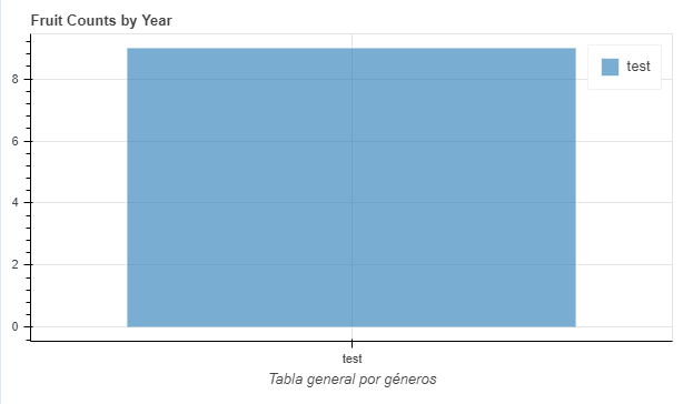
when the value of my data is bigger or smaller than 9, y-axis is correct but when the value is 9, y_axis is not showing the correct range value:
Is this a problem with my code?