Convert time values so heatmap will show up

Hi,

I am working on a big code that would be to big to add here. So I am just adding a few screenshots of the issue I am facing. Here I am defining the figure:

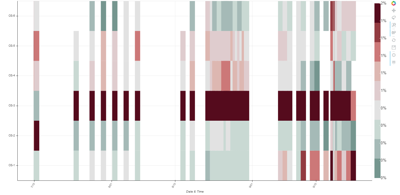
    pHM = figure(tools = TOOLS, 
               plot_width = 1600, 
               plot_height = 800, 
               x_range = ['01.01.2017 10:00','22.01.2017 16:30', '23.01.2017 14:00', '28.01.2017 15:46', '01.02.2017 11:55', '12.02.2017 17:00',
                          '19.02.2017 16:40','24.02.2017 11:15', '02.03.2017 17:00', '10.03.2017 16:10','15.03.2017 10:07','26.03.2017 10:35',
                          '01.04.2017 11:15','07.04.2017 08:30','12.04.2017 00:00','19.04.2017 15:45'],
               y_range = ['OS-13','OS-1','OS-3','OS-6', 'OS-14', 'OS-4', 'OS-11', 'OS-9', 'OS-7', 'OS-10'],
               x_axis_type="datetime",
               y_axis_label = 'Flux_norm', 
               x_axis_label = 'Date & Time')

    colors = ["#ffffff", "#f2fff2", "#e6ffe6", "#d9ffd9", "#ccffcc", "#bfffbf", "#b2ffb2", "#a6ffa6", "#99ff99",
              "#8cff8c","#80ff80", "#73ff73", "#66ff66", "#59ff59", "#4dff4d", "#40ff40", "#33ff33", "#26ff26", 
              "#19ff19", "#0dff0d", "#00ff00", "#0df200","#1ae600", "#26d900", "#33cc00", "#40bf00", "#4cb200", 
              "#59a600", "#669900", "#738c00", "#808000", "#8c7300", "#996600", "#a65900", "#b24d00", "#bf4000",
              "#cc3300", "#d92600", "#e61900", "#f20d00", "#ff0000"]
              
    from bokeh.models import ColorBar, LinearColorMapper, BasicTicker, PrintfTickFormatter
              
    mapper = LinearColorMapper(palette=colors, low=0, high=5)
    
    pHM.rect(x="Date_time", y="Zone", width=1, height=1,
       source=source_fd,
       view = view_fd,
       fill_color={'field': 'Fnorm', 'transform': mapper},
       line_color=None)
    
    hmLow = TextInput(title = 'Heatmap low:', value = str(0))
    hmMax = TextInput(title = 'Heatmap high:', value = str(10))

    color_bar = ColorBar(color_mapper=mapper, major_label_text_font_size="7px",
                     ticker=BasicTicker(desired_num_ticks=len(colors)),
                     formatter=PrintfTickFormatter(format="%d%%"),
                     label_standoff=6, border_line_color=None, location=(0, 0))
    
    pHM.add_layout(color_bar, 'right')
    
    
    heatmapchange = CustomJS(args = dict(mapper = mapper, 
                                     hmLow = hmLow,
                                     hmMax = hmMax),
                                          code="""\
                                          console.log(mapper)
                                          mapper.low = parseFloat(hmLow.value)
                                          mapper.high = parseFloat(hmMax.value);
                                          """)

    hmLow.js_on_change('value', heatmapchange)
    hmMax.js_on_change('value', heatmapchange)

I have just added a few random values for x and y range. And when the user clicks on select tools on the page, it should display that data. This is the raw data date inputs:
image
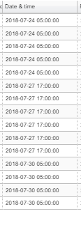
I can see they are displayed below just in seconds from epoch.


Here is the code where the console prints out the values:

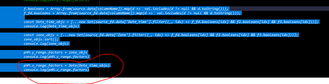
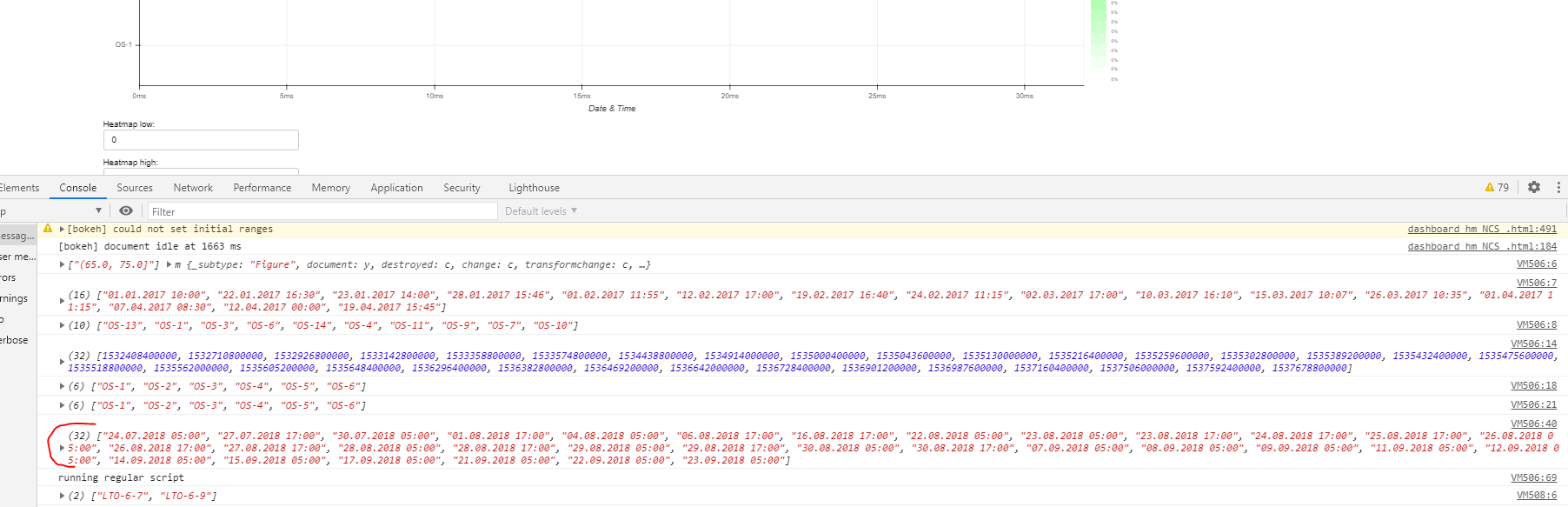
The error i am getting is that FactorRange.factors was given an invalid value:

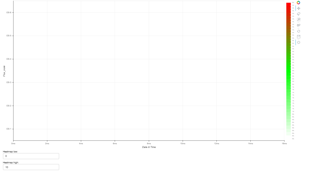
I can see it displays the updated zones, but time is wrong and probably why the plot is empty.

I think I need to convert the values to a date that bokeh can read. Anyone knows what that format should be?

Understand its a problem with no test code, if a test code is really needed I can try to make one.

The factors attribute expects an array of strings, not a single string.

So I need to push this to an array and then add to factors?

var dates = [1532408400000, 1532710800000, 1532926800000, 1533142800000, 1533358800000, 1533574800000, 1534438800000, 1534914000000, 1535000400000, 1535043600000, 1535130000000, 1535216400000, 1535259600000, 1535302800000, 1535389200000, 1535432400000, 1535475600000, 1535518800000, 1535562000000, 1535605200000, 1535648400000, 1536296400000, 1536382800000, 1536469200000, 1536642000000, 1536728400000, 1536901200000, 1536987600000, 1537160400000, 1537506000000, 1537592400000, 1537678800000]

for (var date in dates) {
  //console.log(dates[date], Date(dates[date]))
  var d = new Date(+dates[date]);
  console.log(d.toString())

}

Converting the dates like this:

                                          const datetime = [];
                                          
                                          for (var date in Date_time_objs) {
                                                  var MyDate = new Date(+Date_time_objs[date]);
                                                  datetime.push(('0' + MyDate.getDate()).slice(-2) + '.'
                                                  + ('0' + (MyDate.getMonth()+1)).slice(-2) + '.'
                                                  + MyDate.getFullYear() + ' ' 
                                                  + ('0' + MyDate.getUTCHours()).slice(-2) + ':' 
                                                  + ('0' + MyDate.getMinutes()).slice(-2))
                                                  }

You can see below its the same format. Still no plot. Does it mean there is something else wrong in the code. Source is empty. Is there a way I can check that?

Hi @Zana,

I do think a minimal reproducing example, or at least code that can be copied and pasted and run in its entirety, would be helpful here for diagnosis.

While Carolyn is absolutely right, the very first thing you should do is to figure out whether you need the categorical axis at all. I mean, you’re using dates that Bokeh supports as is, you just have to specify x_axis_type="datetime".
If you’re sure about categories, your factors (the list you pass to the x_range parameter) rigidly state what categories might appear in the data. Each data point must belong to a category from that list. If you introduce some data that has new categories, you will have to update the factors (p.x_range.factors = [...new factors here...]) but do note that the order matters.

Hi,

Thanks for the reply. As I was making a test example last night, it was working fine in the test example with dummy data (of course…). Scratched my head multiple times, added x_axis_type = datetime. Didnt need to convert the dates. The issue was the width of the p.rect, they where to thin I couldnt see it on the plot. Once I did this:

source=source_fd, view=view_fd, 
width=100000000, height=1,

The heatmap showed up.

Now I have another question :smiley:
Is it possible to change the width of the rect so the next starts when the other stops. Something like p.width.factors = [array of values]
Where the array of values is the time (s from epoch) subtracted from the next?

Ah, so your dates have gaps and you want to avoid gaps.
There are two solutions that I know of:

  1. Use categories and just specify factors with gaps
  2. Convert ordered dates into indices and use the solution from here: How do I make omit missing dates gaps in graph when using datetime as x-axis - #2 by Alexandre_Daly

Just noting: please do make sure to use 2.2.3, there was a bug in earlier 2.2.x specifically affecting rects on datetime axes (not sure if it is relevant here for certain but worth mentioning)

2 Likes

Thanks Bryan, I’ll look into that.