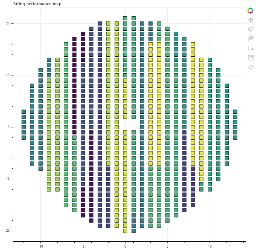
I am trying to make a map of a floating PV solar farm that shows performance ( or temp, current etc.) for the different groups of solar panels at a chosen date (chosen with a DateSlider).
I want the map to show a clear separation between the groups (grouped as in the image). In addition the groups should be colored according how well they perform.
I have tried bokeh.charts HeatMap but it is deprecated.
Check out the rect glyph. You can use a color-mapper, e.g. LinearColorMapper, to equate a variable in your data at each (x,y) coordinate to some color-coded measure like performance, temperature, or whatever.
You can look through the bokeh documentation and examples online. Or, see this discourse topic – or perhaps others – that have some of the relevant syntax (ignoring of course the posters issues with how they formatted the data and focusing on the details of setting up the plot and color-mapper).