Data is pretty much simplified, but that not important since issue reproduced
import random
import sys
import pandas as pd
from bokeh import events
from bokeh.io import output_file
from bokeh.models import HoverTool, Line, ColumnDataSource, TapTool, CustomJS, CrosshairTool
from bokeh.palettes import Turbo256
from bokeh.plotting import figure, show, curdoc
OUTPUT_HTML_FILE = sys.argv[1] if len(sys.argv) > 1 else 'chart.html'
if not OUTPUT_HTML_FILE.endswith('.html'):
OUTPUT_HTML_FILE += '.html'
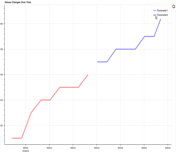
data = [{'time': 1738947484.271536, 'value': 151, 'type': 'vs', 'name': 'Parameter1'},
{'time': 1738947484.29157, 'value': 151, 'type': 'vs', 'name': 'Parameter1'},
{'time': 1738947484.31152, 'value': 153, 'type': 'vs', 'name': 'Parameter1'},
{'time': 1738947484.332541, 'value': 154, 'type': 'vs', 'name': 'Parameter1'},
{'time': 1738947484.351486, 'value': 154, 'type': 'vs', 'name': 'Parameter1'},
{'time': 1738947484.372012, 'value': 155, 'type': 'vs', 'name': 'Parameter1'},
{'time': 1738947484.391883, 'value': 155, 'type': 'vs', 'name': 'Parameter1'},
{'time': 1738947484.41132, 'value': 155, 'type': 'vs', 'name': 'Parameter1'},
{'time': 1738947484.431446, 'value': 156, 'type': 'vs', 'name': 'Parameter1'},
{'time': 1738947484.450649, 'value': 157, 'type': 'vs', 'name': 'Parameter1'},
{'time': 1738947484.471536, 'value': 157, 'type': 'vs', 'name': 'Parameter1'},
{'time': 1738947484.490712, 'value': 158, 'type': 'vs', 'name': 'Parameter1'},
{'time': 1738947484.51077, 'value': 158, 'type': 'vs', 'name': 'Parameter1'},
{'time': 1738947484.531372, 'value': 158, 'type': 'vs', 'name': 'Parameter1'},
{'time': 1738947484.550755, 'value': 159, 'type': 'vs', 'name': 'Parameter1'},
{'time': 1738947484.571007, 'value': 159, 'type': 'vs', 'name': 'Parameter1'},
{'time': 1738947484.591335, 'value': 161, 'type': 'vs', 'name': 'Parameter1'}]
if not data:
sys.exit()
# Convert the data into a DataFrame
df = pd.DataFrame(data)
# Convert the 'time' from EpochTime to datetime
df['time'] = pd.to_datetime(df['time'], unit='s')
# Set up the output file (HTML)
output_file(OUTPUT_HTML_FILE)
# Create a color palette using Turbo256 for as many lines as you need
list_Turbo256 = list(Turbo256)
random.shuffle(list_Turbo256)
colors = list_Turbo256[:len(df['name'].unique())] # Slice the first N colors from Turbo256
# Create a figure for the plot
curdoc().theme = 'caliber'
p = figure(title="Values Changes Over Time",
x_axis_label='Time', y_axis_label='Value', x_axis_type='datetime',
sizing_mode='stretch_both', width=800, height=600, tools="pan,wheel_zoom,box_zoom,reset,save")
p.border_fill_color = "whitesmoke"
p.min_border_left = 10
p.outline_line_width = 2
p.outline_line_alpha = 0.3
p.outline_line_color = "navy"
# Add a line for each unique parameter 'name' with a unique color
sources = []
lines = []
for name, color in zip(df['name'].unique(), colors):
# Filter the data for each parameter
parameter_data = df[df['name'] == name]
if not len(parameter_data.values):
continue
source = ColumnDataSource(parameter_data)
sources.append(source) # Save for callback
# Add line
p.circle(x='time', y='value', source=source, size=4.9, color=color, alpha=0, hover_alpha=0)
renderer = p.line(x='time', y='value', source=source, legend_label=name,
line_width=5, line_color=color, line_alpha=0.4, hover_alpha=0.7)
lines.append(renderer)
# Set selection and non-selection styles
renderer.selection_glyph = Line(line_width=7, line_color=color, line_alpha=1)
renderer.nonselection_glyph = Line(line_width=3, line_color=color, line_alpha=0.2)
renderer.glyph.line_join = "round" # Makes thin lines look better
renderer.glyph.line_cap = "round"
# Add hover tool to display time and value
hover = HoverTool(tooltips=[("Time", "@time{%H:%M:%S}"), ("Value", "@value"), ("Name", "@name")],
formatters={"@time": "datetime"})
p.add_tools(hover, TapTool()) # Add TapTool for selection
hover.renderers = lines
# Add CrosshairTool
crosshair = CrosshairTool()
p.add_tools(crosshair)
# Make only Hover inspect tool enabled by default, but not Crosshair
p.toolbar.active_inspect = [hover]
# JavaScript Callback to switch hover mode based on crosshair activation
callback = CustomJS(args=dict(hover=hover, crosshair=crosshair, p=p), code="""
// Check if crosshair tool is active
let isActive = crosshair.active;
console.log("Crosshair active:", isActive);
if (isActive) {
hover.mode = 'vline'; // Enable vline mode
} else {
hover.mode = 'mouse'; // Default back to mouse mode
}
p.change.emit();
""")
# Attach callback to figure tool change event
p.js_on_event(events.Tap, callback)
# Customize the legend
p.legend.location = "top_right"
p.legend.click_policy = "hide" # Click to hide/show lines
p.legend.border_line_alpha = 1
p.legend.background_fill_alpha = 1
p.legend.background_fill_color = "whitesmoke"
# JavaScript Callback for Auto-Scaling on Selection
callback = CustomJS(args=dict(p=p, sources=sources), code="""
console.log("Selection triggered!"); // Check if the callback runs
let x_min = Infinity, x_max = -Infinity, y_min = Infinity, y_max = -Infinity;
let found_selection = false;
// Loop through each data source
sources.forEach((source, index) => {
const selected_indices = source.selected.indices;
console.log(`Source ${index} selected indices:`, selected_indices); // Log selected indices
if (selected_indices.length > 0) {
found_selection = true; // A line has been selected
let data = source.data;
console.log(`Data for Source ${index}:`, data); // Log entire dataset
x_min = Math.min(x_min, ...data['time']);
x_max = Math.max(x_max, ...data['time']);
y_min = Math.min(y_min, ...data['value']);
y_max = Math.max(y_max, ...data['value']);
console.log(`New Ranges for Source ${index}:`);
console.log(`x_min: ${x_min}, x_max: ${x_max}`);
console.log(`y_min: ${y_min}, y_max: ${y_max}`);
}
});
// If a line is selected, update the plot range
if (found_selection) {
console.log("Updating ranges...");
p.x_range.start = x_min;
p.x_range.end = x_max;
p.y_range.start = y_min - 5; // Add some padding
p.y_range.end = y_max + 5;
p.change.emit(); // 🚀 This forces Bokeh to redraw
} else {
console.log("No selection detected.");
}
""")
# Attach the callback to selection event
for source in sources:
source.selected.js_on_change("indices", callback)
# Show the plot
# show(p)
from bokeh.models import ColumnDataSource, CustomJS, Button
from bokeh.plotting import figure, column, show
button = Button(label='change line')
show(column(p, button))