How to remove missing date gaps

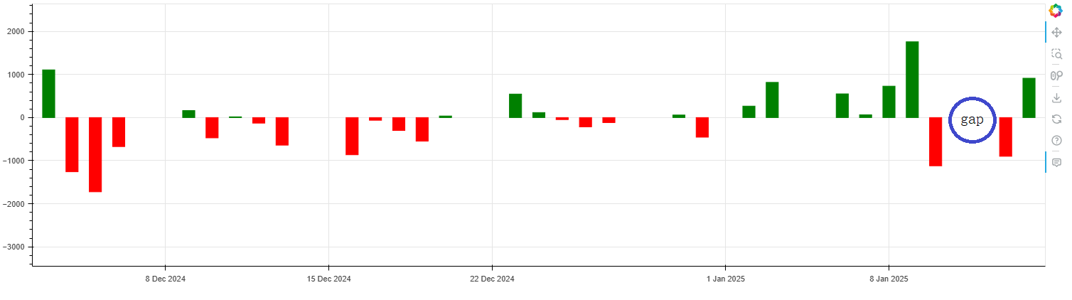
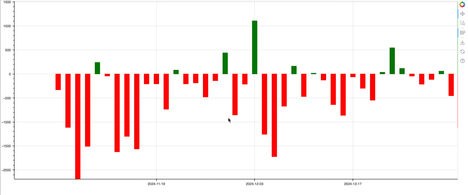
from datetime import datetime, timedelta
import pandas as pd
from bokeh.plotting import figure, show, output_file
from bokeh.models import ColumnDataSource, HoverTool, Range1d, DatetimeTickFormatter
fill_color = []
y= [ -331.6, -1114.8, -2299.9, -1509.2,   240.7,   -43.2, -1623.2,
        -1301.2, -1562.6,  -209.4,  -208.1,  -735.4,    81.4,  -208.8,
        -187.7,  -480.7,  -141.4,   440.2,  -855.7,  -214.1,  1106.9,
        -1257.4, -1722.7,  -672.9,   163. ,  -471. ,    17.1,  -128.7,
        -639.5,  -863.1,   -62.2,  -299.9,  -547.3,    36.3,   545.1,
          116. ,   -46.5,  -214.8,  -116.6,    58.9,  -454.9,   265.5,
          816.5,   549.9,    64.3,   728.6,  1758.3, -1119.4,  -898.7,
          912.9]
for a in y:
    if a >= 0:
        fill_color.append('green')
    elif a < 0:
        fill_color.append('red')
dates = ['2024-11-05', '2024-11-06', '2024-11-07', '2024-11-08',
               '2024-11-11', '2024-11-12', '2024-11-13', '2024-11-14',
               '2024-11-15', '2024-11-18', '2024-11-19', '2024-11-20',
               '2024-11-21', '2024-11-22', '2024-11-25', '2024-11-26',
               '2024-11-27', '2024-11-28', '2024-11-29', '2024-12-02',
               '2024-12-03', '2024-12-04', '2024-12-05', '2024-12-06',
               '2024-12-09', '2024-12-10', '2024-12-11', '2024-12-12',
               '2024-12-13', '2024-12-16', '2024-12-17', '2024-12-18',
               '2024-12-19', '2024-12-20', '2024-12-23', '2024-12-24',
               '2024-12-25', '2024-12-26', '2024-12-27', '2024-12-30',
               '2024-12-31', '2025-01-02', '2025-01-03', '2025-01-06',
               '2025-01-07', '2025-01-08', '2025-01-09', '2025-01-10',
               '2025-01-13', '2025-01-14']
x = pd.to_datetime(dates)
p = figure(width=1500, height=400, x_axis_type='datetime')
p.xaxis.major_label_overrides = {
    i: date.strftime('%b %d') for i, date in enumerate(pd.to_datetime(dates))
}
p.xaxis.formatter = DatetimeTickFormatter(days=["%d %b %Y"])
p.vbar(x=x, width=45000000, bottom=0, top=y, color = fill_color)
p.add_tools(HoverTool(tooltips=[("date", "@x{%F}"),( "value", "@top{"f"0.0""}"),], formatters={'@x':'datetime',},))
p.x_range = Range1d(x[-31]+timedelta(days=0.3), x[-1]+timedelta(days=0.7), bounds=(x[0]-timedelta(days=0.7), x[49]+timedelta(days=0.7)))
p.y_range = Range1d(1.5 * min(y), 1.5 * max(y))
show(p)

I’ve referenced this post, but still fail to reproduce the same effect.

Here is is simpler example from the gallery you can refer to.

missing_dates — Bokeh 3.6.2 Documentation

Long story short, there is no direct support for this. You will need to plot with the x-axis as a integer index into the dataset rows, then use some axis lable overrides to manually add the axis labels you wnat.

Thank you very much indeed.

Hi, I have some suggestions and don’t know if here is the right place or hvplot is the right place.

I suggested adding a skip missing data parameter for x-axis datetime data in general. Or creates DatetimeTickFormatters with this parameter.

Manually replacing x ticks in small range data (like 3 ohlc candles) causes numbers to appear on the x-axis like here in the first post Skip missing data on timeseries axis - hvPlot - HoloViz Discourse

In general, axes, tickers, and tick formatters have no knowledge of the data, so there would be no mechanism to implement a configuration like that at the Bokeh level. This would be more appropriate for a something like hvplot that could examine the data up front, then configure Bokeh objects as needed from the higher level.

Thank you for the reply.

And what about the numbers on the x axis when have a few data points? When I use

fig.xaxis.major_label_overrides = {
    i: dt.strftime("%b %d") for i, dt in enumerate(df["Date"])
}

For e.g. 3 data points, there occures the numbers 0.5 and 1.5, Like in the screenshot on the given link. I think it depends on the width of the figure

You need to also explicitly supply the tick locations that you want to use, not just the label overrides. The example I posted above does this by setting .ticker to a list of desired tick locations.

I have been wrestling with this also but see it as something broader than date gaps. Code below demonstrates the same behavior with scatter plots - it looks like Bokeh inserts data to create a linear x-axis regardless of what is in the dataframe. Maybe an x_range is automatically created using first and last x values in the data? Can there not be a “use raw x data” option?

You can comment in/out scatter plot with integer or string x-axis data as well as try line plot with DateTime dataframe with or without DateTimeTickFormatter. In every case there are x values in the plot that are not in the dataframe.

Converting x values to strings for tick labels isn’t a viable solution for large datasets where you want to zoom/pan - you either end up with too many or not enough tick values since they don’t automatically adjust.

import polars as pl
import pandas as pd
from bokeh.plotting import figure, show
from bokeh.models import DatetimeTickFormatter

test_figure_line = figure()
test_figure_scatter = figure()

# Test scatter plot

scatter_df = pl.DataFrame(
    {
        # behaves the same with strings or integers
        # "XValue": ["1", "2", "3", "6", "7", "8"],
        "XValue": [1, 2, 3, 6, 7, 8],
        "YValue": [6, 5, 4, 3, 2, 1],
    }
).to_pandas()

print(scatter_df)

test_figure_scatter.scatter(x=scatter_df.XValue, y=scatter_df.YValue, color="red")

show(test_figure_scatter)

# Test line plot

line_df = pl.DataFrame(
    {
        "DateTime": [
            "2025-01-01",
            "2025-01-02",
            "2025-01-03",
            "2025-01-06",
            "2025-01-07",
            "2025-01-08",
        ],
        "Value": [1, 2, 3, 4, 5, 6],
    }
).to_pandas()
line_df["DateTime"] = pd.to_datetime(line_df["DateTime"])
line_df.set_index("DateTime", inplace=True)

print(line_df)

# behaves the same with or without the formatter
# test_figure_line.xaxis.formatter = DatetimeTickFormatter(days="%b-%d")
test_figure_line.line(line_df.index, line_df.Value, line_color="blue", line_width=2)

# show(test_figure_line)

`

@kampai-shp If you want a categorical axis, you have ask for one by explicitly stating what factors comprise the categorical range, the order you want them in. Please see this section:

https://docs.bokeh.org/en/latest/docs/user_guide/basic/axes.html#categorical-axes

Otherwise, yes, the default range and axis is always a linear continuous numerical one. I.e. no data at all is ever “inserted” — numerical ranges (in any plotting system ever) just span whatever numerical interval they span in its entirety.

Note that none of this has any influence on either what tick locations are chosen (that’s up to the axis Ticker) or how they are formatted (that’s up to the axis TickFormatter)

But also, the technique above does not use categorical axes, either. It uses an explicity mapping of integer row indices to datetime labels, but the underlying axis/range are still numeric.

Converting x values to strings for tick labels isn’t a viable solution for large datasets where you want to zoom/pan - you either end up with too many or not enough tick values since they don’t automatically adjust.

If you need true, actual broken axes (i.e. as seen in specialized financial plotting tools), that are also interactive and work across multiple zoom scales, then Bokeh is probably just not the right tool for you. I don’t think there will be another solution besides the “map a subset of row indices to string datetime labels” any time soon.

Actually it occurs to me that the recently added CustomJSTicker might offer a decent but not perfect approach that works with zooming. I’ll have to work up an example in the next few days when I have time.

Thanks for the info, Bryan.

The “date gap” situation is common across many Python plotting projects. mplfinance has solved it but isn’t built to integrate with other GUIs.

Eliminating the gap is more important than the axis ticks so I’ll work on that path. HoverTool can be used to provide the DateTime info for specific bars on smaller time intervals.

I’ve found Bokeh to be easier than Dash, Streamlit, Shiny for quickly building a lightweight interactive web financial app with plots so would like to stick with it.

Here is a minimal example that also uses the index-based approach to remove “gaps” but adds:

  • a CustomJSTicker to pick three equally-spaced indices inside the current viewport to use as tick locations, and
  • a CustomJSTickFormatter that uses the ticks (which are indices) to look up the date string to show from the data source

Obviously this can be improved and made more sophisticated, e.g. maybe you want to have “nicer” tick locations than simply N equally-spaced locations. I leave those refinements as an exercise for the reader.

ScreenFlow

from bokeh.plotting import figure, show
from bokeh.models import ColumnDataSource, CustomJSTicker, CustomJSTickFormatter

date = ["2024-11-05", "2024-11-06", "2024-11-07", "2024-11-08", "2024-11-11", "2024-11-12", "2024-11-13", "2024-11-14", "2024-11-15", "2024-11-18", "2024-11-19", "2024-11-20", "2024-11-21", "2024-11-22", "2024-11-25", "2024-11-26", "2024-11-27", "2024-11-28", "2024-11-29", "2024-12-02", "2024-12-03", "2024-12-04", "2024-12-05", "2024-12-06", "2024-12-09", "2024-12-10", "2024-12-11", "2024-12-12", "2024-12-13", "2024-12-16", "2024-12-17", "2024-12-18", "2024-12-19", "2024-12-20", "2024-12-23", "2024-12-24", "2024-12-25", "2024-12-26", "2024-12-27", "2024-12-30", "2024-12-31", "2025-01-02", "2025-01-03", "2025-01-06", "2025-01-07", "2025-01-08", "2025-01-09", "2025-01-10", "2025-01-13", "2025-01-14"]
x = list(range(len(date)))
y = [-331.6, -1114.8, -2299.9, -1509.2, 240.7, -43.2, -1623.2, -1301.2, -1562.6, -209.4, -208.1, -735.4, 81.4, -208.8, -187.7, -480.7, -141.4, 440.2, -855.7, -214.1, 1106.9, -1257.4, -1722.7, -672.9, 163.0, -471.0, 17.1, -128.7, -639.5, -863.1, -62.2, -299.9, -547.3, 36.3, 545.1, 116.0, -46.5, -214.8, -116.6, 58.9, -454.9, 265.5, 816.5, 549.9, 64.3, 728.6, 1758.3, -1119.4, -898.7, 912.9]
color = ["green" if a >= 0 else "red" for a in y]

source = ColumnDataSource(data=dict(x=x, y=y, date=date, color=color))

p = figure(width=1500)

p.vbar(x="x", top="y", color="color", width=0.5, bottom=0, source=source)

# always three equally spaced ticks
p.xaxis.ticker = CustomJSTicker(
    args=dict(source=source),
    major_code="""
        const start = Math.max(cb_data.range.start, 0)
        const end = Math.min(cb_data.range.end, source.data.x.length-1)
        const d = (end-start) / 4
        return [Math.round(start+d), Math.round(start+2*d), Math.round(start+3*d)]
    """)

# use the tick (i.e index) to look up the date string
p.xaxis.formatter = CustomJSTickFormatter(
    args=dict(source=source),
    code="return source.data.date[tick] "
)

show(p)
1 Like

Another, different approach to this general problem (also enabled by CustomJSTicker) would be to use the date strings themselves as categorical coordinates directly, and then use CustomJSTicker to choose “nice” locations by paring down the factors to show on the axis.

This is awesome, Bryan! Thanks for prototyping.

1 Like

A great thanks for solving this problem :+1:, another issue, if I want to add a few more dates on the x-axis, given there’s enough space, say every 5 bars show a date, can that be done?

I’m not sure I understand the ask, exactly, In any case for the sake of keeping this forum organized, perhaps a new topic for a new question, with more details about the goal.

Thanks, I’ll start a new post.