Hello, I am having a wired problem in the layout of the varea_stack plot:
as a source I have a pd DataFrame that looks a little like this:
                 budf0                budf1  ...         budf9        budf10
0   2004-09-22 00:00:00  2004-09-22 00:00:00  ...      0.000000   8369.992188
1   2004-09-22 00:00:00  2004-09-22 00:00:00  ...      0.000000   8369.992188
2   2004-09-22 00:00:00  2004-09-22 00:00:00  ... -62263.421875   8369.992188
3   2004-09-22 00:00:00  2004-09-22 00:00:00  ... -60510.796875   8369.992188
4   2004-09-22 00:00:00  2004-09-22 00:00:00  ... -66217.226562   8369.992188
..                  ...                  ...  ...           ...           ...
792 2018-08-22 00:59:00  2018-08-22 00:59:00  ...  73861.562500  32149.527344
793 2018-09-01 00:25:00  2018-09-01 00:25:00  ...  73885.562500  32149.527344
794 2018-09-20 00:59:00  2018-09-20 00:59:00  ...  73959.929688  32149.527344
795 2018-09-21 00:59:00  2018-09-21 00:59:00  ...  73989.625000  32149.527344
796 2018-09-22 00:59:00  2018-09-22 00:59:00  ...  88514.390625  32149.527344
i want to do an varea_stack plot with “budf0” on the x axis and “budf3” - “budf10” as stackers, so my code looks like this:
stackPlot = figure()
stackPlot.xaxis.formatter = DatetimeTickFormatter()
stackNames = [f"budf{i}" for i in range(3,len(filteredDf.columns))]
stackPlot.varea_stack(stackers=stackNames, x="budf0", color=brewer['Spectral'][len(stackNames)], source=filteredDf)
show(stackPlot)
when i run this piece of code my plot looks like this:
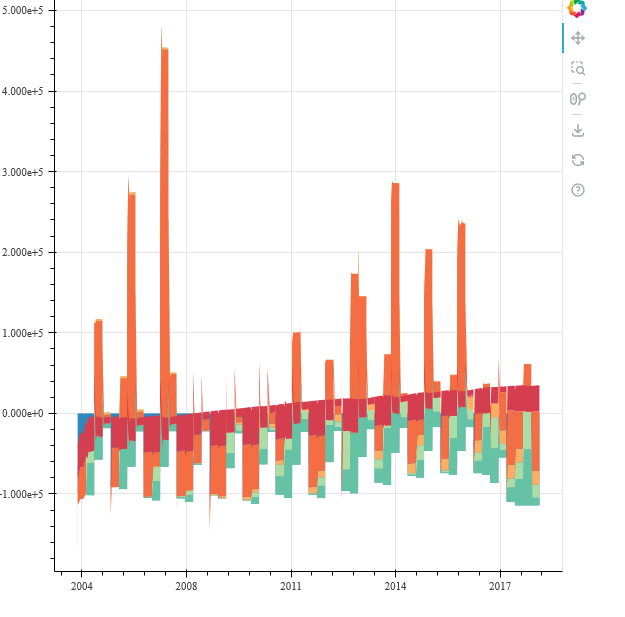
the plot above is definitively not correct. (the graphs are just wrong)
However, when I plot each column of my source one after another like so:
budfs=["budf3","budf4","budf5","budf6","budf7","budf8","budf9","budf10"]
colo=brewer["Spectral"][11]

for i in range(len(budfs)):
    y.varea_stack(stackers=[budfs[i]],x="budf0", color=colo[i], source=filteredDf)
show(y)
then the shape of the graph looks correct, like this:
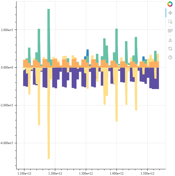
But this is not varea_stack plot anymore, it is just each column plotted on top of each other. Can someone tell me what I do wrong? And why my original plot looks so wrong?
thanks very much in Advance