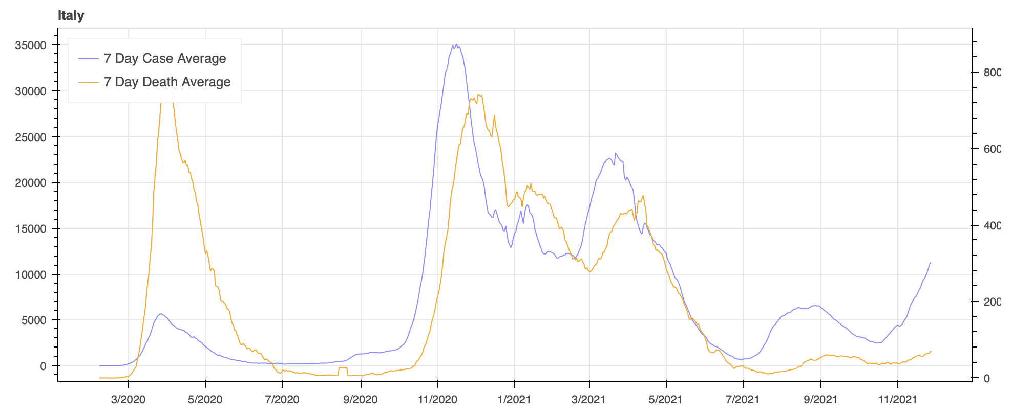
I am making a plot with two line graphs and using a secondary y-axis. However, the primary y-axis on the left automatically puts 0 slightly above the bottom of the graph where the secondary y-axis puts 0 on the very bottom of the graph.
Here is my code:
x = list(europe[europe.location == coun][‘datetime’].iloc[-660:])
y = list(europe[europe.location == coun].iloc[-660:].new_cases_smoothed)
y2 = list(europe[europe.location == coun].iloc[-660:].new_deaths_smoothed)
us = figure(title=coun, plot_height=400, plot_width=1000, x_axis_type="datetime", min_border = 10)


us.line(x, y, color="blue", legend_label="7 Day Case Average", alpha=0.45)
us.extra_y_ranges = {"foo": Range1d(start=-10, end=europe[europe.location == coun]
                                    .iloc[-660:].new_deaths_smoothed.max() + 100)}
us.line(x, y2, color="orange", y_range_name="foo", legend_label="7 Day Death Average")
us.add_layout(LinearAxis(y_range_name="foo"), 'right')
us.xaxis.ticker.desired_num_ticks = 15
us.legend.location = "top_left"
So you can manipulate this with the start parameter for Range1d but that is pretty cumbersome when making multiple plots. Is there any way to automatically put 0 for both y-axises at the same level?
It’s true, to me, it just looks a lot cleaner when the graphs are not offset and it’s difficult to see parts of the graph that are at or close to 0 when it starts at the very bottom.
@coyne44 are you asking how to get rid of the range padding? You can also set that to zero (on data ranges) Also: please indicate who / which post you are replying to (with quote block or @name)
Thanks for the reply. I would like same range padding to apply to the secondary y-axis on the right so that 0 is at the same level for both line graphs.
@coyne it’s still really unclear if you want both range starts to be exactly zero or whether you want the range starts to be based on the line data, but with the same padding
If it’s the latter, I think your only option is zero range padding, since range padding is a function of the range length. The same padding percentage means a different physical length (in pixels) unless both ranges coincidentally contrive to be exactly the same start/end.
If it is the former, did you try my suggestion above? I.e. only setting start=0 on two data ranges?
Matplotlib does this automatically so I thought there might be a way to do it with bokeh. It seems like the best way to do this is possibly use a start value for the secondary axis that is a percentage of the total range, ex. start = (-0.05 * range).
I do not want the range start to be 0, but to have the same padding
I don’t thinks there is any solution for this. Since the ranges are not the same scale, the only way to ensure the same padding (in pixels) is to set the padding to zero. If you don’t want to do that, I think you will have to explicitly set the start on the ranges to both be the zero, or else just “eyeball” separate values that are “close”.
FWIW anchoring twin axes together at a common point seems like a reasonable thing, but you are in fact the first person to ever ask about it. You can make a GitHub Issue but I can’t make any promises about anything soon. MPL has the luxury of generating static output mostly. Due to the huge intersection of interactive considerations, ranges/axes are 100% the most complex, complicated, convoluted code in all of Bokeh. Adding even more to that would need a lot of +1’s to justify the effort.
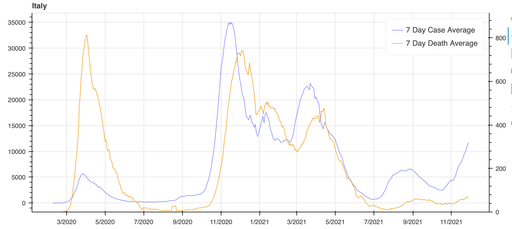
I changed the start and end values of secondary y-axis to both be multiples of the y-range (variables start and end below) and now they are lining up as I wanted.
x = europe[europe.location == coun]['datetime'].iloc[-660:]
y = europe[europe.location == coun].iloc[-660:].new_cases_smoothed
y2 = europe[europe.location == coun].iloc[-660:].new_deaths_smoothed

us = figure(title=coun, plot_height=400, plot_width=900, x_axis_type="datetime", min_border = 10)

start = -.05 * (y2.max() - y2.min())
end = 1.05 * (y2.max() - y2.min())

us.line(x, y, color="blue", legend_label="7 Day Case Average", alpha=0.45)
us.extra_y_ranges = {"foo": Range1d(start=start, end=end)}
us.line(x, y2, color="orange", y_range_name="foo", legend_label="7 Day Death Average")
us.add_layout(LinearAxis(y_range_name="foo"), 'right')
us.xaxis.ticker.desired_num_ticks = 15
us.legend.location = "top_left"
That should be a good enough fix for what I am wanting to do. Thanks for you all your quick replies and solutions!
Nice, was gonna suggest doing the “percentage calc” type thing, pretty sure that’s what I’ve resorted to before too
@Bryan I might make a feature request concerning a few “secondary axis nice to haves”, as per Secondary axis and scale problems - #3 by gmerritt123 and another very pedantic use case I ran into today (I’ll get into the details of that with an MRE on github).